Carnegie Classification Year-over-Year (YoY) Growth Rate Comparison
Carnegie Classification Year-over-Year (YoY) Growth Rate Comparison

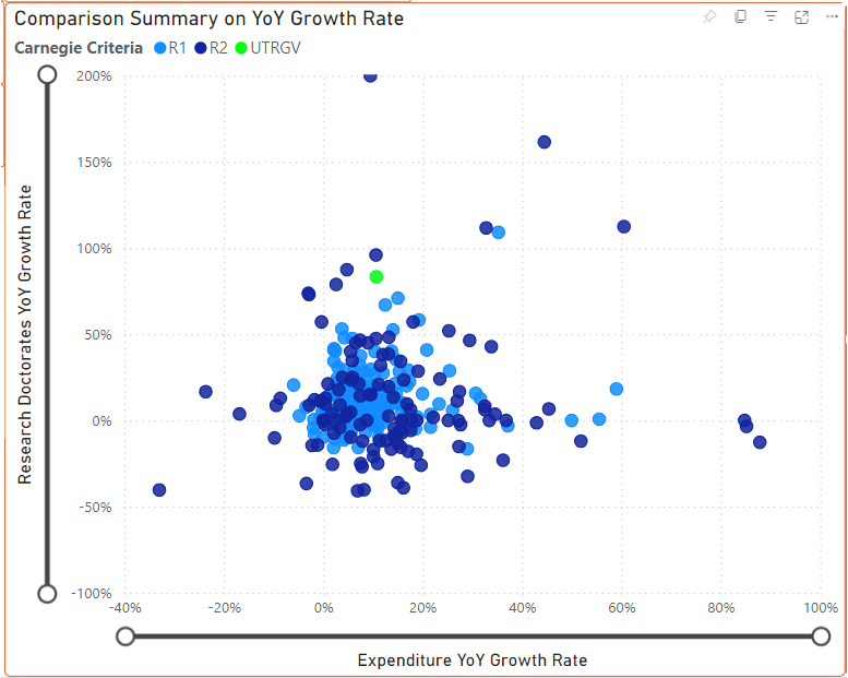
The Carnegie Classification comparison graph provides an insightful view into how institutions are evolving over time based on their research growth. This graph measures the year-over-year (YoY) growth rate for two essential research metrics: total research expenditure and research doctorates awarded. By tracking these growth rates, users can see how institutions’ research efforts expand or contract annually.
Understanding the Axes
- X-Axis (Expenditure YoY Growth Rate): Shows the growth rate of each institution’s research spending compared to the previous year. Institutions with a positive growth rate are increasing their research funding, while those with a negative growth rate are experiencing a decrease.
- Y-Axis (Research Doctorates YoY Growth Rate): Displays the change in the number of research doctorates awarded from year to year. Institutions with a high positive growth rate on this axis are awarding more research doctorates each year, indicating growing research output.
Color-Coding by Carnegie Criteria
Each point on the scatter plot represents an institution, and the colors indicate the Carnegie Classification criteria met by each:
- R1 institutions (blue) meet the highest levels of research activity.
- R2 institutions (green) also have significant research activity but at a slightly lower threshold than R1.
This color-coding enables users to quickly identify which institutions fall into R1 or R2 categories and see how they are performing in terms of YoY growth.
UTRGV in Focus
The University of Texas Rio Grande Valley (UTRGV) is highlighted with a green marker for easy identification. This unique marker helps stakeholders easily find UTRGV and compare its growth trajectory with other institutions on the plot.
Interpreting Growth Rates and Trends
The two threshold sliders at the top allow users to focus on specific growth ranges for research doctorates and expenditures:
- Research Doctorates YoY Growth Rate Slider: Helps users filter institutions based on changes in the number of research doctorates awarded, from significant decreases to substantial increases.
- Expenditure YoY Growth Rate Slider: Enables filtering based on how research spending has changed, providing a way to isolate institutions with substantial investment growth or contraction.
Purpose of the YoY Growth Rate Comparison
This comparison tool provides an interactive way to assess how institutions are expanding or scaling back their research capacity. By examining both research expenditure and doctorate production growth rates, users gain insight into the pace at which different universities are enhancing their research impact.
For UTRGV, this graph serves as a benchmark for its year-over-year performance, highlighting its position among other institutions striving for growth in research funding and doctorate awards. This visualization encourages discussions about strategic investment in research, program expansions, and funding allocations to support the institution's growth goals.
