

 rotate(10)'/%3E%3Cpath d='M.038.113v.15l.15.088.15-.088v-.15L.188.025l-.15.088Z' stroke='%23c44900' stroke-width='.0375' transform='rotate(10)'/%3E%3C/svg%3E)
Making your course more accessible helps students successfully access, navigate, and engage with course materials, regardless of the device, browser, or technology they use.
As course content evolves from semester to semester, accessibility should be viewed as an ongoing process of continuous improvement rather than a one-time task.
Recent updates under Title II of the Americans with Disabilities Act (ADA) reinforce the responsibility of public institutions to ensure digital content is accessible and aligned with Web Content Accessibility Guidelines (WCAG) 2.1 Level AA standards. These requirements apply to course pages, uploaded documents, videos, multimedia, and third-party tools used within Brightspace.
Public institutions are expected to work toward compliance with the updated accessibility requirements by April 26, 2027.
Key Accessibility Areas in Brightspace
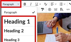
Use Proper Headings in Pages & Assessment Instructions
Headings help organize content and allow screen reader users to navigate pages more efficiently. Proper heading structure supports WCAG 2.1 Success Criterion 1.3.1 (Info and Relationships).
Important: Use Brightspace’s built-in heading styles found under the Format dropdown in the text editor.
Avoid manually creating headings using:
- Bold text
- Enlarged font sizes
- Underlined text
Best Practices:
- Each page should have a heading structure
- Use logical order
- Heading 1: Page title
- Heading 2: Major sections
- Heading 3: Subsections
- Heading 4: Sub-subsections (if needed)
- Use only one Heading 1 per page
- Avoid skipping heading levels (example Heading 2 → Heading 4)
Clear heading structure improves readability, organization, and accessibility.
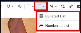
Use Proper Lists
Built-in lists improve readability and help screen readers identify related items and sequences correctly. Proper lists support: WCAG 2.1 Success Criterion 1.3.1 (Info and Relationships).
Important: Use Brightspace’s built-in list tools found under the Lists dropdown in the text editor.
Avoid manually creating lists using:
-
- Hyphens (-)
- Asterisks (*)
- Typed numbers (1, 2, 3)
Best practices:
- Use Bullet Lists for related items
- Use Numbered Lists for steps or sequences
- Keep list items concise when possible
- Maintain parallel structure within lists
- Use lists only for related content
- Avoid using lists for visual spacing or layout
Proper list formatting improves readability and navigation across devices and assistive technologies.
Readable content helps students find, understand, and engage with course materials more effectively.
Improve Readability By:
- Breaking long text into shorter paragraphs.
- Adding white space between sections.
- Use left-aligned text for instructional content
- Maintain consistent alignment throughout the course
- Using clear, direct language.
- Placing important instructions on separate lines.
Avoid:
- Large blocks of text.
- Dense instructions.
- Centered or justified paragraphs.
- Excessive use of bold, italics, or color for emphasis.
- Avoid large blocks of ALL CAPS, bold, or italicized text
- Unexplained abbreviations or jargon.
Quick Check: Can students quickly scan the page and identify key information and instructions?
Clear and consistent formatting helps students read and navigate course content more easily across devices and technologies.
Use Readable Font Styles
Simple, familiar fonts are generally easier to read and process.
Best practices include:
- Use standard sans-serif fonts when possible (Lato is set as default in Brightspace)
- Maintain consistent font styles throughout the course
- Avoid decorative or cursive fonts in instructional materials
- Limit excessive font variations
Consistent font styles help reduce visual clutter and improve readability.
Use Readable Font Sizes
Text should remain readable across devices without requiring excessive zooming.
Best practices include:
- Use Brightspace’s default paragraph size
- Avoid manually shrinking text
- Maintain consistent sizing across pages and instructions
Students should be able to resize text up to 200% without loss of readability or functionality.
Quick Check: Is the text easy to read, consistently formatted, and readable without zooming?
Color can help organize content and draw attention to important information, but it should never be the only way information is communicated.
Identify potential color issues, such as:
- Instructions that say “items in red are required”
- Color-coded deadlines with no written clarification
- Light gray or pastel text on a white background
Ensure color is not the only way meaning is conveyed
If color is used to emphasize or categorize information:
- Add clear labels such as “Required,” “Important,” or “Deadline”
- Pair color with icons, or headings
- Provide written descriptions instead of relying on color cues alone
Quick Check: Can students understand the information if color is removed?
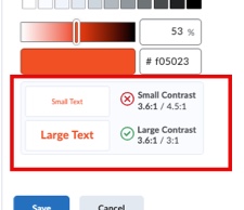
Ensure sufficient color contrast
Text must be easily readable against its background.
Brightspace Tip: When applying text colors in the Brightspace Editor, a contrast indicator will alert you if the selected colors do not meet accessibility standards.
- Use dark text on a light background (or light text on a dark background)
- Avoid light gray, pastel, neon, or overly bright colors for body text
- Confirm content remains readable if printed in grayscale
- Avoid placing text over busy images or patterned backgrounds
Low contrast can make content difficult to read for students with low vision, color blindness, or those viewing content on mobile devices.
Avoid:
- Using red and green together to indicate differences
- Highlighting large blocks of text
- Using color to simulate headings instead of applying heading styles
- Decorative color that reduces readability
Descriptive links help students understand where a link will take them before selecting it. This is especially important for students using screen readers.
Do:
- Use link text that describes the destination or purpose.
Good Examples:
Avoid:
- Click Here
- Read This
- More Information
- Posting raw URLs in course content
Quick Check: Can students understand where the link goes without reading the surrounding text?
Name Files Clearly in Brightspace
File names should be descriptive and consistent.
Avoid generic titles such as:
- syllabus.pdf
- final.docx
- scan123.pdf
- document(1).pdf
Instead, use clear naming conventions:
- Fall2026_BIOL1301_Syllabus.pdf
- Module2_CaseStudyInstructions.pdf
- Week4_LabReportTemplate.docx
Descriptive file names help students quickly locate materials, reduce confusion when downloading files, support assistive technology navigation, and prevent version-control issues.
All meaningful images must include concise alternative (alt) text describing the content or purpose of the image. Decorative images should be marked as decorative.
Keep in Mind
- Describe the purpose of the image, not just what it looks like.
- Keep alt text concise (generally 1–2 sentences).
- Avoid phrases such as “image of” or “picture of” unless necessary for context.
- If the image contains text, include the essential text in the alt description.
- Mark purely decorative images as decorative (leave alt text blank if the system allows).
- For complex images (charts, graphs, diagrams), provide a brief alt description and include a more detailed explanation in the surrounding text.
In Brightspace,
- Edit page where image is located
- Select the image
- Then select Image Options icon
- Provide Alternative Text
- If decorative, check Decorative Image
- Otherwise provide alt text in Alternative Description text box provided
- Then press Save
Effective alt text ensures students using screen readers receive the same meaningful information as sighted learners.
Proper table structure allows screen readers to correctly interpret relationships between rows and columns.
What to consider with tables
- Use tables only for data, not layout.
- Identify header cells (either row or column or both, clear column headings, and a table caption.
- Avoid merged cells and overly complex layouts.
Add proper table headers
Header cells help screen readers identify relationships between rows and columns, making tables easier to navigate and understand.
- Edit the page continuing the table.
- Select the cell(s) that should serve as headers.
- From the text editor menu, select Table → Cell → Cell Properties.
- Under Cell Type, select Header Cell.
- Under Scope:
- Select Column Group when top row is headings.
- Select Row Group when first column is headings.
- Save changes to page.
Avoid:
- Leaving cells blank
- Using bold text instead of proper header formatting
- merging or splitting cells
Add a table caption or context
A table caption provides context and helps learners understand the purpose of the table before navigating its contents.
In Brightspace
- Select the table.
- Choose Table Properties icon and check Show caption, then click Save
- Within page, then enter caption in field box provided.
- Save changes to page.
Example: Table 1. Assignment Grading Breakdown
Accessibility requirements apply not only to Brightspace pages, but also to documents uploaded into your course. Word documents, PowerPoint presentations, PDFs, syllabi, rubrics, and instructional handouts should follow accessibility best practices and align with WCAG 2.1 principles.
Review Documents Used in Your Course
Review course modules and content areas for uploaded materials such as:
- Word documents
- PowerPoint presentations
- PDFs
- Syllabi
- Rubrics
- Instruction sheets
If a document contains text, images, tables, links, or color formatting, it should be reviewed for accessibility.
Use Built-In Accessibility Checkers
Microsoft Office and Adobe Acrobat include built-in accessibility checkers that can help identify common accessibility issues.
In Microsoft Word or PowerPoint:
- Review → Check Accessibility
In Adobe Acrobat:
- Tools → Prepare for Accessibility → Check for Accessibility
These tools can help identify issues related to headings, alternative text, reading order, tables, color contrast, and document structure.
Conduct Manual Reviews
Automated checkers cannot identify every accessibility issue. Manual review is also important to ensure documents are clear, readable, and usable.
When reviewing documents, check for:
- Proper heading structure
- Meaningful link descriptions
- Accurate alternative text for images
- Logical reading order
- Accessible tables
- Sufficient color contrast
- Readable font styles and sizes
- Captioned multimedia when applicable
For PDFs, confirm text is selectable and not image-only scanned content.
Resources
Visit the Creating Content section for step-by-step guidance on improving the accessibility of Word documents, PowerPoint presentations, and PDFs.
Consistently reviewing uploaded documents helps improve readability, usability, and access to course materials across devices and assistive technologies.
All prerecorded instructional videos must include accurate captions. Captions benefit:
- Deaf or hard-of-hearing students
- English language learners
- Students studying in noisy or quiet environments
Keep in Mind
- Auto-generated captions must be reviewed for accuracy.
- Captions must be time-synchronized.
- Transcripts alone do not replace captions.
- Ensure key visual information is either narrated during the video or provided through audio description.
- Avoid phrases such as “as you can see here” without describing what students are seeing.
Visit Creating Videos page on left-hand menu to learn how to generate and edit videos in Panopto, Youtube and Brightspace Media Library.
Accurate captions are both a legal requirement and a best practice for inclusive teaching.
Accessibility responsibilities extend beyond Brightspace pages. Faculty must also review external resources linked within the course to ensure they are accessible to all students.
External content may include:
- Journal articles
- PDFs hosted on external sites
- Publisher platforms
- Third-party learning tools
- YouTube or streamed videos
- Websites
- Open Educational Resources (OER)
Even if the content was created by a third party, institutions remain responsible for providing accessible access to required materials.
Identify external content in your course
Review each module and assessment for:
- Hyperlinks to outside websites
- Embedded YouTube videos
- Linked PDFs
- Publisher courseware
- External simulations or tools
Check Website Accessibility
- Use a web accessibility checker such as WebAIM WAVE or SiteImprove Accessibility Browser Extension to determine if the page is accessible.
- If page is not accessible, reach out to provider to make changes. If they can not make changes remove resource and replace with accessible alternative.
Note: These tools do not guarantee full compliance but help identify common barriers.
Review video accessibility
For YouTube or other video platforms:
- Confirm accurate captions are available
- Avoid relying solely on auto-generated captions without review
- Ensure audio content is clearly understandable
- Provide transcripts when possible
If captions are inaccurate or missing, contact owner to make needed modifications. If unable to replace with alternative accessible resource.
Review external PDFs
- Avoid uploading scanned PDFs that are image-only.
If text within the document cannot be highlighted, searched, or copied, it is likely a scanned image and is not accessible to screen readers.
Although Optical Character Recognition (OCR) is available in tools such as Adobe Acrobat, it is not a complete solution. OCR may produce: misspelled words, missing characters, improper punctuation and more throughout the page.
- Run Adobe Acrobats Accessibility checker
- If file allows, fix the issues identified by accessibility checker.
- Confirm PDFs are selectable (not scanned images)
- Ensure documents contain proper headings and tags
- Verify reading order is logical
- If a required external resource is not accessible, replace with accessible alternative
Note: All UTRGV faculty and staff have access to Adobe Acrobat by installing Adobe Creative Cloud.
Proactively reviewing external content reduces compliance risk, prevents barriers before students encounter them, and promotes equitable access. Ensuring third-party materials are accessible strengthens student self-efficacy by removing unnecessary obstacles to learning.
Where Should I Start?
If you're not sure where to begin, you're not alone. Many faculty find it helpful to focus on the materials students use most frequently and make improvements over time.
A suggested starting point:
- Start with courses you are currently teaching
Focus on courses students are actively accessing and using. - Review one module at a time
Working through a single week or module makes the process more manageable than reviewing an entire course at once. - Prioritize high-impact content
Begin with materials students interact with most often, such as:
- Syllabus and course policies
- Assignment instructions
- Course content pages
- Discussions
- Quizzes and assessments
- Videos and multimedia
- Use accessibility tools available in Brightspace
Leverage the Brightspace Accessibility Checker for page content and Ally for uploaded documents and files. - Conduct a manual review
Automated tools are helpful, but they cannot identify every accessibility issue. Review content for readability, meaningful link descriptions, heading structure, alternative text, caption accuracy, organization, and overall usability. - Review videos and multimedia
Verify that captions are accurate and edit auto-generated captions when necessary. - Check external resources
Review linked websites, videos, documents, and third-party tools for accessibility and usability. If accessibility issues are identified, consider providing an alternative resource, or contact the content creator to inquire about accessibility improvements or available accessible versions. - Document your progress
Keep track of updates and improvements as you work through your course. Feel free to use our Brightspace Inventory Log (Excel Worksheet). Accessibility improvements completed today will make future course updates easier.
Accessibility is an ongoing process, and continued progress over time helps improve usability and access for all learners.