

 rotate(10)'/%3E%3Cpath d='M.038.113v.15l.15.088.15-.088v-.15L.188.025l-.15.088Z' stroke='%23c44900' stroke-width='.0375' transform='rotate(10)'/%3E%3C/svg%3E)
Border Business Briefs
Border Business Briefs are a series of publications produced by the Center for Border Economic Studies (CBEST) at The University of Texas Rio Grande Valley (UTRGV). These briefs serve as newsletters that provide insights into economic indicators and forecasts specifically focused on the Rio Grande Valley, South Texas, and North Tamaulipas regions.
Key Features of Border Business Briefs:
- Published by CBEST, a public policy research unit in the Robert C. Vackar College of Business and Entrepreneurship at UTRGV.
- Content includes:
- Economic trends and forecasts
- Trade and industry analysis
- Employment and labor market data
- Regional development insights
- Special issues may focus on long-term trends or specific topics like the impact of NAFTA.
- Recent topics include trade wars and tariff impacts in North America, with analysis from UTRGV faculty.
These briefs are designed to inform policymakers, business leaders, academics, and the broader community about the economic dynamics of the border region, supporting informed decision-making and regional development.
Current Issue
Vol 22, No. 2 - Summer 2026
Growth at the Border: Recent Investment and Job Creation in the Rio Grande Valley
By Francisco Aldape, Maroula Khraiche, Andre V. Mollick, and Jean Baptiste Tondji
We examine, in this brief, the Rio Grande Valley (RGV) as a deeply integrated cross-border economy shaped by manufacturing complementarities with northern Mexico and evolving patterns of investment, employment, and wages. Recent growth has generated substantial job creation, but employment remains concentrated in comparatively low-paying service occupations. At the same time, emerging investments in industry and technology point to gradual economic diversification and the potential expansion of higher-value-added activities in the region.
View PDFPast Issues
Vol 22, No. 1 - Spring 2026
Occupations, Wages and Artificial Intelligence in the Rio Grande Valley
By Maroula Khraiche, Elisa Taveras Pena, and Jean Baptiste Tondji
This brief examines labor market outcomes in the Rio Grande Valley (RGV). Using worker-level data from the American Community Survey (ACS), it first characterizes the distribution of individuals' occupations and their associated wages in the RGV. Then, it integrates occupational skill requirements from the Occupational Information Network (O*NET) to analyze the skill composition of jobs in the RGV and the relationships among these skills. Finally, drawing on measures of occupational-level exposure to artificial intelligence (AI), the brief assesses the extent to which jobs in the RGV are susceptible to AI-related transformation.
Vol 21, No.2 - Fall 2025
Private School Vouchers in Texas: Past experience and future consequences
By Maroula Khraiche, Elisa Taveras Pena, and Jean-Baptiste Tondji
On 3 May 2025, Governor Greg Abbott signed Senate Bill 2 into law, authorizing the establishment of an education savings account program (or a private school voucher program) that will allow Texan families to use at least $1 billion in public taxpayer dollars to fund their children’s private and home-school education (Edison, 2025a). Implementation of the law is expected to start in 2026. In the tug of war between parental choice in education and public education funding, parental choice prevailed. School vouchers are widely studied in economics, and the outcomes of such programs have been documented in several natural experiments. In this brief review, we examine the literature on school vouchers, including the arguments for and against them, as well as the empirical studies that have documented their impact on student outcomes.
Spring 2025 v20, n1
The use (and misuse) of tariffs in North America: A new trade war?
By Maroula Khraiche, Armando Lopez-Velasco, and Jean-Baptiste Tondji
Trade wars may have started. At the time this report was published, the Trump administration had threatened, then paused, a 25 percent tariff on Canadian and Mexican goods. Before the pause, Mexico and Canada were preparing retaliatory tariffs. After the pause, Trump ordered a 25 percent import tax on all steel and aluminum entering the United States to start in March 2025 and announced a plan for tariffs on US trading partners.
In this brief, we document the different perspectives and economic consequences of North American trade wars and beyond.
A Brief History of Trade Deals in North America
In 1964, the US and Canada signed the North American Auto Pact. Subsequently, trade in North America grew rapidly. Much of this growth was in intra-industry trade. Previously, tariff protections set by Canada and the US limited imports and exports, and in large, parallel operations were set up in each country to avoid paying tariffs, one in Canada and another in the US. American firms with Canadian subsidiaries were smaller in scale than their US counterparts and, therefore, were at a disadvantage.
The car industry is characterized by what economists call internal economies of scale. In such industries, as production rises, average costs decrease. This implies that a larger production (which can be realized when firms can sell final goods in both countries) is more cost-effective and, therefore, increases the profits of firms while reducing prices for consumers. Another benefit of allowing firms to increase production levels by accessing more markets is that more firms can participate, increasing the varieties offered to consumers. In this case, countries would both import and export cars (i.e., Intra-Industry Trade), and consumers would gain from more choices and lower prices. This is a textbook example of important gains from trade, e.g., see Krugman and Melitz (2023). The Pact confirmed this result: the number of varieties produced in Canada declined while the level of certain model cars increased. In essence, production was concentrated in fewer plants that produced higher levels. Therefore, American firms imported some models from Canada and increased their exports of others. Another benefit from rising trade was that firm-level productivity was observed. Later, in 1989, the Canada–US Free Trade Agreement expanded to include other manufacturing sectors.
Over time, the North American Free Trade Agreement between the US, Canada, and Mexico (NAFTA) was signed in 1994, and Mexico was included in the free trade zone. Eventually, trade in automotive parts, not just final goods, increased substantially. In 2018, during President Trump’s first term in office, NAFTA was renegotiated as the US-Mexico-Canada Agreement (USMCA). In the new deal, provisions were added to improve labor standards and open the Canadian dairy market, among other adjustments.
During the renegotiation of NAFTA that resulted in the signing of the USMCA, economists calculated the costs of dissolving the free trade agreement in the continent. For instance, Head and Mayer (2019) found that consumers in all three countries would experience up to 1.4 million fewer cars being made in North America. The losses would fall disproportionally on Canada and Mexico. Given the new Trump
administration’s agenda on the US economy, it is likely that the US, Canada, and Mexico will revisit the USMCA trade agreement.
Trump’s Tariff Strategy 2.0
Given the net loss countries typically incur once trade barriers are implemented, it may be puzzling why such trade wars emerge. From an economic perspective, despite their negative effect, many countries use tariffs or taxes on imported goods to protect domestic industries, generate revenue, and address trade imbalances. Beyond economic purposes, political considerations and national security measures might also justify tariffs.
In the particular case of the recent trade wars initiated by the US, three major reasons have been used to justify Trump’s decision to levy tariffs, “the most beautiful word in the dictionary.” First, the US economy has witnessed a great decline in manufacturing jobs over the last 40 years; see, e.g., Dharshini (2025). Mr. Trump argued that jobs that used to exist in the US have migrated to other lower-wage countries like Mexico and China due to globalization and previous trade agreements. Second, Mr. Trump believes that the US is running a large trade deficit. At the same time, other countries, including its North American allies, Canada and Mexico, and those in the European Union, have had a record of significant trade surplus by selling their products to US consumers. By imposing tariffs, he expects that this would establish a level playing field. Leveraging the American economic power, he believes that these protectionist intentions would generate new trade agreements between the US and other countries that may lead to the resurrection of the manufacturing industry and boost the demand for products made in America (Reuters, 2025). The argument is that a tariff policy, mixed with an investment and growth strategy and national security policies, could boost US manufacturing.
Third, the tariffs may be seen as a negotiating tactic. After the announcement of the tariffs (later paused), Mexico and Canada have both acted to address Mr. Donald Trump’s border concerns (Boak, Verza, and Gillies (2025) and Stevis-Gridneff et al. (2025)). Mexico’s President Claudia Sheinbaum agreed to take back thousands of the first wave of migrants deported from the US and send 10,000 members of its National Guard troops to the border to focus on fentanyl smuggling, migrants, and guns. Similarly, Canada offered $1.3 billion Canadian dollars ($900 million) for border security with a package that included drones, helicopters, more border guards, and the creation of a joint task force with the US. Additionally, Prime Minister Justin Trudeau agreed to have a new “fentanyl czar” and list Mexican drug cartels as terrorist organizations.1
However, there are several strong counter-arguments for the motivations listed above for the trade wars. First, the US is still the “world’s largest economy of the world” (Reuters, 2025, n.d). Although the country lost manufacturing jobs that employ many working-class individuals, the American economy has also generated tremendous growth in other sectors, including technology, innovation, automation, outer space, and services, among many others. Additionally, the tariffs imposed on China during the first Trump administration failed to increase the number of jobs in manufacturing, in fact, they continued to decline. Even without a significant change in trade policy, the US is on a higher growth trajectory than other advanced economies. Secondly, economists typically doubt the importance of bilateral trade balance as a barometer of economic health. We discuss this in the following section.
The Irrelevance of Bilateral Trade Balances
As we mentioned in the previous section, the second justification President Trump has floated for using tariffs against Mexico and Canada is to “correct” the US’s bilateral trade deficit with these countries; see, e.g., Wile (2025). However, economists have long recognized that bilateral trade balances are essentially irrelevant, as the following hypothetical example illustrates.
Imagine that a school teacher buys meat from a butcher every month, while the butcher never buys anything from the school teacher. When examining the monthly trade balance between these two economic actors, it turns out that the teacher has a trade deficit every month. But is it a problem for the school teacher to have a permanent trade deficit (or for the butcher to have a permanent trade surplus with this school teacher)? The answer is no because the school teacher still produces something of value (teaching services) for people who need teaching services and who, in turn, are selling goods and services to the butcher. In that sense, having a bilateral non-zero trade balance opens up different avenues for trading and specialization (e.g., the possibility that the butcher buys bread from the baker, who in turn buys teaching services from the school teacher). Similar to the transactions of the teacher with the butcher, bilateral trade balances between countries are essentially irrelevant.
A slightly more informative magnitude would be the net trade position (also known as the “trade balance”) of the school teacher, which means adding all of the bilateral trade positions of this school teacher with any other economic actor. If the school teacher ends up with an aggregate trade surplus, then the school teacher is saving some of his or her income and, as a consequence, accumulating assets that represent future consumption. The school teacher cares about current consumption and the level of saving, but whether it has a very positive trade balance with some actors or a very negative trade balance with other actors is usually irrelevant. The school teacher would not complain to the butcher about the fact that the butcher does not buy teaching services—to the contrary, the school teacher would be happy to obtain meat.
The same analogy applies to countries in that the net trade position (once all of the trade positions with all countries are aggregated) will have a mirror representation with respect to asset accumulation: an aggregate trade surplus represents an economy that is accumulating foreign assets (thus accumulating purchasing power for future consumption from output produced in other countries). In contrast, an aggregate trade deficit represents foreign economies accumulating US assets.
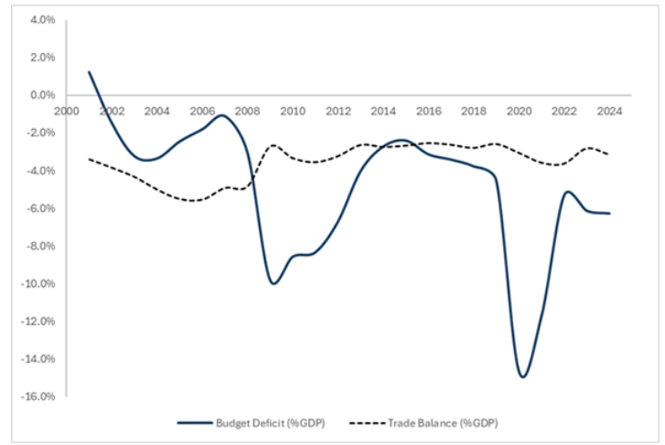
Figure 1 displays the US trade balance since 2001. It has been negative for the whole period and has fluctuated between 2.5 percent (2016) and 5.5 percent of GDP (2005). In 2024 this number was 3.1 percent of GDP, very close to the minimum. While unfair trading practices do happen (e.g., ignoring US property rights by some countries), and these can affect bilateral trade balances, a crucial factor often missing from discussions about the persistent US trade deficit is the low US saving rate relative to the level of US investment. A negative trade balance is necessarily a consequence of national savings being lower than domestic investment.
By definition, national savings is the sum of private and public (government) savings. Governments can run fiscal deficits, meaning that they spend more than they collect in taxes, which leads to the accumulation of public debt. A fiscal deficit is commonly known as the “budget deficit” (budget deficit:
government’s saving is actually negative), which under some circumstances can lead to a trade deficit. This scenario has been referred to as the “twin deficits,” where a government’s budget deficit causes (or is a significant factor in producing) a trade deficit
Figure 1 also illustrates the US budget deficit as a percentage of US GDP since 2001, showing how much the government needs to borrow each year to cover its expenses. Note that 2001 was the last year the US had a fiscal surplus. It is also apparent that in recent years, the budget deficit dwarfs the US trade deficit. A persistent budget deficit can represent a problem because it means that the government is growing its debt as a percentage of GDP (see Figure 2, where US public debt in 2023 is a staggering 123 percent of GDP), which after some point (not clear where is that threshold, which is different for different countries for a host of reasons) might be unsustainable.
Figure 1: The Twin Deficits: The US Budget Deficit and the US Trade Deficit
Sources: Gross Domestic Product [GDP], retrieved from FRED, Federal Reserve Bank of St. Louis; https://fred.stlouisfed.
org/series/GDP, February 12, 2025. Budget Deficit, US Department of Treasury. National deficit data. Retrieved from https:
//fiscaldata.treasury.gov/americas-finance-guide/national-def.: US Census Bureau and US Bureau of Economic Analysis, Trade
Balance: Goods and Services, Balance of Payments Basis [BOPGSTB], retrieved from FRED, Federal Reserve Bank of St. Louis.
Going back to trade, classical economic theory illustrates that negative trade balances in the present will imply positive trade balances in the future. Essentially, trade deficits mean borrowing from the rest of the world, and in periods in which the country repays those claims, it runs a trade surplus. But there is one special circumstance that allows the US to run permanent trade deficits (at least of “moderate” size) and that is not available to other countries. Since the US dollar is used as reserve currency worldwide, when other countries receive dollars in exchange for their goods, instead of buying American goods and services with those assets, they decide to keep those green pieces of paper as a store of value (or to conduct international transactions between foreign countries), so that the US can permanently run a negative trade balance every period.
These are actually good news for Americans in that we obtain real goods and services from the rest of the world in exchange for green pieces of paper (other assets can also be used, but that possibility is available for other countries also; what matters is the possibility of paying for foreign goods and services with an intrinsically worthless asset called a dollar, not backed by gold or anything else). If the citizens and governments of other countries stop using the dollar as a store of value (or use it less than currently), trade surpluses would be more likely for the US. In summary, a trade deficit can result from a budget deficit: too much government spending relative to taxes collected, not because other countries are taking advantage of the US (which can happen in individual cases or industries). Some countries might be engaged in unfair trade practices. But a bilateral trade deficit is not evidence of this; in general, it is an irrelevant figure. The aggregate trade balance of the US can also be negative because of the special place of the dollar in the world monetary system.
Figure 2: US public debt as percentage of GDP
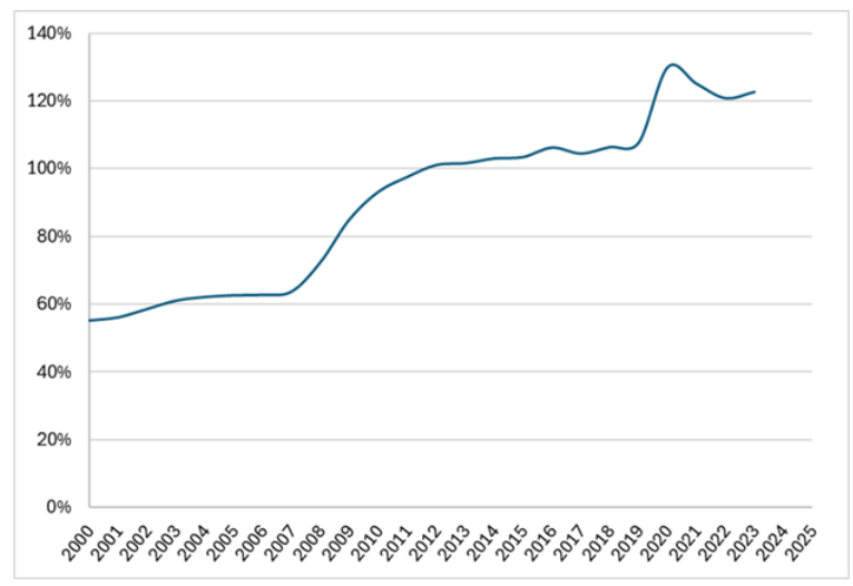
Sources: Gross Domestic Product [GDP], retrieved from FRED, Federal Reserve Bank of St. Louis; https://fred.stlouisfed.org/ series/GDP, February 12, 2025. Total Public Debt, US Department of the Treasury. Fiscal Service, Federal Debt: Total Public Debt [GFDEBTN], retrieved from FRED, Federal Reserve Bank of St. Louis; https://fred.stlouisfed.org/series/GFDEBTN, February 14, 2025
Effects of Tariffs on Product Markets and Consumers
Policymakers typically face two competing issues when enacting a tariff policy. On the one hand, it may stimulate import competing industries, boosting domestic supply, and generating new jobs. On the other hand, tariffs can yield an increase in prices (and inefficiency as domestic firms protected by tariffs spend resources on rent seeking to keep tariffs in place rather than improve productivity). So, the net effect of the tariff policy depends on the size of each dimension. However, typically, trade liberalization in countries, when accompanied by reform policies, tends to be accompanied by economic growth, a decrease in the price of goods, and improved productivity in the exporting sector. Additionally, there is a consensus that imposing a tariff policy on a specific product leads to higher prices for this product and other related goods and services. It is worth noting that the time horizon also matters in assessing the effect of higher trade barriers. It is for this reason that President Trump, when announcing his tariff policy, acknowledged that ``there may be a little pain for Americans in the short term.”
As a concrete example, between 1981 and 1984, there was a trade restriction of Japanese automobiles to the US. This policy led to an increase in the price of automobiles for American consumers. With a US-Japan trade agreement in the long run, Japanese manufacturers invested in the US, and nowadays, the US has a vibrant automobile industry. Other scholars, such as Meredith Crowley, Professor of Economics at the University of Cambridge, have suggested that other forms of direct government support may have generated more substantial support for the US industry than trade barrier policies (Dharshini, 2025).
Tariffs act as taxes and, like most government interventions, distort free exchanges between demanders and suppliers of goods and services. The tax burden distribution depends on the price elasticity of consumers and suppliers in the market. While in the short-term, some suppliers may be reluctant to pass the resulting additional cost to consumers, they tend to do it gradually. As Meredith Crowley put it, “Once you realize the tariff is in place permanently, the manufacturer realizes everyone’s going to have to pay it, and they gradually raise their prices” (Dharshini, 2025, n.d). Since tariffs are levied on goods rather than services, and lower-income individuals tend to buy more goods, they bear a heavier tariff incidence. Non-economic rationales for supporting tariffs do not erase the economic costs and potential inflationary effects of tariffs. Whether the primary motive is economic or geopolitical, without well-calibrated tariff policies, the inefficiencies and welfare losses remain.
Effects of Tariffs on Exchange Rates
One final variable that has not yet been discussed is the exchange rate between the US dollar and the Mexican peso and, in general, between the US dollar and any other currency or basket of currencies in the world. An indirect effect of trying to protect US industries (before any retaliation by other countries) is that foreigners find it more difficult to obtain dollars, which are required for paying for American goods and services. In terms of supply and demand for dollars, the supply decreases when tariffs are imposed and this leads to an appreciation of the dollar (the dollar becomes more expensive).
An appreciation of the dollar in itself (in the absence of considering that tariffs make imports more expensive) is good for American consumers as it makes imports cheaper. But it is not good news for American exporters. That is, the exchange rate appreciation induces American goods and services to become more expensive to foreigners, something that tends to increase foreign imports in the US and decrease American exports, arguably the opposite of the intended effects of protecting domestic industries via tariffs. Put differently, generalized tariffs on imports appear to give an advantage to exporters but produce an exchange rate effect that affects them negatively.
While a unilateral increase in tariffs leads to an appreciation, in a trade-war scenario, the ultimate effect on the exchange rate is hard to forecast as it also depends on the response of the other countries and on which countries end up affecting the most in terms of foregone output. What is clear is that the volume of trade decreases, and all consumers and producers in all countries end up paying the tariffs imposed by other countries, and everything becomes more expensive, leading to misallocation of resources and less specialization, thus producing an aggregate decrease in welfare.
Finally, one additional undesirable effect for the US is that a full-blown trade war could induce more countries to organize efforts to replace the dollar with something else (e.g., BRICS), something that is arguably not in the best interest of Americans for reasons specified above.2
Implications of a Trade War on Unauthorized Migration
In 2023, approximately 80 percent of Mexican exports and 78 percent of Canadian exports went to the US. From the US perspective, about 15 percent of total imports came from Mexico and 14 percent from Canada (O’Neil and Huesa, 2025). The sum of exports plus imports as a percentage of GDP is a measure of the degree to which each economy depends on trade. In 2023, Mexico’s total exports were worth $603 Billion (B), while imports were worth $528B. Since Mexico’s GDP was $1,790B, exports plus imports were 63 percent of the value of the Mexican GDP. In the case of Canada, the figures for the same year were respectively $574B, $533B, and $2,140B, for exports plus imports representing 51.7 percent of GDP. In contrast, for the US, these figures are $1.86 Trillions of exports, $3 Trillions of imports, and a GDP of $27.72 Trillions, for exports plus imports representing only 17.5 percent of US GDP.3 These numbers clearly show that Mexico and Canada are more dependent on trade with the US than the US is on trade with those countries.
Economic shocks have effects on immigration flows. There is significant migration from Mexico to the US of both the legal or authorized (family-based and jobs-based) type and illegal or unauthorized type. Unauthorized migration, in particular, is responsive to the business cycle, increasing during US economic booms and decreasing during Mexican booms, driven by several “push” and “pull” factors of immigration.4 A full-blown trade war would harm all involved countries, but it would be particularly damaging to Mexico and Canada due to its significant exposure to the external sector and, more importantly, due to the volume of trade with the US. If the US imposes general tariffs on Mexican imports and other factors remain constant, the incentives to emigrate to the US without authorization would increase. The bigger the gap between US GDP growth and its Mexican counterpart (or the worse the recession in Mexico is), the larger the expected unauthorized migration flows to the US. The Trump administration has already shown that enforcement actions will be used to curb unauthorized immigration. However, within this type of immigration, the overstaying of temporary permits (e.g., tourist visas) has historically been hard to detect as the entry of these foreigners into the US is legal. According to Warren and Kerwin (2017), the percentage of over-stayers within the unauthorized population (as opposed to entries without inspection) increased from 29 percent in 1995 to 66 percent in 2014.
A few tariffs in certain sectors are unlikely to cause significant labor movements if the Mexican economy grows at a rate close to that of the US, especially if the other countries refrain from escalating. However, a full-blown trade war would reduce overall trade and likely deliver a more significant blow to the very open Mexican economy, leading to increased unauthorized migration to the US. These expected effects are inconsistent with the Trump administration’s objectives on unauthorized immigration: keeping unauthorized migration at a low level is incompatible with harming the Mexican economy and other source countries of unauthorized immigration.
Likely Scenarios for The Rio Grande Valley
The Rio Grande Valley (RGV) depends on trade with Mexico, facilitated by the ports of Roma, Brownsville, McAllen, Hidalgo, Progreso, and Rio Grande City. Many local businesses rely on goods from Mexico. Exports from the Maquiladora industry, which assembles goods in Mexico using parts from the US, generate jobs for trucking, warehousing, and logistics companies in the RGV. Several retail stores in the two major metropolitan areas, Brownsville-Harlingen and McAllen-Edinburg-Mission, benefit from Mexican shoppers who live across the Texas border. Increasing tariffs on imports and exports could generate adverse consequences, including manufacturing and supply chain disruption, trade, job losses, and economic slowdown. RGV farmers, who export citrus and other agricultural products to Mexico, could face reduced demand if Mexico imposes retaliatory tariffs. The burden on farmers can be significant if the tariff dispute includes additional costs of seeds, fertilizers, and agricultural equipment. If farmers and retailers can’t pass on extra costs to their customers or receive other support from the government, they will exit the market.
Concluding Remarks
The current US administration has positioned tariffs as a central tool of economic and political leverage. While tariffs can counteract unfair trade practices, their indiscriminate application poses significant economic risks, potentially destabilizing not only the US economy but also key trade partners like Mexico and Canada. These nations, heavily reliant on trade with the US, would face severe economic repercussions under an extensive tariff regime.
Strategically, the threat of tariffs can serve as a bargaining tool to secure concessions on issues such as border security, control of illicit substances (e.g., fentanyl), and deportation agreements. However, broad-based protectionism can lead to unintended consequences, including currency appreciation that undermines US export competitiveness. Additionally, economic strain in Mexico due to restrictive trade policies may exacerbate unauthorized migration, contradicting US immigration objectives.
Economically, addressing trade deficits through tariffs is misguided, as bilateral trade balances are not a primary macroeconomic concern. More pressing is the US budget deficit, which poses a greater risk to financial stability. Furthermore, an all-out trade war could accelerate global efforts to reduce reliance on the US dollar, diminishing American economic influence.
The administration's tariff strategy appears to be more about political leverage than economic confrontation. While targeted tariffs against unfair trade practices—such as intellectual property violations—may be justified, widespread protectionism risks economic instability and geopolitical backlash. Perhaps a measured and strategic approach to tariffs is the most pragmatic course of action.
____
Maroula Khraiche is an Associate Professor of Economics at the University of Texas Rio Grande Valley.
Armando Lopez-Velasco is an Assistant Professor of Economics at the University of Texas Rio Grande Valley.
Jean-Baptiste Tondji is an Associate Professor of Economics at the University of Texas Rio Grande Valley.
Endnotes
- See, e.g., BBC News and BBC Central America on February 3, 2025.
- BRICS is an intergovernmental organization consisting of ten countries—Brazil, Russia, India, China, South Africa, Egypt, Ethiopia, Indonesia, Iran, and the United Arab Emirates.
- Data on exports and imports are available at The Observatory of Economic Complexity at https://oec.world/en. GDP figures available from World Development Indicators, available at https://databank.worldbank.org/.
- Some recent evidence of the response of unauthorized immigration flows to push and pull factors on immigration is found in Lopez-Velasco (2025). Lee (1966) is the author who first describes the “push” and “pull” factors of immigration.
References
- Boak, J., Verza, M. & Gillies, R. (February 4, 2025). What did US get from deals to pause tariffs on Canada and Mexico? Not that much, observers say. [Text file] Associated Press. Retrieved from
- Dharshini, David. (February 10, 2025). The Debate: Do Trump’s tariffs mean the end of the post-war free trade world? [Text file]. BBC News.
- Head, Keith, and Thierry Mayer. (2019). Brands in Motion: How Frictions Shape Multinational Production.American Economic Review, 109 (9): 3073–3124.
- Lee, E. (1966). A theory of migration. Demography, 3(1), 47–57.
- Lopez-Velasco, A.R. (2025) On the design of an optimal immigration policy. Economic Inquiry, 63(1), 47–97.
- Wile, Rob. (February 6, 2025). Trump detests the US trade deficit. Here’s what it means. [Text file]. NBC News.
- O’Neil, S. K., & Huesa, J. (February 5, 2025). What Trump’s Trade War Would Mean, in Nine Charts. Council on Foreign Relations.
- Reuters (January 23, 2025). LIVE: WTO Director-General Ngozi Okonjo-Iweala discusses tariffs at Davos.[Video file].
- Stevis-Gridneff, M., Swanson, A., & Romero, S. (February 3, 2025). How Could Trump’s Tariffs Affect the US, Canada, and Mexico? [Text file]. New York Times.
- Warren, R., & Kerwin, D. (2017). The 2,000 Mile Wall in Search of a Purpose: Since 2007, Visa Overstays have Outnumbered Undocumented Border Crossers by a Half Million. Journal on Migration and Human Security, 5(1), 124-136.Migration and Human Security, 5(1), 124-136.
Fall 2023 v19, n1
A snapshot of Immigration Flows into the US
Armando R. Lopez-Velasco
The US is a rich country to which many people from developing countries would like to migrate to. The opportunities to migrate are restricted to people who fall into certain categories: relatives of US citizens (with priority given to immediate relatives of American citizens but there are permits to other relatives under “family-sponsored” preferences like siblings of American citizens), workers with certain skills (mostly classified as high-skilled), permits for refugees and asylees; and finally there is a “diversity” lottery where people from countries with low rates of immigration to the US can apply.
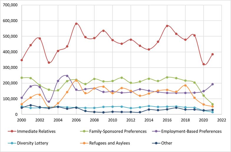
The number of permanent resident permits given in the US for the period 2000-2021 are shown in figure 1. For the years 2000-2019, which do not include the last 2 years as they can be atypical due to the pandemic, approximately 65% of all the permanent residence permits were allocated towards family-based immigration, which represents an average of about 680,000 permits per year. Skill-based categories represent about 154,000 permits per year (almost 15%), refugees and asylees were given an average of 135,000 permits (almost 13%) while about 47,000 (4.5%) permits were allocated to the diversity lottery. Finally, about 3% were given for other categories.
Fall 2023 v19, n1 (ACCORDIAN menu starts here)
Figure 1. Permanent resident permits given by type of immigrant (2000 – 2021)
Source: Department of Homeland Security, Yearbook of Immigration Statistics. Various years. Available at: https://www.dhs.gov/immigration-statistics/yearbook
For people that do not have close relatives which are US citizens nor qualify for having special skills that would allow them to migrate to the US (e.g. a Ph.D. from an American University), there does not exist a mechanism that would allow them to come to the US to work legally either in a temporary or permanent way. For those individuals, the only way to come and work in the US is via unauthorized immigration, either in the form of crossing the border illegally (mostly through the Mexican border) and which is a very risky proposition that often involves paying large sums to human smugglers better known as “coyotes” as well as a very dangerous journey, or in the case of having a temporary visiting permit (i.e. a tourist-visa) by violating the terms of their stay (typically overstaying in order to work).
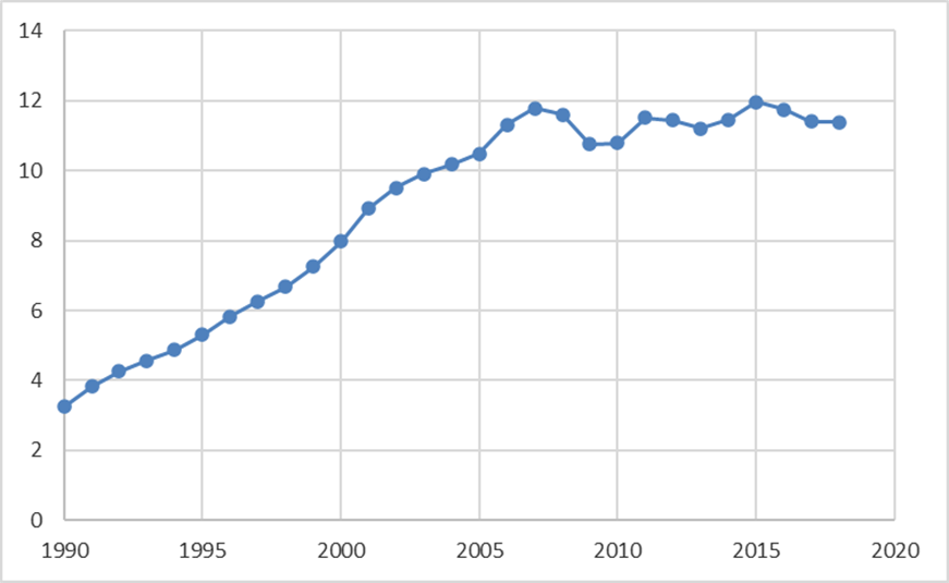
Figure 2 displays the stock of unauthorized immigrants for the period 1990-2018. This number starts at about 3 millions in 1990, and reaches a maximum of 12 millions in 2007 and 2015, with a decrease in 2008-2010 due to the effects of the housing crisis which dried up the demand for many jobs which unauthorized immigrants tend to occupy (e.g. construction workers) as well as the effects of the economic downturn. These numbers are in the aftermath of the legalization (amnesty) of 2.7 millions of unauthorized immigrants under the Immigration Reform and Control Act (IRCA) passed in 1986. IRCA also devoted more resources for border enforcement in an attempt to control future unauthorized immigration.
Figure 2. Unauthorized immigrants residing in the US, years 1990-2018 (Millions)
Source: Department of Homeland Security at https://www.dhs.gov/immigration-statistics/population-estimates/unauthorized-resident from 2005 to 2018. Years 1990 to 2004 inferred from growth rates constructed from estimates of the unauthorized population residing in the US by Warren and Warren (2013).
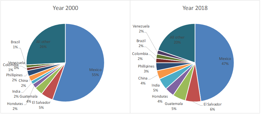
With regards to whom specifically are these unauthorized immigrants, figure 3 shows two snapshots of their country of origin for years 2000 and 2018. Mexican citizens represent the largest share, but such number has (steadily) decreased from 55% in 2000 to 47% in 2018. Central American countries have seen their shares increased over the same period: El Salvador from 5% to 6.4%, Guatemala from 3.4% to 5.4% and Honduras from 2% to 4%. At the same time, there are other countries who used to represent a small share of unauthorized immigrants but who now make a significant amount: China, India and Philippines accounted for about 6% of the total stock of unauthorized immigrants in 2000 but accounted for almost 12% in 2018 (most of their citizens via overstaying their visas rather than crossing the border without a visa). Similarly, Venezuela, Colombia and Brazil used to represent about 2% in 2000 but represent slightly more than 5% in 2018.
Figure 3. Origin of Unauthorized population residing in the US, 2000 and 2018
Source: Department of Homeland Security, Estimates of the Unauthorized Immigrant Population Residing in the United States available at https://www.dhs.gov/immigration-statistics/population-estimates/unauthorized-resident
Flows of unauthorized immigrants respond to “pull” (from the host economy) and “push” (from their country of origin) factors, as well as to the level of enforcement in the host country (see for example Orrenius and Zavodny (2013) and the references therein). High growth and low unemployment in the host economy are factors that tend to attract immigrants, while low growth in the sending economies, high unemployment and political instability in the sending economies are factors that tend to increase the supply of immigrants, everything else constant. For these reasons, the flow of unauthorized immigration is to be thought of as “equilibrium” migration flows which adjust in response to these forces.
In the case of family-based migration flows, since the US laws are such that there is no limit to who can come in the form of immediate relatives (parents, natives and children of American citizens), it implies that they are also equilibrium migration flows. Skill-based immigrants may or may not be an equilibrium flow in the sense that there is a limit in the number of high-skilled immigrants that can come to the US in a given year and that number is typically exhausted every year (thus the short side of the market would determine skill-based immigrants flows), while the case of refugees is a category that the US decides for diplomatic reasons in response to conflicts and international crisis/disasters.
Figure 4. Border Patrol Budget as % of GDP
Source: US GDP: World Development Indicators, series NY.GDP.MKTP.CD at https://databank.worldbank.org/source/world-development-indicators#. Data on Budget of the Border Patrol from American Immigration Council, available at https://www.americanimmigrationcouncil.org/research/the-cost-of-immigration-enforcement-and-border-security.
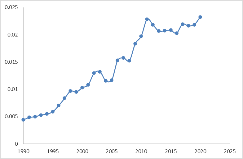
Figure 4 illustrates that expenditure in enforcement, as captured by the US Border Patrol budget for the period 1990-2021, has been steadily increasing from almost .005% of GDP in 1990 to almost .023% of GDP in 2021. Yet unauthorized immigration kept increasing for much of this period until the housing crisis hit in 2008. Precisely because unauthorized migration responds to different forces, for all practical purposes bringing unauthorized immigration to 0 is impossible to achieve as there are real costs of enforcing the border and there are other variables that enter the decision whether to migrate or not in an unauthorized way, in addition to moral issues and diplomatic relations.
A possible amnesty for unauthorized immigrants has cost and benefits that are hard to quantify. Among the benefits, one can expect higher rates of income taxes paid by immigrants (though many do pay income taxes via an ITIN number[1]) from having a legal status; better allocation of talent as currently those immigrants tend to concentrate in certain industries for which a job doesn't require a social security number (e.g. construction workers, gardeners, domestic workers, etc.) as opposed to working in the sector where their productivity is highest and which would also lead to higher tax revenue; and there's also the human benefit that there are many families in the US where some of the members have legal status but some others do not. On the cost side, unauthorized immigrants do not qualify for most government transfers and so any amnesty would likely impact those costs. Similarly, unauthorized immigrants currently do not have social security benefits (even though some of them do pay social security taxes by means of an ITIN number) which could change under a possible amnesty. Also, as Orrenius and Zavodny (2013) have argued, IRCA lead to more legal immigration since the current system favors family-reunification. So, after gaining legal status, many of the legalized immigrants through IRCA were able to petition for their relatives once they became US citizens. Another point of contention is the right to vote that immigrants might obtain if they choose to become citizens (typically after having at least 5 years of permanent residence). Finally, there's an expectation channel where a current amnesty could lead to an expectation of a future amnesty as this arguably happened with IRCA, and hence in the absence of other enforcement measures and some form of temporary/guest worker program (discussed later), continued unauthorized immigration could be the result. Hence the political hot-potato that is any possible amnesty.
Arrest Data
Arrest data offers an interesting snapshot of who comes to the US in an unauthorized way. Figure 5 shows the number of arrests by the border patrol along the Mexican border, starting in 2008 as available from the Transactional Records Access Clearinghouse (TRAC) at Syracuse University. Starting in 2008, these numbers stayed below 500,000 arrests per year until 2019 which saw 860,000 arrests, then decreased during 2020 when countries closed borders and much of the economic activity was restricted during the early stages of the COVID pandemic. Finally, 2021 and 2022 have seen these numbers skyrocket to 1.65 and 2.2 million arrests respectively.[2]
The border Patrol divides the border with Mexico into 9 sectors. Five of these are located in Texas, which are Rio Grande Valley (RGV), Laredo, Del Rio, Big Bend and El Paso sectors. The other sectors covering the border with Mexico are Tucson, Yuma, El Centro and San Diego. Figure 5 also shows how many of the annual arrests took place in the RGV Sector.
From 2008 to 2011 The RGV sector had between 10 and 20% of all the arrests in the Mexican border. Starting in 2012 the RGV has become the sector with the most arrests, suggesting that there are more attempts to cross through this sector. Indeed, more than 52% of all the arrests during 2014 took place in the RGV. More recently, in 2021 the RGV share of arrests was 33%, which corresponds to about 549,000 arrests in 2021.[3]
Figure 5. Border patrol arrests in the Mexican border (1000’s)
Source: Transactional Records Access Clearinghouse (TRAC) at Syracuse University, available at https://trac.syr.edu/phptools/immigration/cbparrest/ . Total arrests for year 2022 available at https://www.cbp.gov/newsroom/stats/cbp-enforcement-statistics . Number of arrests at Rio Grande Valley sector for year 2022 are a projection from the observed numbers from TRAC for 2022 arrest numbers until July of 2022.
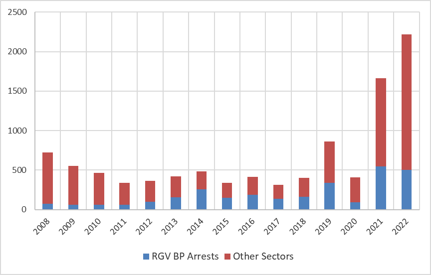
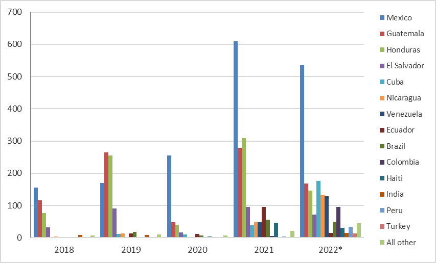
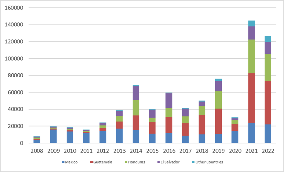
Figure 6 shows the countries of origin of the people most recently arrested by Border Patrol Officers, starting in 2018. In previous years, most of these unauthorized immigrants used to come from Mexico, Guatemala, Honduras and El Salvador. Starting in 2021, a significant share of those arrests corresponds to individuals from other countries. In particular, other Central and South American countries including Cuba, Nicaragua, Venezuela, Ecuador, Brazil, Colombia, Haiti and Peru represented less than 2% of the arrests in 2018 when combined (and also in previous years, not shown), but lately those countries represent 20% of the arrests in 2021 and 40% of the arrests in 2022 (with data until July of 2022). There are also distant countries that historically were not represented among the arrested at the southern border, including people from India (14,826 arrests from January to July of 2022), Turkey (12,562), Romania (5,455), Georgia (4,728), Russia (3,987), Uzbekistan (2,755), Senegal (2,237), Bangladesh (1,790), Ghana (1,751), Angola (1,455) and China (1,244), among many others.
At this level of generality and without more data it is impossible to disentangle the specific reasons for why the recent increase in arrests and which presumably implies both a higher number of people arrested (as there is a possibility of attempting to cross multiple times) and a larger pool of people attempting to cross in an unauthorized way (some of which are successful and of course do not get counted in arrest data), but a few reasons are easy to identify. First, the pandemic affected countries in unexpected and asymmetric ways (not all sectors were equally affected) and thus lack of opportunities in the sending countries might have precipitated at least some of this increase. Second, the timing is also consistent with the change of administration in the US. There might be a perception by immigrants that the Biden administration might be less inclined to expel immigrants as compared to the Trump administration (though the Biden administration kept using title 42 to quickly expel immigrants attempting to obtain asylum in the US until May 11th of 2023).[4] The evidence from both old countries and the newer countries comprising a significant number of arrests at the southern border also suggest either an expectations channel, or perhaps diffusion of know-how about how foreigners can come through Mexico in order to attempt to cross into the US.
Figure 6. CBP arrest data by country of origin 2018 -2022* (Thousands)
Source: Transactional Records Access Clearinghouse at Syracuse University, available at https://trac.syr.edu/phptools/immigration/cbparrest/ . Data for 2022 until end of July.
Finally, title 42 which started in March of 2020, resulted in many people sent to Mexico during the pandemic, and this in turn created incentives to repeatedly attempting to cross into the US. Hence it is possible that the numbers for 2021 and 2022 are much more inflated than previous years in terms of counting aliens attempting to cross (as opposed to counting number of arrests). It is possible to estimate the number of aliens apprehended from the data on repeated arrests, which yields an estimate of slightly more than 1 million of aliens arrested in 2021, a number still higher than the number of arrests (also overstating aliens arrested but probably less) in any previous year to 2021 and thus the increase in foreigners remains.[5]
Figure 7 shows another recent phenomenon, the rise in the number of unaccompanied children coming to the US. In 2008 the total number of unaccompanied children was slightly above 8000, while in 2021 this number was almost 145,000. During the period discussed, more than 95% of them came from Mexico, Guatemala, Honduras, and El Salvador and for most of the period there was an upward trend. Recently (2021) the biggest shares came from Guatemala (40%) and Honduras (27%).
But why the increase in unaccompanied children? The situation of the sending economies could help explain some of these flows as the countries in Central America are relatively poor compared to other countries in the American continent, with a high poverty rate and violence. Then there is also incentives. In 2008 the US passed the William Wilberforce Trafficking Victims Reauthorization Act of 2008, which among other things created specific legal protections for minors traveling alone and which can produce a tension between the objectives of protecting the children from trafficking and the improved incentives for minor migrants to come unaccompanied precisely because of the better protection and possibility of staying at the US while their case is resolved.
Figure 7. Unaccompanied Children Arrested at Border by Origin
Source: Transactional Records Access Clearinghouse at Syracuse University, available at https://trac.syr.edu/phptools/immigration/cbparrest/ . Data for 2022 until end of July.
Since 2012, the majority of unaccompanied children have been arrested at the border through the RGV sector. For example, in 2021 in the RGV sector there were 76,284 arrests out of 144,873 minors arrested (almost 53%).
Often, minors turn themselves at the border to be arrested, as they are typically held in detention, and finally released to some family member in the US or to some sponsor after some days (perhaps months when detention centers are full). Of the minors which have been apprehended from 2014 to 2019, only 4% have been expelled (Hesson and Rosenberg (2021)). In addition, under title 42 (discussed below) during the pandemic minors could be expelled if traveling with their families, but not necessarily if they were traveling alone and which reinforces the incentive to split at the border -assuming they have someone on the US waiting for them. Finally, these numbers cannot show how many minors are abused, exploited and even die during the journey from other countries as only those that arrive and are arrested are counted.
Concluding Remarks
There are different types of immigrants and many different programs in the US that regulate immigration (directly in the case of legal immigration and indirectly via enforcement in the case of unauthorized immigration). This note attempts to present the state of immigration flows to the US and discusses some of the immigration challenges. Due to the complexity of the topic and in order to keep the discussion short, the note does not attempt to discuss comprehensive immigration reform.[6]
With respect to unauthorized immigration, addressing push factors (violence, lack of opportunities, poverty, etc.) is clearly important but it is something that depends heavily on the institutions and quality of the government of the sending countries. What a host economy like the US can control is the level of legal migration allowed into the country as well as the type and level of enforcement. An enforcement-only approach is unlikely to control unauthorized flows and is also likely to impose high human costs. There is possibly a better solution that could represent a win-win situation for the US and to many would-be unauthorized immigrants: the possibility of a guest or temporary worker program.
There are some advantages of a guest worker program when the alternative is unauthorized immigration[7]: it would allow for a way to come and work for a category of people that currently have no legal way of coming to the US. The stay is temporary as opposed to permanent as the current system ends up inducing unauthorized migration with a long stay (see Orrenius and Zavodny (2013)) due to the high costs of crossing.[8] Since by definition a guest worker program allows people only temporary in US soil, in a decade there could be a larger number of people who would benefit from working in the US temporarily as opposed to the same stock of people over many years under unauthorized immigration. Then those temporary workers would return to their home economies with some capital. Also, for national security issues, a guest worker program would be preferred over unauthorized immigration. Finally, other countries that are traveled during the journey to the US (e.g. Mexico) would also benefit from the existence of such program as many of the immigrants that are rejected in the US might end up in Mexican cities.
Some of the big winners of the status-quo are the criminal groups which charge significant amounts of money in attempts to smuggle people into the US or who kidnap or exploit foreigners while in transit to the border. Because of that, many potential immigrants would prefer to apply for a legal temporary worker permit, thus leading to some tax revenue (cost of the permit) plus some savings as compared to an enforcement-only framework in that the pool of potential unauthorized immigrants would be theoretically lower. Finally, the journey to come to the US would not be as dangerous as it is right now.
____
Armando R. Lopez-Velasco is an Assistant Professor of Economics at The University of Texas Rio Grande Valley.
Endnotes
- American Immigration Council, “How the United States Immigration System Works”, retrieved on 5/26/23. Available at https://www.americanimmigrationcouncil.org/research/how-united-states-immigration-system-works
- Kerr, Sari Pekkala & William R. Kerr (2011), “Economic Impacts of Immigration: A Survey”. NBER Working paper 16736, National Bureau of Economic Research Inc.
- Lopez-Velasco, Armando R. (2022), “On the Design of an Optimal Immigration Policy”. Available at SSRN: https://ssrn.com/abstract=4047652 or http://dx.doi.org/10.2139/ssrn.4047652
- Orrenius, Pia M. and Zavodny, Madeline (2012). "The Economic Consequences of Amnesty for Unauthorized Immigrants," Cato Journal, Cato Institute, vol. 32(1), pages 85-106, Winter.
- Transactional Records Access Clearinghouse at Syracuse University, available at https://trac.syr.edu/phptools/immigration/cbparrest/
- United States. Department of Homeland Security (2021). Yearbook of Immigration Statistics. Washington, D.C,: U.S. Department of Homeland Security, Office of Immigration Statistics, 2022.
Footnotes
[1] A social security number is needed in order to work in the US. In absence of it, immigrants can request an Individual Tax Identification Number (ITIN) for tax purposes.
[2] Number of arrests is not the same as numbers of aliens apprehended since some of them can do multiple tries in a calendar year if deported to Mexico. Still, when seen as a proxy, the number of arrests are indicative of a bigger pool of people trying to enter the US in an unauthorized way.
[3] In the months of January to July of 2022 there were 374,645 arrests in the RGV sector. The RGV share of total arrests up to that point in time was 22%.
[4] Title 42 was a law passed in 1944 which had never been used before and which gave authorities the power to expel people at the border in case of contagious disease, in this case used for the Covid pandemic. Hence even if some of those potential immigrants were claiming asylum, the US could quickly expel them at the border and not process those applications. In some cases, this resulted in quickly deporting them to their home countries, and in some other cases leaving them in Mexico. Eventually the Biden administration stopped applying title 42 to minors (January of 2021) as the CDC issued an order that title 42 was not to be applied to minor immigrants.
[5] Using TRAC data it is possible to estimate the number of aliens from statistics on the frequency of observations with specific number of arrests. In 2021 the estimated number of aliens is 1,040,695.
[6] For an analysis of what constitutes an optimal immigration policy and how different forces shape the demand for the different immigration flows, please see Lopez-Velasco (2022).
[7] The possible wage effects of immigration are ignored in this discussion since the alternative to a guest worker program is unauthorized immigration (as opposed to zero unauthorized immigration) and thus for a same pool of workers under each regime, the wage effects would be approximately the same under each scenario. Whether immigration affects wages of natives is an empirical question where the results are essentially mixed. See for example, the survey in Kerr and Kerr (2011).
[8] Orrenius and Zavodny (2013) argue that previous to the events of September 11 of 2001, unauthorized immigrants from Mexico would come to the US and work for a season, then go back home. After these events, an emphasis on national security at the border made crossing a more expensive and complicated endeavor. Since crossing back and forth became unfeasible, duration of the stay became much longer (mostly permanent).
Fall 2022 v18, n2
Taming Inflation: The Tradeoffs of Monetary Tightening
Maroula Khraiche and Andre Mollick
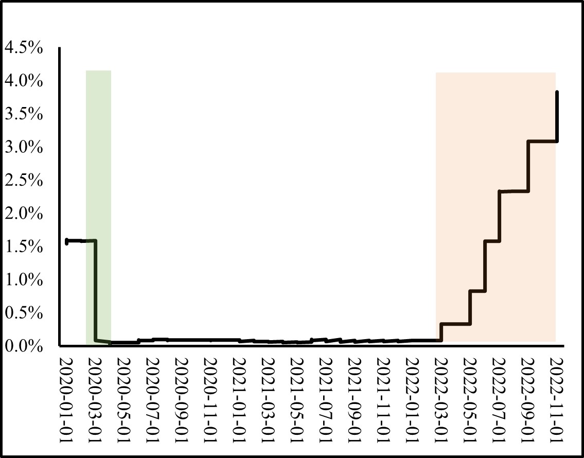
In the summer of 2022, consumers experienced the highest inflation rates in decades. In June of 2022, the Consumer Price Index (CPI), rose 1.3% compared to May, which implied a 9.1% increase over the past 12 months. The CPI is a measure of the average change over time in the prices paid by consumers for a basket of goods, therefore, changes in the CPI pin down inflation faced by consumers. In more welcome news released on December 12th, 2022, the U.S. Bureau of Labor Statistics (BLS) reported that the CPI rose only by 0.1% in November compared to the previous month. This implies that over the last 12 months, inflation was 7.1% . Nonetheless, this level of inflation is still higher than the 2% historically targeted by central banks. If fact, economists view such a high inflation rate as destabilizing. Panel (a) in Figure 1 depicts the fall and then sharp increase in the growth rate of the CPI (i.e., inflation) since the beginning of the pandemic until November of this year.
Another worrying sign is that inflation has exhibited a persistent upward trend over the past year. Initially, these inflationary pressures were thought to be transitory resulting from the imbalance between supply and demand created by the pandemic; elevated demand partially driven by extra funds households received from relief packages was met with shortages and supply chain interruptions. Furthermore, Russia’s invasion of Ukraine raised food and energy prices, which raised costs and added to the price pressures. Yet looking at the core inflation rate, which excludes food and energy prices, high and persistent trends in inflation are still detected. Over the past year, core inflation grew about 6.5% in the U.S. pointing to causes other than the rise in energy prices. Panel (b) in Figure 1 shows the increase in core inflation. With the economy still recovering from the pandemic and in hopes that the rise in prices would resolve as supply chain disruptions and pandemic fueled demand for goods dissipated, the Federal Reserve (Fed) was slow to respond, further fueling inflation. What’s causing this persistence in inflation? One explanation is the public’s expectations. Inflation tends to have momentum and as people expect higher prices, higher prices materialize. However, another predictor of future inflation is the growth of money. Money supply rose dramatically over the past two years as the Fed cut interest rates to near zero to stabilize the economy during the pandemic. Panel (a) in Figure 2 shows the steep rise in money supply measured as M2. According to the St. Louis Fed, as of May 2020, M2 consists of M1 plus small-denomination time deposits and balances in retail MMFs and M1 consists of currency, demand deposits at commercial banks and other liquid deposits, consisting of OCDs and savings deposits (including money market deposit accounts).
This report discusses the role policy may have played in fueling inflation and the role it is playing in taming it. Despite the focus on policy in this report, it is worth noting that the extraordinary economic shock of the pandemic has also had an effect on aggregate price and this effect has yet to fully disappear and may be even more important than policy.
Fall 2022 v18, n2
Figure 1: The Consumer Price Index for All Urban Consumers, Annual Percent Change
Green area indicates the Covid recession, orange area indicates the period of monetary tightening. Source: Bureau of Labor Statistics
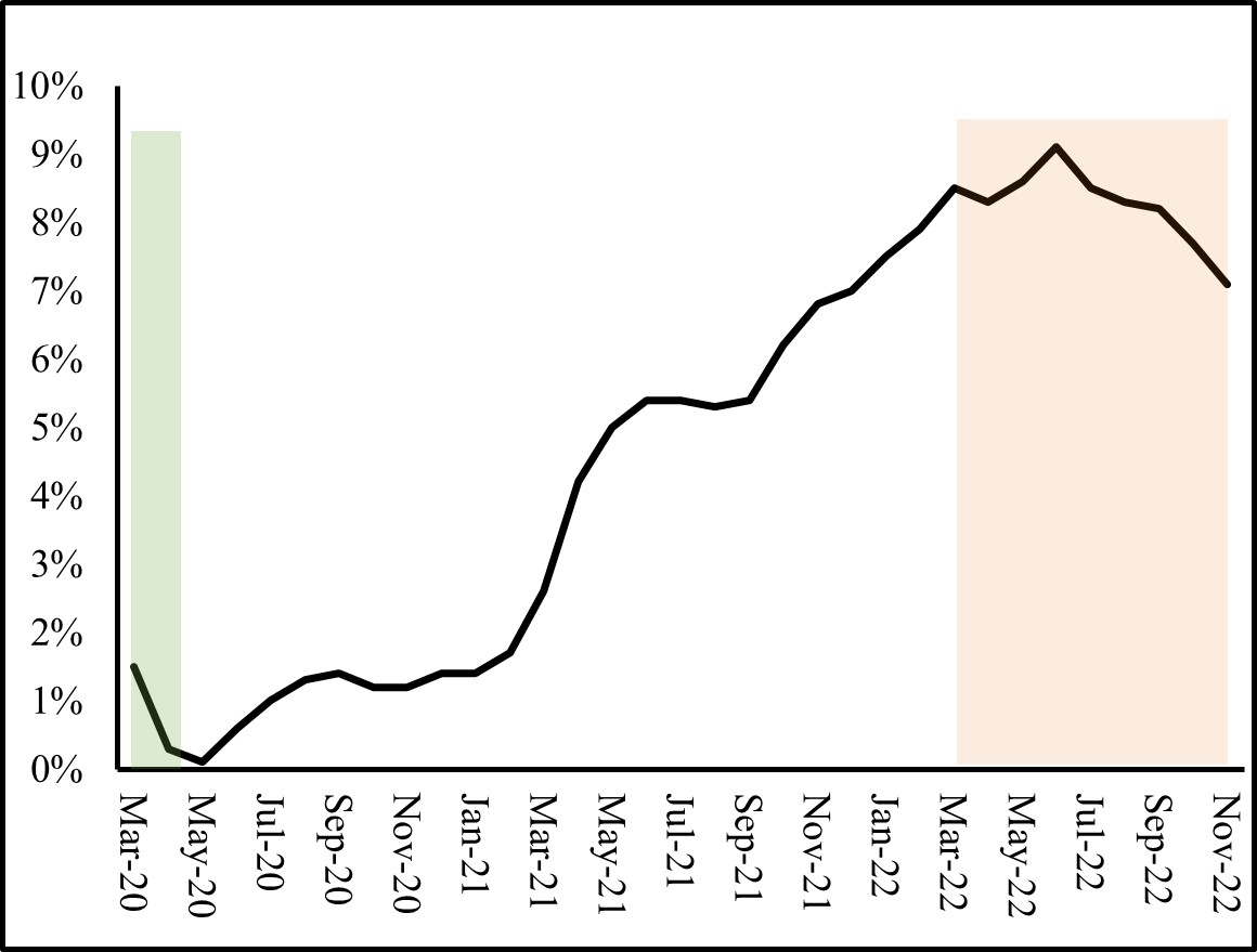
(a) All Items
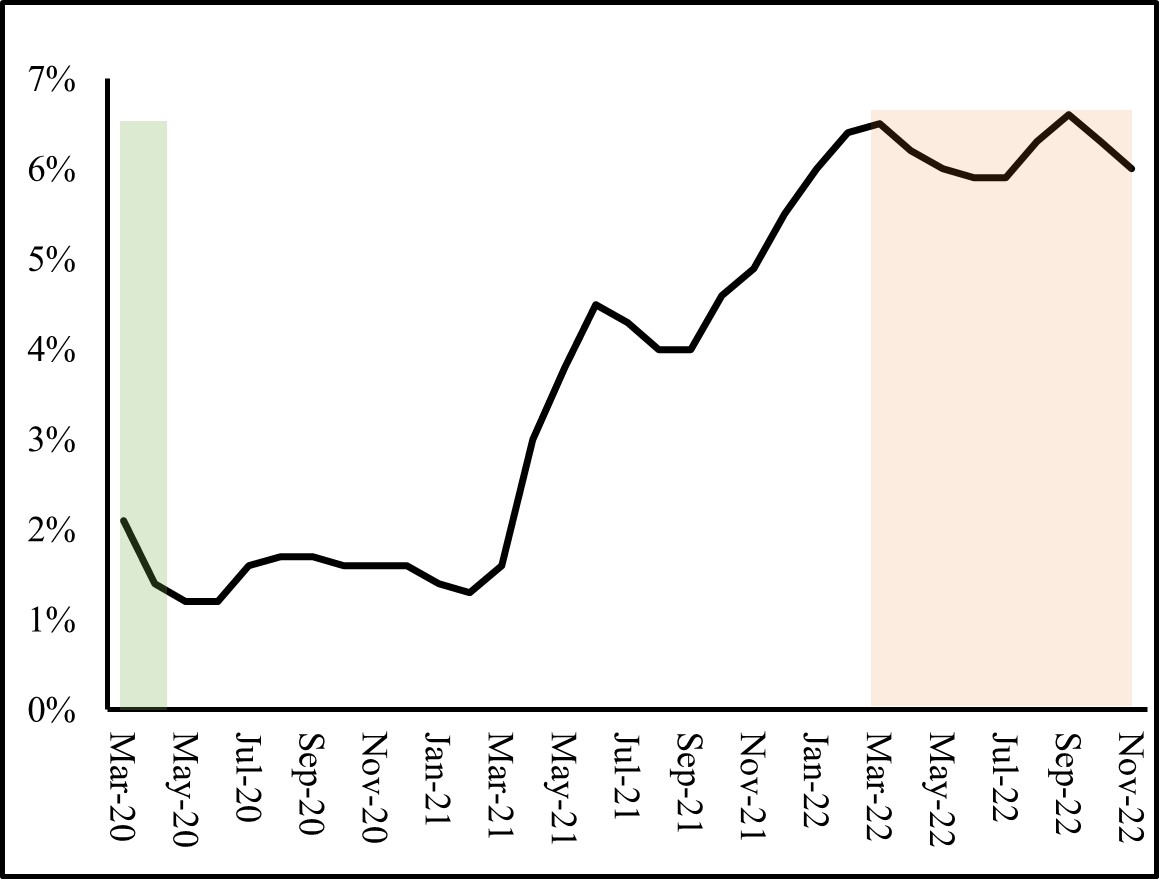
(b) All items less food and energy
Fiscal and Monetary Response
During the pandemic, both fiscal and monetary policy were used extensively to keep the economy afloat during this extraordinary health crisis. Fiscal policy is defined as the use of government revenue and spending in order to influence the economy. During the pandemic, expansionary fiscal policy amounted to $5 Trillion in stimulus and relief packages. The Coronavirus Preparedness and Response Supplemental Appropriations Act which passed in March, 2020, allocated $8.3 billion to state and local governments to fight the spread of the virus, fund research for a vaccine, and support efforts to stop the spread of the virus overseas. Families First Coronavirus Response Act (FFCRA) was also passed. FFCRA allocated $192 billion to help families who rely on free school lunches, aid small firms finance paid sick leave for those suffering from COVID-19, add $1 billion to unemployment insurance in states, and fund COVID-19 testing [1]. During the same period, the Coronavirus Aid, Relief, and Economic Security Act (CARES Act) allocated $2.2 trillion to help families and industries, established the Paycheck Protection Program (PPP) and the Economic Injury Disaster Loan (EIDL) and contained additional funding for hospitals and COVID-19 testing [3]. In 2021, the Consolidated Appropriations Act allocated $900 billion (some of which was distributed as direct payments to households) and the American Rescue Plan paid out $1.9 trillion in various relief for firms and households [5].
Monetary policy is undertaken by the Federal Reserve (the United States’ central bank) which generally adjusts money supply and interest rates in order to achieve economic goals. During the pandemic, providing liquidity and ensuring the stability of the financial system and the economy were the focus of the Fed. Therefore, the Fed cut the Federal funds (FF) rate by 1.5 percentage points on March 3 and March 15, 2020. These cuts lowered the short-term FF rate to a range of 0% to 0.25% (see panel (b) of Figure 2). In doing so, the Fed reduced the costs of borrowing and freed up reserves for banks, ensuring ample liquidity when needed and encouraging banks to make loans. Cutting the interest rates is typically achieved by increasing money supply through bond purchases (see box below), therefore, money supply rose dramatically in 2020 and 2021.
Another policy tool that the Fed has been employing since the Great Recession of 2007-2009 is Quantitative Easing (QE). At the time, cutting the FF rates to almost zero was not sufficient to spur on economic recovery. As a result, the Fed employed QE which involves the purchases of Treasury securities and mortgage-backed securities (MBS) using newly created electronic cash. Such purchases by the Fed boost banks’ reserves and lowers long term interest rates. On March 15, 2020, the Fed resumed the purchasing of large amounts of Treasuries and residential and commercial MBS initially to stabilize markets and then continued on with QE to provide further liquidity to markets [6]. In December of 2020, the Fed indicated that it would slow these purchases tapering its purchases further in December 2021.
Figure 2: Money Supply and Target Interest Rates
Green area indicates the Covid recession, orange area indicates the period of monetary tightening.
Source: St. Louis Fed
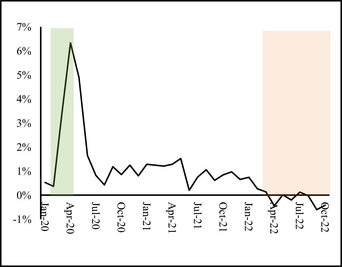
(a) Monthly M2, Monthly Percent Change
(b) Daily Effective FF Rate, Percent
FOMC and FF rate: The federal funds rate is a short-term interest rate at which banks trade the balances they have at Federal Reserve Banks with each other. Although the effective federal funds rate is determined in the market as banks with more liquidity negotiate lending rates with those seeking liquidity, this rate is also influenced by the Federal Reserve. If the Fed wishes to reduce the rate, the Fed instructs its traders to buy short term government bonds from banks, which in turn increases their liquidity as the bonds are exchanged for balances (these trades are termed open market operations). When banks have more liquid funds to loan out, this reduces the rate they charge each other for funds (in other words, the FF rate falls). Alternatively, if the Fed wishes to raise the FF rate, it will sell government bonds, reducing banks’ liquidity as they trade the bonds for balances. Open market operations are decided by the Federal Open Market Committee (FOMC) which meets eight times a year to determine a target for the FF rate. Although the FF rate is an interbank rate, it has the potential to influence the interest rates faced by consumers such as the prime rate, mortgages, loans, and savings rate. Intuitively, a bank’s lending rate will be related to the rate at which itself can borrow.
When should rates rise? When should they fall? Among other responsibilities, the Fed has a dual mandate set forth by Congress. The dual mandate is price stability and economic growth. If economic growth is in jeopardy, such as during a pandemic, the Fed will cut interest rate and provide necessary liquidity. If price stability is a concern, as is the case in 2022, the Fed will raise interest rates to reduce demand and tame inflation.
The Fight Against Inflation
For policymakers to fight inflation, some short-term economic pain and slowdown are inevitable in order to achieve long term economic stability. To minimize economic pain, the fiscal policy (set by Congress and the current Administration) must work in the same direction as monetary policy (set by the Fed). To that end, the Inflation Reduction Act was passed in 2022. The $437 billion spending package is expected to raise $737 billion in revenue and reduce net federal expenditures by $300 billion over the next decade, in hopes of reigning in the government budget deficit. Cutting the deficit can at times have the effect of dampening inflation if it reduces overall demand of goods and services and take pressure off the prices. Most of the additional revenue will be raised through a 15% corporate minimum tax rate and through prescription drug price reform allowing Medicare to negotiate the price of certain prescription drugs starting in 2026. Such a reform is welcome news given the high levels of the U.S. health care spending. However, the act packs the biggest punch in its environmental goals. $369 billion of subsidies and tax credits are to be allocated over the decade on electric vehicles (EV), renewable energy, carbon capture, and other climate change combating measures. For example, the IRA includes a subsidy of $7,500 for purchasing of EV for the lower end models and a requirement that 40% of battery components for EV be sourced from factories in the U.S. or its free trade agreement partners and that batteries be U.S. made by 2029. This is primarily to phase out Chinese components and minerals.
The IRA should have a favorable effect on cutting the U.S. greenhouse-gas emissions, but its effect on inflation will not be immediate. The Fed has the primary responsibility to reduce inflation. The Fed raised benchmark federal-funds rate six times this year (to a range between 3% and 4% from near zero, as can be seen in panel (b) of Figure 2). By raising borrowing costs and making it more costly to finance homes, cars, and business investment with higher interest rates, the Fed can curb demand for goods and services and relieve pressure off prices to further increase. In fact, the higher mortgage rates have slowed down the housing market. Housing starts and residential permits both fell on a national level.
The Fed is also hoping that a cooling down in the labor market can remove pressure off prices. And although showing some signs of loosening, labor markets remain tighter than they have ever been, with record rates of quits and job openings. Labor market tightness is sometimes measured by the number of vacant jobs compared to the number of workers available. A tight labor market favors workers. One reason for this tightness is that during the pandemic, labor market participation decreased due to many reasons such as early retirement, lack of childcare options, health concerns, and change in preferences. Another reason could be the change in the nature of available jobs during the pandemic. Labor market participation has not rebounded; therefore, the supply side of the labor market remains low. The demand for labor (vacancies) may decline as the Fed hikes interest rates. Indeed, initial jobless claims showed a slight increase signaling perhaps an increase in layoffs (but are still low enough to signaling a still strong labor market). Vacancies and new jobs have slowed down in September.
“Inflation is always and everywhere a monetary phenomenon” -Milton Friedman
As the Fed raises interest rates, reducing aggregate demand for goods and services, we expect a slowdown in economic growth and an increase in the unemployment rate. This is the price of stability: reducing aggregate demand with higher borrowing costs slows down economic activity and reduces employment but takes pressure off prices to further rise. Nonetheless, some economists would argue that even if the Fed does not raise rates, a slowdown might ensue as the expansionary effects of monetary (and fiscal) policy undertaken in the previous two years dissipate.
Regional Outlook
The changes taking place on a national level have had an effect on some sectors in Hidalgo County. Given its interest sensitive nature, the housing sector has experienced some shifts. Since the Federal reserve’s interest rate hike in March 2022, months in inventory has steadily increased reaching 3.9 in October of 2022, as can be seen in the Table 1. This is above the level seen last October when months in inventory was 2.4. Median home prices were stable (or slightly up) and single-family housing construction permits has steadily decreased since August. Permits, which are obtained before construction, are an indicator of future housing market conditions. This is to be expected as mortgage rates climb with the Fed’s raising of interest rates.
|
Table 1: Housing Market in Hidalgo County, Oct 21-22 |
|||||||
|
Month/Year |
Sales |
Dollar Volume |
Average Price |
Median |
Total Listings |
Months In |
Building Permit |
|
21-Oct |
325 |
74,992,709 |
230,747 |
200,000 |
861 |
2.4 |
512 |
|
21-Nov |
303 |
69,480,703 |
229,309 |
205,000 |
917 |
2.6 |
350 |
|
21-Dec |
362 |
84,411,566 |
233,181 |
218,750 |
828 |
2.4 |
375 |
|
22-Jan |
358 |
80,040,787 |
223,578 |
200,500 |
780 |
2.2 |
388 |
|
22-Feb |
350 |
77,934,240 |
222,669 |
205,000 |
731 |
2 |
290 |
|
Post Monetary Tightening |
|||||||
|
22-Mar |
409 |
100,166,775 |
244,907 |
215,000 |
716 |
1.9 |
385 |
|
22-Apr |
378 |
95,406,508 |
252,398 |
220,750 |
782 |
2.1 |
397 |
|
22-May |
408 |
102,359,297 |
250,881 |
228,150 |
845 |
2.3 |
402 |
|
22-Jun |
395 |
101,115,003 |
255,987 |
231,250 |
974 |
2.6 |
355 |
|
22-Jul |
338 |
84,694,764 |
250,576 |
230,000 |
1101 |
3 |
320 |
|
22-Aug |
383 |
95,084,719 |
248,263 |
220,000 |
1212 |
3.3 |
336 |
|
22-Sep |
324 |
79,412,623 |
245,101 |
228,500 |
1331 |
3.7 |
301 |
|
22-Oct |
323 |
77,484,495 |
239,890 |
225,000 |
1416 |
3.9 |
279 |
|
Average |
358 |
86,352,630 |
240,576 |
217,531 |
961 |
3 |
361 |
The labor market in the region remains fairly strong and stable with unemployment mirroring those before the pandemic levels (see Table 2). From June 2021 to June 2022, average weekly wages grew by 5.10% in Hidalgo County and by 7.80% in Cameron County. The wage growth has barely kept up with inflation over the past year in the region, although this is not evident on a national level where wages grew at a rate of slower than inflation implying a reduction in real wages, as reported in Table 3.
|
Table 2: Unemployment Rates For Select MSAs and Texas |
|||
|
|
Brownsville-Harlingen |
McAllen-Edinburg-Mission |
Texas |
|
Early 2020 levels |
|||
|
2020-Feb |
5.5 |
6.4 |
3.5 |
|
2020-Mar |
8.2 |
9.6 |
5.1 |
|
Post Monetary Tightening |
|||
|
2022-Mar |
6.1 |
7.0 |
4.4 |
|
2022-Apr |
5.9 |
6.8 |
4.3 |
|
2022-May |
6.0 |
6.9 |
4.2 |
|
2022-Jun |
6.9 |
8.1 |
4.1 |
|
2022-Jul |
6.8 |
8.0 |
4.0 |
|
2022-Aug |
6.4 |
7.6 |
4.1 |
|
2022-Sep |
5.8 |
6.7 |
4.0 |
|
Table 3: Employment and Wages (June 2021-June 2022) |
||
|
County |
12-month percent change in employment Total |
12-month percent change in average weekly wage Total |
|
Hidalgo |
3.7% |
5.1% |
|
Cameron |
3.9% |
7.8% |
|
Texas |
5.2% |
6.1% |
|
U.S. |
4.0% |
4.3% |
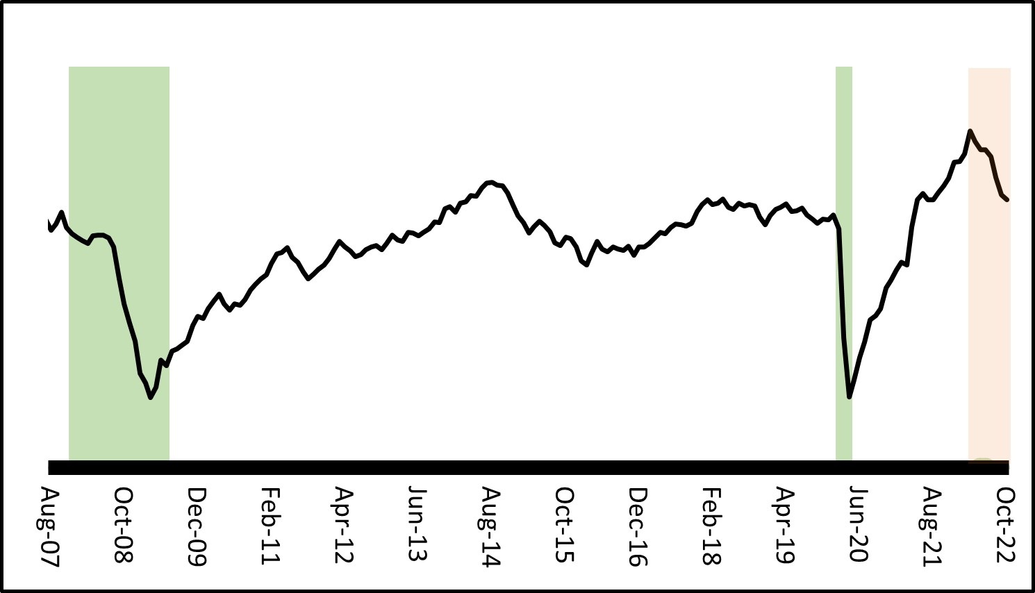
To forecast the region’s economic outlook, economists typically look at leading economic indicators. These indicators are variables that tend to decrease before overall economic activity slows down and rebound before a recovery. For Texas, the Dallas Fed combines into a single index eight indicators including the Texas value of the dollar, U.S. leading index, real oil price, well permits, initial claims for unemployment insurance, Texas stock index, help-wanted index and average weekly hours worked in manufacturing. Despite the strong labor market, the Texas Leading Index shows some signs of a slowdown since the monetary tightening by the Fed as can be seen in Figure 3. It is worth noting that the leading indicators did not pick up earlier recessions with significant lead time as can be seen in Figure 3.
Figure 3: The Dallas Fed Texas Leading Economic Indicators
Green areas indicate recessions, orange area indicates period of monetary tightening.
Source: The Dallas Fed
Summary
The Fed has shown a commitment to keeping rates high and prioritizing price stability. The effects of monetary tightening have been felt as the 12-month inflation rate was 7.1% in November, down from 9.1% in June. On December 14th, 2022, the Fed announced a 0.50 percentage point hike for the FF rate to be between 4.25% to 4.50% (compared to 1.5% to 1.75% in June). This is lower than some hikes earlier this year of .75 percentage point each.
Economists generally agree that the Fed should hold the course until price stability is achieved. In fact, studies covering historical disinflation episodes in several countries show that the output loss from reducing inflation was smaller, the faster the disinflation took place [2, 4]. This is referred to as the ‘cold turkey’ approach to disinflation.
____
Maroula Khraiche is an Associate Professor of Economics at The University of Texas Rio Grande Valley.
Andre Mollick is a Professor of Economics at The University of Texas Rio Grande Valley.
Endnotes
- Families First Coronavirus Response Act Will Cost $192 Billion. Committee for a Responsible Federal Budget. Apr 6, 2020.
- L. Ball. What determines the sacrifice ratio? In Monetary Policy, pages 155−−193. The University of Chicago Press, 1994.
- J. Jamerson, A. Duehren, and N. Andrews. Senate Approves Roughly $2 Trillion in Coronavirus Relief. Wall Street Journal. March 26, 2020.
- H. Katayama, N. Ponomareva, and M. Sharma. What determines the sacrifice ratio? a bayesian model averaging approach. Oxford Bulletin of Economics and Statistics, 81(5).
- N. McCarthy. What’s In The $1.9 Trillion Stimulus Package? Statista, March, 11 2021.
- E. Milstein and D. Wessel. What did the fed do in response to the covid-19 crisis. Brookings Institution, 2021.
Spring 2022 v18, n1
The end of globalization: Texas-Mexico border ports trends
Salvador Contreras
Over the past couple of years there have been hundreds if not thousands of reports suggesting that the end of globalization is upon us (for example [1]). They suggest that the benefits to trade have run their course and that one should expect a retrenchment, or at least a pause, to further expansion. Certainly, current geo-political events make the case to rethink existing alliances.
The Texas Border Region, by its very nature is highly connected to international commerce. The recent, if temporary, decision by the Texas Governor to institute enhance inspections of Mexican trucks along the Texas – Mexico border reminds us that international trade is much bigger then the ports that oversee its flows or the trucks that sit hours on end patiently awaiting their turn to reach a customs officer [2]. It also affects available inventory at our local stores and the prices we pay at the counter.
In this piece we study trends in international trade between the US and its top 3 trading partners. We show a clear deceleration in said activity. We then turn our attention to the Texas-Mexico border. We show that national trade patterns are reflected in trade flows through the El Paso District and Laredo District. Finally, we take a close look at trends at each of the ports in the Laredo District. We close by analyzing the composition of goods that flow through these ports.
Top trading partners
We begin by showing trade patters between the US and its top 3 trading partners. All values are inflation adjusted using the Producer Price Index and reflect 2019 dollars. We focus on the dollar value of total trade. Total trade is defined as exports plus imports.
Figure 1 shows US total trade [exports + imports] with Canada, China, and Mexico. Values are in billions of dollars. Notice that from the early 1990s up to 2000 trade flows are steadily growing. In 2000 trade between Mexico and Canada begin to move sideways while trade with China continues to increase. This period coincides with China joining the World Trade Organization (WTO) in 2001. Canada total trade with the US continued to go sideways through 2021. After the 2008 Financial Crisis we see that Mexico’s trade flows keep pace with China till 2017. Days into the Trump administration’s presidency, the US pulled out of the Trans-Pacific Partnership in early 2017. This and ensuing policies to decouple the US from what were seen by some as bad trade deals can be seen in the data as a decline in trade flows with China [3]. Trade with Mexico continued to grow until the 2020 COVID lockdowns. This allowed Mexico to become the US largest trading partner in 2019. In 2021 total trade with these three countries stood around $580 billion or $1.7 trillion combined or roughly 10% of US Gross Domestic Product (GDP).
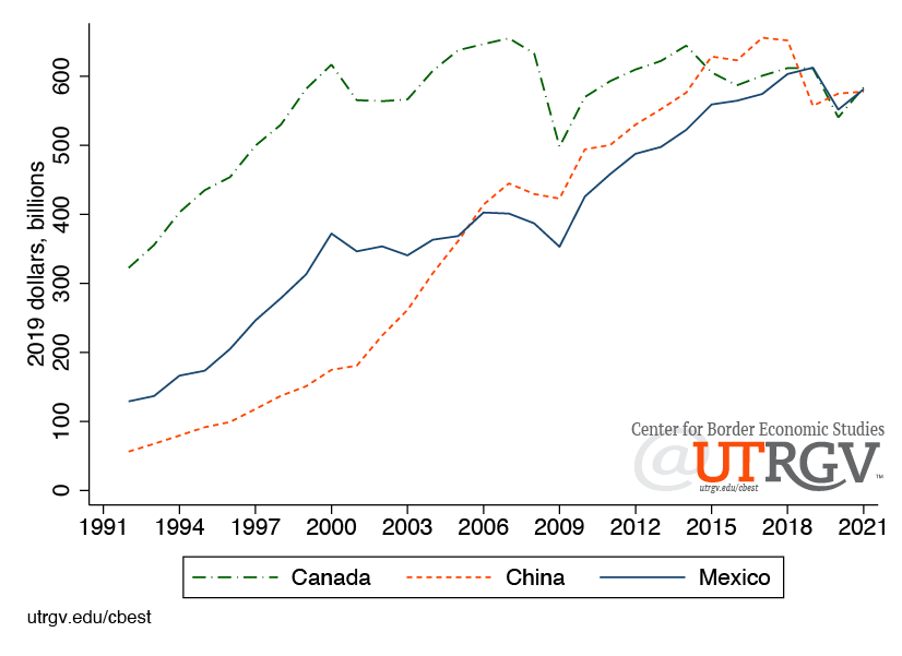
Figure 1: Total trade, top 3 US trading partners
Source: US Census USA Trade
In general, trade has been trending down for the past 4 years. Is this a sign that the end of globalization is real? While, not likely. These trends suggest that it may no longer be expanding. Some argue that COVID and associated disruptions to manufacturing and supply chains is a likely culprit. Recent lookdowns of Shanghai affecting 26 million people, is a reminder that COVID is still around and that it continues to inflict damages to the world supply chain. No doubt, this is reflected in figure 1. Another reason can be placed on protectionist policies. For example, Trump era tariffs that covered a wide array of goods from steel to washing machines have also played role. In 2019, the US earned $79 billion in tariff revenue, double that of 2017 [4].
More complex explanations are geo-political in nature that thread on national security to nationalism. The Russians are reminded in their current foray of conquest that wars require basic understanding of economics and supply chain management. All the money in the world cannot buy you a microprocessor if the seller is unwilling or unable to supply it. From this view, national security arguments seem reasonable. A Brookings report states that there were some benefits to Trump era protectionist policies. For example, employment at steel and aluminum factories appears to have benefited from the use of national security (section 232) reviews. Other antidotal evidence are announcements by companies like Intel who have committed to a $20 billion investment on a new plant in Ohio or Samsung with a $17 billion investment on a Texas facility.
Yet, another explanation to these trends is that trade benefits have run their course. From the time China joined the WTO till about a few years ago, American consumers enjoyed persistent low levels of inflation. For example, in the 1990s inflation, stripping out Food and Energy, averaged 3%, 2% in the 2000s, and 1.9% in the 2010s. In 2021 it averaged 3.6%, 2022 already promises to be above 2021. Low-cost foreign labor and global commodities have benefited Americans over the past 3 decades. However, there are signs that this may be coming to an end. Chinese Industrial Production Prices grew on average by 1.3% over 2000 to 2020. From January 2021 to March 2022 price growth has averaged 8.2%. The US is pushing companies to bring jobs back at a time when costs of producing in China and elsewhere are rising. American’s own recent inflation trends in part reflect this story.
US trade with its top trading partners has stopped growing. It happens to coincide with a period of disappearing cost advantages to offshoring. Globalization continues to have a pulse. What is different now is that margins from trade to both consumers and businesspersons have begun to shrink. These trends will likely make it easier for protectionist voices to get a seat at the policymaking table. Next, we turn to the Texas-Mexico border region.
Texas Border
The El Paso District and the Laredo District cover all Texas land ports with Mexico. In 2021, the Laredo District handled $310 billion in total trade. For comparison, the El Paso District handled $103 billion. Figure 2 shows the two districts total trade index. We set 2010 as the reference year. The figure tells us that total trade prior to the Financial Crisis period was not growing. After 2009, trade flows accelerated for about 6 years. Then, we see a deceleration that continues today. This is consistent with the general trends we observed in figure 1.
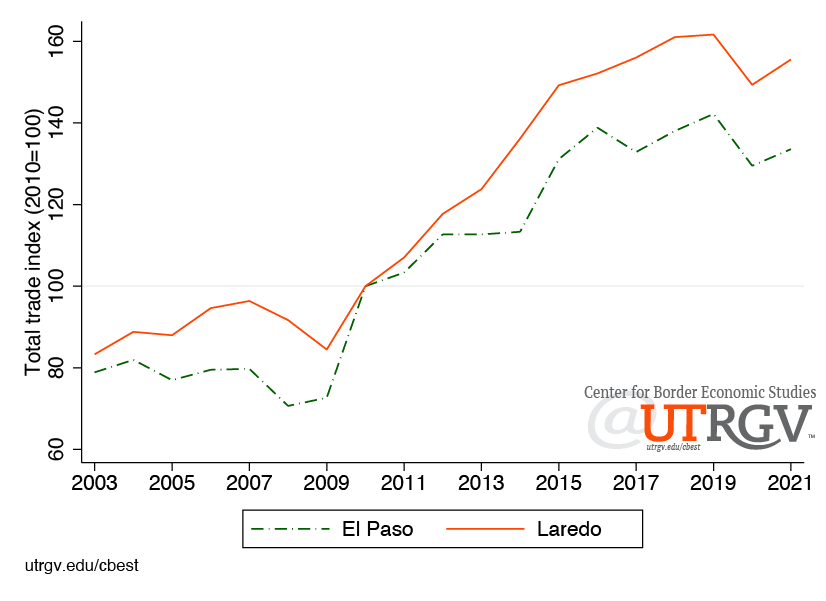
Figure 2: Total trade through Texas border port districts
Source: US Census USA Trade
In 2021 total trade in the El Paso District and the Laredo District was 34% and 56% above 2010 levels, respectively. Trade peaked in 2019, the El Paso District and Laredo District enjoyed $110 billion and $322 billion in total trade, respectively.
The Laredo District is made up of the Port of Brownsville, Port of Del Rio, Port of Eagle Pass, Edinburg Airport, Port of Hidalgo, Port of Laredo, Port of Progreso, Port of Rio Grande City, Port of Roma, and Valley International Airport (Harlingen). We will not report on Edinburg Airport and briefly on Valley International Airport. These two ports are small and do not have trade figures in all the years of analysis. Figure 3 shows the inflation adjusted value of total trade through Laredo District ports.
The Port of Laredo is the district’s largest port. It accounts for 70% of district total. At distant second is the Port of Hidalgo that accounts for $37 billion or 12% of district total. The Port of Eagle Pass and Brownsville round up the largest 4 ports. The Port of Progresso is the district’s smallest port. In 2021 it handled $304 million. Followed by the Port of Roma at $415 million.
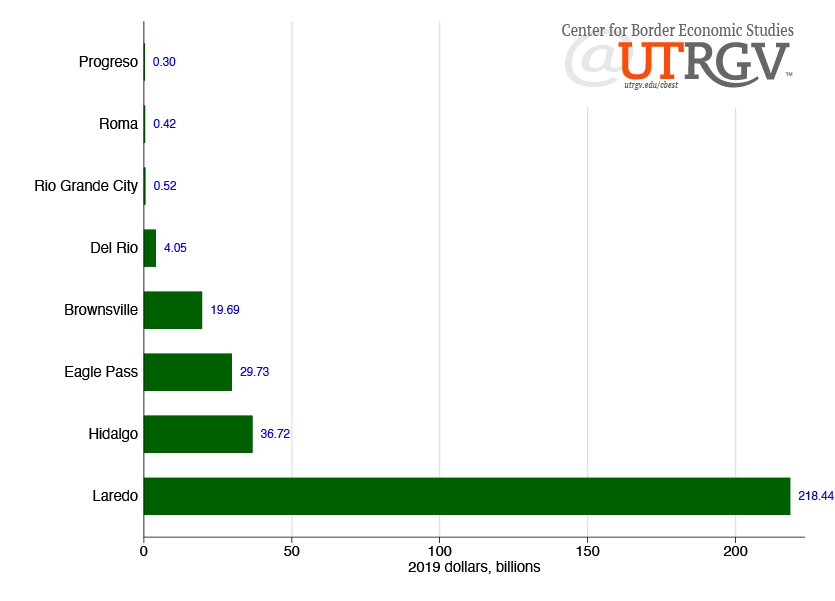
Figure 3: 2021 total trade by port
Source: US Census USA Trade
Figure 4 presents total trade index for the largest ports in the Laredo District. The index is normalized to 100 in 2010 and is based on inflation adjusted port level total trade. The Port of Eagle Pass and Port of Laredo saw the highest growth over the past 10 years. However, notice that these ports reflect zero growth over the past 5 years, like national trends. In 2021, the Port of Eagle Pass and Port of Laredo were 63% and 61% above 2010 levels, respectively. The Port of Brownsville and Port of Hidalgo have seen a steady upward movement in trade flows over the past 10 yeas. In 2021 these ports were 34% and 38% above their 2010 levels, respectively.
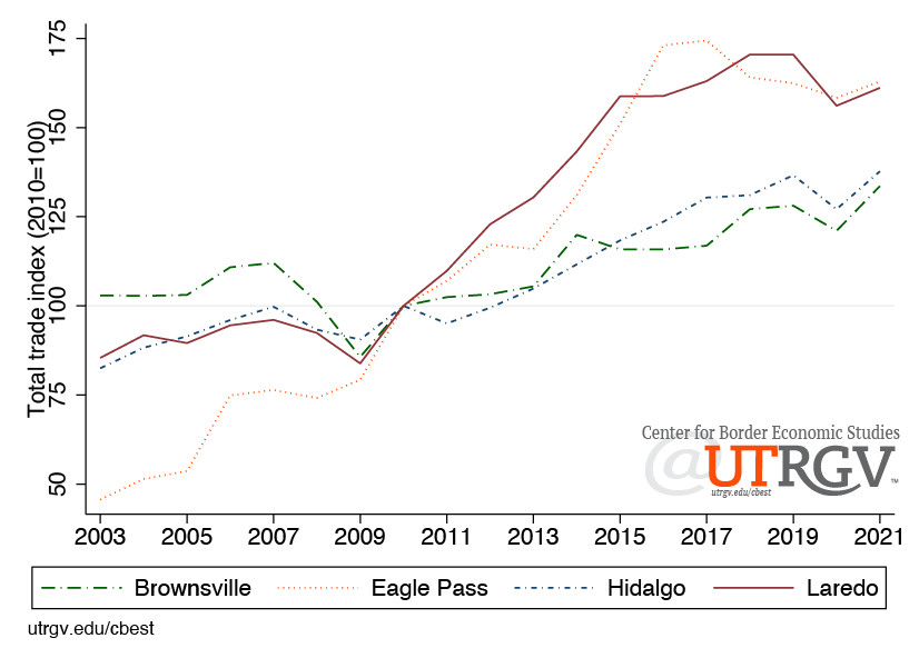
Figure 4: Laredo District, large ports
Source: US Census USA Trade
Figure 5 presents the total trade index for the small ports in the Laredo District. The Port of Roma has the largest increase. For this reason, the values for the Port of Roma appear on the right-axis (all others, left-axis). In 2021, the Port of Roma moved 10 times the value it handled in 2010. This impressive growth occurred in the past 3 years. Th
e Port of Rio Grande City observed the second largest end of period growth. In 2021 total trade was under 2 times larger than 2010. The only port to see no growth over the past decade is the Port of Progreso. It ended 2021 9% below its 2010 level.
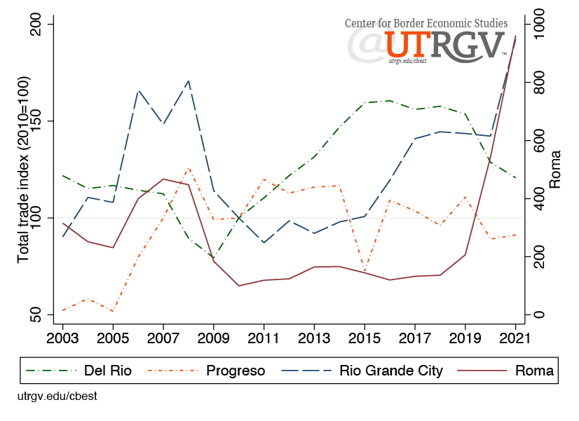
Figure 5: Laredo District, small ports
Source: US Census USA Trade
Composition of goods
Next, we present the categories of goods that cross the El Paso District and Laredo District. Categories are based on the Harmonized System (HS) codes. We present both 2-digit and 6-digit categories. The 2-digits correspond to the chapter or broad category. The item can be further detailed by their heading with two additional digits and subheading with an additional two digits. Table 1 presents the 2021 share of total trade by chapter category (2-digit). For example, HS 84 “Nuclear reactors, boilers, machinery, and mechanical appliances; parts thereof” represents 36% of the $103 billions of total trade in the El Paso District. Of these, 11 billion was southbound and $26 billion was northbound flows, for a total of $37 billion. There is a total of 99 2-digit codes.
Table 1 presents the top 10 2-digit codes for the El Paso District and Laredo District. Notice that 75% of everything that moves through the El Paso District are in the top 4 categories. Six of the district’s 10 categories have exports exceed imports. Of the 10 categories, on net, $19 billion flow northbound. In comparison, the Laredo District appears more diversified. The top 10 categories account for 75% of total flows. In addition, both El Paso District and Laredo Districts share the same top three HS 2-digit categories 84, 85, and 87. These three account for 69% of El Paso District and 53% of Laredo District total trade. The Laredo District’s top two categories account for $115 billion in total trade.
Table 1: 2021 El Paso District and Laredo District share of total trade, top 10 categories (2-digit)
Source: US Census USA Trade
|
|
|
Million (2019 dollars) |
|
||
|
District |
Harmonized System Code |
Exports |
Imports |
Total trade |
Share of total trade (%) |
|
El Paso |
84 Nuclear reactors, boilers, machinery and mechanical appliances; parts thereof |
10,894.7 |
26,208.0 |
37,102.6 |
36.0 |
|
El Paso |
85 Electrical machinery and equipment and parts thereof; sound recorders and reproducers, television image and sound recorders and reproducers, and parts and accessories of such articles |
13,342.5 |
12,400.8 |
25,743.2 |
25.0 |
|
El Paso |
87 Vehicles other than railway or tramway rolling-stock, and parts and accessories thereof |
1,094.0 |
6,828.2 |
7,922.2 |
7.7 |
|
El Paso |
90 Optical, photographic, cinematographic, measuring, checking, precision, medical or surgical instruments and apparatus; parts and accessories thereof |
1,612.1 |
5,178.4 |
6,790.5 |
6.6 |
|
El Paso |
39 Plastics and articles thereof |
2,330.3 |
819.5 |
3,149.9 |
3.1 |
|
El Paso |
27 Mineral fuels, mineral oils and products of their distillation; bituminous substances; mineral waxes |
3,026.3 |
0.5 |
3,026.8 |
2.9 |
|
El Paso |
94 Furniture; bedding, mattresses, mattress supports, cushions and similar stuffed furnishings; lamps and lighting fittings, not elsewhere specified or included; illuminated signs, illuminated name-plates and the like; prefabricated buildings |
173.9 |
1,964.4 |
2,138.3 |
2.1 |
|
El Paso |
73 Articles of iron or steel |
746.6 |
432.4 |
1,179.0 |
1.1 |
|
El Paso |
10 Cereals |
1,001.2 |
3.8 |
1,005.0 |
1.0 |
|
El Paso |
74 Copper and articles thereof |
744.4 |
112.9 |
857.3 |
0.8 |
|
Laredo |
87 Vehicles other than railway or tramway rolling-stock, and parts and accessories thereof |
12,449.4 |
51,908.3 |
64,357.7 |
20.8 |
|
Laredo |
84 Nuclear reactors, boilers, machinery and mechanical appliances; parts thereof |
17,991.9 |
32,861.6 |
50,853.5 |
16.4 |
|
Laredo |
85 Electrical machinery and equipment and parts thereof; sound recorders and reproducers, television image and sound recorders and reproducers, and parts and accessories of such articles |
14,886.4 |
33,863.7 |
48,750.1 |
15.7 |
|
Laredo |
27 Mineral fuels, mineral oils and products of their distillation; bituminous substances; mineral waxes |
16,451.6 |
381.6 |
16,833.2 |
5.4 |
|
Laredo |
39 Plastics and articles thereof |
11,248.5 |
4,177.4 |
15,425.9 |
5.0 |
|
Laredo |
73 Articles of iron or steel |
3,552.5 |
4,416.2 |
7,968.6 |
2.6 |
|
Laredo |
94 Furniture; bedding, mattresses, mattress supports, cushions and similar stuffed furnishings; lamps and lighting fittings, not elsewhere specified or included; illuminated signs, illuminated name-plates and the like; prefabricated buildings |
911.4 |
6,599.3 |
7,510.7 |
2.4 |
|
Laredo |
90 Optical, photographic, cinematographic, measuring, checking, precision, medical or surgical instruments and apparatus; parts and accessories thereof |
2,590.1 |
4,298.8 |
6,889.0 |
2.2 |
|
Laredo |
22 Beverages, spirits and vinegar |
192.8 |
6,380.0 |
6,572.8 |
2.1 |
|
Laredo |
8 Edible fruit and nuts; peel of citrus fruit or melons |
79.5 |
5,487.9 |
5,567.3 |
1.8 |
Table 2 presents the more disaggregated 6-digit categories for all ports in the Laredo District (except Edinburg Airport). We present the top 5 goods. For example, the top category through the Port of Brownsville is HS 271019, “Petroleum oils and oils from bituminous minerals, not containing biodiesel, not crude, not waste oils; preparations n.e.c, containing by weight 70% or more of petroleum oils or oils from bituminous minerals; not light oils and preparations.” The Port of Brownsville saw $2.6 billion flow southbound and $286 million northbound. This good accounts for 14.5% of the port’s $19.7 billion in total trade. Three of the top 5 categories in the port are in HS 27. The oil and gas sector accounts for a quarter of the port’s total trade. More importantly, these are mainly southbound flows. Table 2 also shows that natural gas is an important commodity accounting for $1.4 billion and $4.2 billion of southbound flows through the Port of Brownsville and the Port of Hidalgo, respectively.
In February avocados were temporary barred from entering the US because of a threatening phone call made to a US inspector in the state of Michoacan [5]. More recently, Governor Abbot’s decision to order enhanced inspections of trucks crossing from Mexico caused much concern about potential losses of perishable goods such as avocados and tomatoes [6]. Table 2 shows that $1.4 billion worth of avocados crossed through the Port of Hidalgo and $20 million the Port of Progreso. In addition to $52 million in lemons through the Port of Progreso, $41 million in peppers and pimento through the Port of Rio Grande City, and $81 million in tomatoes and $40 million in vegetables through the Port of Roma. In all, about $1.7 billion in perishable produce crossed through the southern part of the Laredo District.
Table 2 shows that 4 of the 5 top 6-digit categories in the Port of Laredo are in HS 87. Indeed, 3 of the 5 categories in the Port of Eagle Pass are in HS 87. It shows that the northern part of the district mostly moves components associated with the transportation industry. In addition, among the top three district’s ports, the Port of Laredo is the most diversified, followed by the Port of Hidalgo, and the Port of Eagle Pass is the least. The top 5 6-digit commodities account for 53% of the Port of Eagle Pass total trade, 27% of the Port of Hidalgo and 14% of the Port of Laredo.
Table 2: 2021 Port level share of total trade, top 5 categories (6-digit)
Source: US Census USA Trade
|
|
|
Millions of 2019 dollars |
|
||
|
Port |
Harmonized System Code |
Exports |
Imports |
Total trade |
Share of total trade (%) |
|
Brownsville |
271019 Petrol Oil Bitum Mineral (nt Crud) Etc Nt Biodiesl |
2,562.0 |
286.4 |
2,848.3 |
14.5 |
|
Brownsville |
271121 Natural Gas, Gaseous |
1,392.7 |
0.0 |
1,392.7 |
7.1 |
|
Brownsville |
852351 Solid-state Non-vol Semiconductor Storage Devices |
1.4 |
1,063.7 |
1,065.1 |
5.4 |
|
Brownsville |
271012 Lt Oils, Preps Gt=70% Petroleum/bitum Nt Biodiesel |
734.1 |
0.0 |
734.1 |
3.7 |
|
Brownsville |
847330 Parts & Accessories For Adp Machines & Units |
54.9 |
502.3 |
557.2 |
2.8 |
|
Del Rio |
940190 Parts Of Seats (ex Medical, Barber, Dental Etc) |
13.6 |
480.8 |
494.4 |
12.2 |
|
Del Rio |
841191 Turbojet And Turboproller Parts |
2.1 |
288.6 |
290.7 |
7.2 |
|
Del Rio |
880000 Civilian Aircraft, Engines, And Parts |
247.5 |
0.0 |
247.5 |
6.1 |
|
Del Rio |
870899 Parts And Accessories Of Motor Vehicles, Nesoi |
67.2 |
160.4 |
227.6 |
5.6 |
|
Del Rio |
850940 Electromech Food Grinder Processor Mixer Extrctor |
74.9 |
116.9 |
191.8 |
4.7 |
|
Eagle Pass |
870421 Trucks, Nesoi, Diesel Eng, Gvw 5 Metric Tons & Und |
3.2 |
4,904.9 |
4,908.1 |
16.5 |
|
Eagle Pass |
870431 Mtr Veh Trans Gds Spk Ig In C P Eng, Gvw Nov 5 Mtn |
226.8 |
4,518.7 |
4,745.5 |
16.0 |
|
Eagle Pass |
220300 Beer Made From Malt |
0.0 |
3,091.2 |
3,091.2 |
10.4 |
|
Eagle Pass |
870323 Pass Veh Spk-ig Int Com Rcpr P Eng >1500 Nov 3m cc |
37.1 |
1,933.0 |
1,970.1 |
6.6 |
|
Eagle Pass |
120190 Soybeans, Nesoi |
909.5 |
0.0 |
909.5 |
3.1 |
|
Hidalgo |
271121 Natural Gas, Gaseous |
4,244.6 |
0.0 |
4,244.6 |
11.6 |
|
Hidalgo |
852872 Reception Apparatus For Television, Color, Nesoi |
0.8 |
2,564.2 |
2,565.0 |
7.0 |
|
Hidalgo |
080440 Avocados, Fresh Or Dried |
0.0 |
1,441.6 |
1,441.6 |
3.9 |
|
Hidalgo |
853710 Controls Etc W Elect Appr F Elect Cont Nov 1000 V |
99.5 |
938.4 |
1,037.9 |
2.8 |
|
Hidalgo |
271012 Lt Oils, Preps Gt=70% Petroleum/bitum Nt Biodiesel |
701.9 |
47.5 |
749.4 |
2.0 |
|
Laredo |
870120 Road Tractors For Semi-trailers |
17.7 |
6,177.7 |
6,195.4 |
2.8 |
|
Laredo |
870899 Parts And Accessories Of Motor Vehicles, Nesoi |
2,058.9 |
3,267.3 |
5,326.2 |
2.4 |
|
Laredo |
851762 Mach For Recp/convr/trans/regn Of Voice/image/data |
809.4 |
4,512.5 |
5,321.9 |
2.4 |
|
Laredo |
870829 Pts & Access Of Bodies Of Motor Vehicles, Nesoi |
1,480.9 |
3,656.0 |
5,137.0 |
2.4 |
|
Laredo |
870323 Pass Veh Spk-ig Int Com Rcpr P Eng >1500 Nov 3m cc |
157.9 |
4,218.6 |
4,376.5 |
2.0 |
|
Laredo |
870840 Gear Boxes For Motor Vehicles |
1,725.9 |
2,632.4 |
4,358.3 |
2.0 |
|
Progreso |
100590 Corn (maize), Other Than Seed Corn |
88.7 |
0.0 |
88.7 |
29.2 |
|
Progreso |
080550 Lemons And Limes, Fresh Or Dried |
0.0 |
52.2 |
52.2 |
17.2 |
|
Progreso |
100610 Rice In The Husk (paddy Or Rough) |
26.0 |
0.0 |
26.0 |
8.6 |
|
Progreso |
100790 Grain Sorghum, Nesoi |
25.3 |
0.0 |
25.3 |
8.3 |
|
Progreso |
080440 Avocados, Fresh Or Dried |
0.0 |
20.1 |
20.1 |
6.6 |
|
Rio Grande City |
680911 Plstr Brds Etc Nt Orna, Fcd W ppr O pprbrd Only |
0.0 |
58.8 |
58.8 |
11.2 |
|
Rio Grande City |
730661 Tubes, Pipes Etc Irn/stl Wldd, Sq/rct Cr-sec Nesoi |
0.6 |
42.8 |
43.4 |
8.3 |
|
Rio Grande City |
847989 Mach & Mechanical Appl W Individual Function Nesoi |
0.0 |
42.4 |
42.4 |
8.1 |
|
Rio Grande City |
070960 Fruits Of Genus Capsicum Or Pimenta, Fresh/chilled |
0.0 |
41.2 |
41.2 |
7.9 |
|
Rio Grande City |
721070 Fr Ir/nas 600mm W Om, Painted, Varnished, Plastic |
0.0 |
41.0 |
41.0 |
7.8 |
|
Roma |
070200 Tomatoes, Fresh Or Chilled |
0.0 |
80.5 |
80.5 |
19.4 |
|
Roma |
070999 Vegetables, Fresh Or Chilled, Nesoi |
0.0 |
40.3 |
40.3 |
9.7 |
|
Roma |
220210 Waters, Incl Mineral & Aerated, Sweetnd Or Flavord |
0.0 |
28.4 |
28.4 |
6.8 |
|
Roma |
851712 Phones For Cellular Ntwks Or For Oth Wireless Ntwk |
27.1 |
0.0 |
27.1 |
6.5 |
|
Roma |
070490 Edible Brassicas (cabbages Etc) Nesoi, Fr Or Chill |
0.0 |
20.3 |
20.3 |
4.9 |
|
VIA, Harlingen |
880000 Civilian Aircraft, Engines, And Parts |
5.4 |
0.0 |
5.4 |
68.1 |
|
VIA, Harlingen |
854231 Processors And Controllers, Electronic Integ Circt |
0.0 |
0.8 |
0.8 |
10.4 |
|
VIA, Harlingen |
901590 Parts And Accessories For Surveying Etc Nesoi |
0.8 |
0.0 |
0.8 |
10.4 |
|
VIA, Harlingen |
850450 Electrical Inductors Nesoi |
0.0 |
0.3 |
0.3 |
3.9 |
|
VIA, Harlingen |
854239 Electronic Integrated Circuits, Nesoi |
0.0 |
0.1 |
0.1 |
1.8 |
Summary
The end of globalization is probably not here. However, there are clear indications that US trade over the past few years has begun to wane. It’s hard to see what the impetus will be to get trade flows growing again. National security concerns and politics across the globe are working in favor of taming globalists ideas. The Texas border region plays an important role helping keep shelves across the US stocked. This is often forgotten when policymakers fail to consider the effects that trade policy decisions have on the Texas border. In fact, we learned from the 10 days the Texas order on enhanced inspections of Mexican trucks was in effect that individuals with little say on matters of international commerce can so easily inflict damages on trade flows and border communities [7].
____
Dr. Salvador Contreras is Associate Professor of Economics at the University of Texas Rio Grande Valley
Endnotes
[1] Justin Lahart. Globalization Isn’t Unraveling. It’s Changing. The Wall Street Journal. April 15, 2022. https://www.wsj.com/articles/globalization-isnt-unraveling-its-changing-11650015032?page=1
[2] Governor Abbott Takes Aggressive Action To Secure The Border As President Biden Ends Title 42 Expulsions. Office of the Texas Governor. April 6, 2022. https://gov.texas.gov/news/post/governor-abbott-takes-aggressive-action-to-secure-the-border-as-president-biden-ends-title-42-expulsions
[3] Jim Tankersley and Keith Bradsher. Trump Hits China With Tariffs on $200 Billion in Goods, Escalating Trade War. The New York Times. Sept. 17, 2018 https://www.nytimes.com/2018/09/17/us/politics/trump-china-tariffs-trade.html
[4] Geoffrey Gertz. Did Trump’s tariffs benefit American workers and national security? Brookings. SEPTEMBER 10, 2020. https://www.brookings.edu/policy2020/votervital/did-trumps-tariffs-benefit-american-workers-and-national-security/
[5] Anthony Harrup. Mexico Resumes Exports of Avocados to U.S. The Wall Street Journal. Feb. 18, 2022. https://www.wsj.com/articles/mexico-resumes-exports-of-avocados-to-u-s-11645213662?page=1
[6] Jason Beeferman. In McAllen, Gov. Greg Abbott’s border inspections meant late deliveries, rotten produce and lost business. The Texas Tribune. April 15, 2022. https://www.texastribune.org/2022/04/15/mcallen-greg-abbott-border-inspections/
[7] Sandra Sanchez. $1B lost due to South Texas bridge closure, truck inspections, city officials say. Border Report. Apr 18, 2022 https://www.borderreport.com/regions/texas/1b-lost-due-to-south-texas-bridge-closure-truck-inspections-city-officials-say/
Winter 2021 v17, n4
The reach of the Paycheck Protection Program in the Lone Star State
Salvador Contreras
The Paycheck Protection Program (PPP) by some accounts was instrumental at preventing mass small business failures. The program awarded $790 billion in forgivable loans to 11 million small businesses. As of December 2021, $630 billion had been forgiven. The program was a direct response to COVID and its effect on the economy. In April 2020, employment dropped by 21 million. Stay at home orders and health concerns made it clear that American businesses needed support. Congress moved swiftly to address the public health emergency. They started with the $1.8 trillion Coronavirus Aid, Relief, and Economic Security (CARES) Act. President Trump signed the bill into law on March 27, 2020.
The CARES Act allocated $367 billion in tax free forgivable loans to small businesses. The PPP’s main goals were to keep workers on employers’ payrolls and ensure the continuity of small businesses. The program was aimed at businesses with 500 or fewer employees, sole proprietors, independent contractors, self-employed, nonprofit organizations, veterans organizations, or tribal business concerns that met the small business criteria. In addition, it afforded establishments in the accommodation and food services sector the same rule to each physical location.
The program allowed businesses to borrow up to 2.5 times their average monthly payroll expense up to $10 million. To make the loan forgivable the borrower needed to allocate at least 60% (originally 75%) of the principal amount to payroll, maintain employee counts and keep compensation to at least 75% pre-COVID levels. Payroll expenses covered wages, bonuses, commissions, payroll taxes, health insurance, and retirement plan contributions.
The government used the banking system to promptly push these grants to businesses. These included federally insured banks, credit unions, farm credit systems and non-bank, non-insured depository institutions such as Community Development Financial Institutions. These loans required no collateral or personal guarantees. Financial institutions were generously compensated to help administer the PPP. Banks received 5% of the principal for loans up to $350 thousand, 3% for loans between $350 thousand and $2 million, and 1% for loans above $2 million. They collected an additional 1% on the portion of any non-forgivable amount. Banks for their part bared no risk and the loans had no effect on their capital requirements. The Brookings paper by Glenn Hubbard and Michael Strain provides an extensive description of the program (see endnotes).
The PPP ran out of money two weeks into its existence. On April 24, President Trump signed into law the $484 billion Paycheck Protection Program and Health Care Enhancement (PPPHCE) Act that allocated $320 billion to the PPP. By the end of May, the PPP ran out of funds once again. On December 27, President Trump signed into law the $2.3 trillion Consolidated Appropriations Act of 2021 that allocated $325 billion for the PPP. In the summer of 2021, the PPP ended. Texas small businesses made 931 thousand applications for $62 billion in PPP forgivable loans. For comparison, California (population 10 million above Texas) had 1.3 million small business applicants borrow $103 billion and Florida (population 8 million below Texas) had 980 thousand applicants borrow $50 billion. Stated differently, the average PPP loan in California was $81 thousand and Florida $51 thousand. Texas landed in the middle with an average of $67 thousand.
In this report, we turn our attention to the reach of the PPP in the Lone Star State. We show that there was broad participation by in state and out-of-state financial institutions. Further, we show that regional banks played an important role in support of their communities. Overall, we note that the PPP helped strengthen the resiliency of Texas small businesses and provided support to community banks.
Texas
The PPP had broad participation from the financial community. Some 5 thousand financial institutions took part in the endeavor. JP Morgan Chase, Bank of America, and PNC Bank were responsible for 10% of total US applications valued at $97 billion or 12% of total.
Table 1 presents the top 10 lenders to Texas small businesses by value. These 10 banks handled $20.7 billion in applications or 33% of all the PPP Texas loans. Of these, Frost Bank, Prosperity Bank, Allegiance Bank, and Comerica Bank are based in the Lone Star State. Frost Bank was responsible for $4.6 billion or 7.4% of the state’s total. Not surprising, Texas banks mostly lent to Texas businesses, except Comerica Bank. Of Comerica Bank’s $4.9 billion loans, 81% were to non-Texas small businesses.
Texas accounted for 6% of Bank of America and 7% of Wells Fargo Bank’s PPP loans (second and third largest US banks). Cross River Bank of New Jersey was the 7th largest Texas PPP lender. Cross River Bank, with only 1 branch, was able to leverage its small size and entrepreneurial abilities to take full advantage of PPP. In Q4 2019, Cross Rivers Bank had $2 billion in assets. By Q3 2021 (most recent), total assets were up 5-fold to $11.5 billion. Cross River Bank made 8% of its $14.4 billion in PPP loans to Texas small businesses. It also had the most profound reach of any top lender in the state. Cross River Bank made loans to 1,247 Texas zip codes. For comparison, Frost Bank, the state’s largest producer, made loans to 875 zip codes. Allegiance Bank and Comerica Bank concentrated their loans on the fewest number of zip codes, 385 and 512 respectively.
The last column of table 1 presents the estimated revenue each bank earned disbursing the PPP to Texas small businesses. We use the fee structure discussed above to create bank revenue estimates. Our computation may overstate the true revenue amount by including approved PPP loans that did not materialize and understate for the portion of loans that are not forgivable. The top 10 PPP lenders earned $759.4 million. JP Morgan Chase Bank (the largest US bank) took the top spot at $157.8 million followed by Frost Bank at $156.3 million.
Table 1: Texas top 10 PPP lenders by value
Source: Small Business Administration
|
|
Lender |
Home State |
Loans (billions) |
Share of Texas loans |
Share of Bank loans |
Loan applications (thousands) |
Texas zip codes |
Est. revenue (millions) |
|
1 |
Frost Bank |
TX |
$4.6 |
7.4% |
99% |
32.1 |
875 |
$156.3 |
|
2 |
JPMorgan Chase Bank |
OH |
$4.2 |
6.8% |
10% |
47.3 |
1045 |
$157.8 |
|
3 |
Bank of America |
NC |
$2.2 |
3.6% |
6% |
37.4 |
1044 |
$86.6 |
|
4 |
Zions Bank |
UT |
$1.9 |
3.1% |
19% |
13.6 |
660 |
$60.2 |
|
5 |
PNC Bank |
DE |
$1.9 |
3.0% |
9% |
16.1 |
931 |
$64.0 |
|
6 |
Prosperity Bank |
TX |
$1.8 |
2.9% |
90% |
17.2 |
1057 |
$67.1 |
|
7 |
Cross River Bank |
NJ |
$1.1 |
1.8% |
8% |
47.9 |
1247 |
$53.2 |
|
8 |
Allegiance Bank |
TX |
$1.1 |
1.7% |
99% |
9.9 |
385 |
$41.0 |
|
9 |
Wells Fargo Bank |
SD |
$1.0 |
1.6% |
7% |
24.5 |
1123 |
$43.7 |
|
10 |
Comerica Bank |
TX |
$0.9 |
1.5% |
19% |
5.1 |
512 |
$29.4 |
|
|
Total |
|
$20.7 |
33% |
|
251.0 |
|
$759.4 |
Figure 1 presents average PPP loans by zip code. The zip code at the 50th percentile had average loans of $58 thousand. The four shaded areas show the distribution of PPP loans across the state. Rural Texas for the most part sits at both extremes of the loan distribution. For example, zip code 79839 in Hudspeth County had 15 applications with an average loan of $21,000. The largest loan went to Hillcrest Dairy for $62 thousand (WestStar Bank) and the smallest loan to Heart JM Transportation for $4 thousand (PeopleFund). Zip code 79837, also in Hudspeth County (crosses into New Mexico), had 14 applications with an average loan of $91 thousand. The largest loan went to Dell Telephone for $882 thousand (Live Oak Banking Company) and the smallest loan to Richard Archuleta for $3 thousand (Capital Plus Financial).
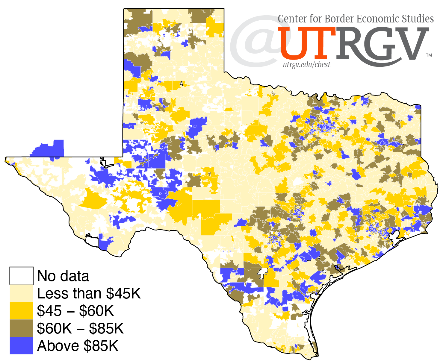
Figure 1: Average PPP loan by zip code
Source: Small Business Administration
The figure also shows that a concentration of above average PPP loans went to Texas largest metros of Austin, Dallas, Houston, and San Antonio. In addition to the metros of Laredo, Corpus Christi, and Beaumont.
Large Metros
Table 2 presents the top 5 lenders in Texas largest metros. The metros are presented in alphabetical order. Austin metro is made up of Bastrop County, Caldwell County, Hays County, Travis County, and Williamson County. The top lender in Austin was Frost Bank, making 4.1 thousand loans with an average face value of $133 thousand. Among the top 5 banks, Horizon Bank, based in Austin, had the higher average at $166 thousand. The top 5 banks made 34% of all loans. The 19 remaining banks headquartered in Austin made an additional 9% of all metro loans. In all, Austin small businesses applied for $5.5 billion to 904 banks.
Table 2: Texas large metros, top 5 PPP lenders by value
Source: Small Business Administration
|
|
Lender |
Home MSA |
Loans (millions) |
Share of MSA loans |
Loan applications (thousands) |
Average loan (thousands) |
Est. revenue (millions) |
|
Austin Metro |
|
|
|
|
|
|
|
|
1 |
Frost Bank |
San Antonio |
$550.1 |
10.0% |
4.1 |
$133.3 |
$20.0 |
|
2 |
JPMorgan Chase Bank |
OH |
$530.5 |
9.6% |
5.5 |
$96.1 |
$19.5 |
|
3 |
Horizon Bank, SSB |
Austin |
$306.0 |
5.6% |
1.8 |
$166.0 |
$11.5 |
|
4 |
Bank of America |
NC |
$240.9 |
4.4% |
4.0 |
$59.8 |
$9.9 |
|
5 |
PNC Bank |
DE |
$224.1 |
4.1% |
1.9 |
$118.1 |
$7.9 |
|
|
Rest of metro banks |
Austin |
$473.0 |
8.6% |
6.9 |
$69.0 |
$18.7 |
|
|
All other banks |
|
$3,179.8 |
57.8% |
46.2 |
$68.9 |
$119.0 |
|
Dallas Metro |
|
|
|
|
|
|
|
|
1 |
JPMorgan Chase Bank |
OH |
$1,705.9 |
8.9% |
18.5 |
$92.4 |
$62.2 |
|
2 |
Frost Bank |
San Antonio |
$1,390.0 |
7.3% |
8.9 |
$156.4 |
$45.8 |
|
3 |
Bank of America |
NC |
$847.9 |
4.4% |
14.7 |
$57.7 |
$33.5 |
|
4 |
PNC Bank |
DE |
$596.7 |
3.1% |
5.3 |
$112.1 |
$20.6 |
|
5 |
Prosperity Bank |
El Campo TX |
$521.3 |
2.7% |
4.6 |
$113.8 |
$18.9 |
|
|
Rest of metro banks |
Dallas |
$5,289.7 |
27.7% |
53.4 |
$99.0 |
$190.0 |
|
|
All other banks |
|
$8,718.5 |
45.7% |
165.5 |
$52.7 |
$324.4 |
|
Houston Metro |
|
|
|
|
|
|
|
|
1 |
JPMorgan Chase Bank |
OH |
$1,521.0 |
8.5% |
17.4 |
$87.7 |
$56.9 |
|
2 |
Zions Bank |
UT |
$1,497.0 |
8.4% |
10.6 |
$141.5 |
$47.3 |
|
3 |
Frost Bank |
San Antonio |
$1,154.0 |
6.5% |
6.6 |
$173.9 |
$37.4 |
|
4 |
Allegiance Bank |
Houston |
$1,010.7 |
5.7% |
9.3 |
$108.5 |
$38.7 |
|
5 |
Bank of America |
NC |
$773.8 |
4.3% |
12.3 |
$62.7 |
$29.3 |
|
|
Rest of metro banks |
Houston |
$2,606.0 |
14.6% |
26.0 |
$100.2 |
$98.1 |
|
|
All other banks |
|
$9,312.7 |
52.1% |
194.8 |
$47.8 |
$353.3 |
|
San Antonio Metro |
|
|
|
|
|
|
|
|
1 |
Frost Bank |
San Antonio |
$988.2 |
22.6% |
7.9 |
$124.7 |
$34.9 |
|
2 |
Broadway National Bank |
San Antonio |
$411.5 |
9.4% |
2.9 |
$142.2 |
$14.5 |
|
3 |
Texas Partners Bank |
San Antonio |
$222.4 |
5.1% |
1.2 |
$184.8 |
$7.6 |
|
4 |
JPMorgan Chase Bank |
OH |
$182.3 |
4.2% |
2.3 |
$80.7 |
$7.1 |
|
5 |
Jefferson Bank |
San Antonio |
$159.1 |
3.6% |
1.2 |
$133.9 |
$6.1 |
|
|
Rest of metro banks |
San Antonio |
$355.4 |
8.1% |
6.8 |
$52.0 |
$14.9 |
|
|
All other banks |
|
$2,053.8 |
47.0% |
38.3 |
$53.6 |
$78.4 |
Dallas metro is made up of Collin County, Dallas County, Denton County, Ellis County, Hood County, Hunt County, Johnson County, Kaufman County, Parker County, Rockwall County, Somervell County, Tarrant County, and Wise County. JP Morgan Chase was the top PPP producer in the Dallas and Houston metros. It was second in Austin and fourth in San Antonio. Dallas top 5 banks do not include a bank headquartered in the metro. Comerica Bank was $19 million short to make the top 5 list. Dallas metro had 62 participating financial institutions that are headquartered there. These banks produced 27.7% of all metro loans worth $5.3 billion. Dallas was the largest destination of PPP loans among the selected metros, worth $19 billion.
Houston metro is made up of Austin County, Brazoria County, Chambers County, Fort Bend County, Galveston County, Harris County, Liberty County, Montgomery County, and Waller County. Houston small businesses applied for $18 billion, 33% of which was produced by the top 5 banks. The remaining 42 financial institutions headquartered in the metro produced $2.6 billion or 14.6% of total. The top home institution, Allegiance Bank, produced $1 billion in loans earning it $38.7 million.
San Antonio metro is made up of Atascosa County, Bandera County, Bexar County, Comal County, Guadalupe County, Kendall County, Medina County, and Wilson County. Of the four metros in table 2, only San Antonio was home to most of its top producers. Frost Bank, Broadway National Bank, Texas Partners Bank, and Jefferson Bank were responsible for 40.7% of all metro loans. These banks also had among the highest average loans compared to top 5 producers at the other metros. For example, Frost Bank average loan was $133 thousand, $156 thousand, $174 thousand, and $125 thousand in the Austin, Dallas, Houston, and San Antonio metro, respectively. The 12th largest producer, Vantage Bank Texas, had the highest average loan among San Antonio based banks at $223 thousand.
South Texas and Border Region
Table 3 presents the top 5 lenders in the Corpus Christi and Border metros. The metros are presented in alphabetical order. The Corpus Christi metro is made up of Aransas County, Nueces County, and San Patricio County. The top 5 lenders in Corpus Christi produced $446 million in PPP loans or 56.7% of total. The 5-remaining metro-based financial institutions made an additional $103 million or 13.1% of total. Texas based banks were responsible for 69.7% of all metro loans. Among metro-based banks, Texas Champion Bank (#8) produced the highest average loan and Navy Army Community CU (#9) produced the lowest average at $125 thousand and $32 thousand, respectively.
El Paso metro is made up of El Paso County and Hudspeth County. El Paso had 248 financial institutions handle 15.7 thousand applications valued at $982.6 million. El Paso based institutions in the top 5 list accounted for 45.8% of all metro loans. The 3-remaining metro-based institutions (FirstLight FCU, El Paso Area Teachers FCU, and El Paso Collaborative for Community & Economic Development) account for an additional 2% of metro loans. The largest loan was made to Pizza Properties Inc. by WestStar Bank for $7.2 million. El Paso had 108 loans with a value over $1 million and 13.6 thousand loans valued under $100 thousand.
Table 3: South Texas and Border Region, top 5 PPP lenders by value
Source: Small Business Administration
|
|
Lender |
Home MSA |
Loans (millions) |
Share of MSA loans |
Loan applications (thousands) |
Average loan (thousands) |
Est. revenue (millions) |
|
Corpus Christi Metro |
|
|
|
|
|
|
|
|
1 |
Frost Bank |
San Antonio |
$149.6 |
19.0% |
1.3 |
$111.3 |
$5.2 |
|
2 |
American Bank |
Corpus Christi |
$135.1 |
17.2% |
1.0 |
$129.0 |
$5.3 |
|
3 |
Prosperity Bank |
El Campo TX |
$72.2 |
9.2% |
0.8 |
$88.3 |
$3.1 |
|
4 |
Kleberg Bank |
Kingsville, TX |
$46.7 |
5.9% |
0.7 |
$68.0 |
$1.9 |
|
5 |
First Community Bank |
Corpus Christi |
$42.7 |
5.4% |
0.5 |
$93.9 |
$1.8 |
|
|
Rest of metro banks |
Corpus Christi |
$103.0 |
13.1% |
1.6 |
$66.0 |
$3.9 |
|
|
All other banks |
|
$238.3 |
30.3% |
4.5 |
$52.9 |
$9.4 |
|
El Paso Metro |
|
|
|
|
|
|
|
|
1 |
WestStar Bank |
El Paso |
$336.2 |
34.2% |
2.6 |
$127.2 |
$12.5 |
|
2 |
JPMorgan Chase Bank |
OH |
$71.1 |
7.2% |
0.9 |
$81.6 |
$2.9 |
|
3 |
United Bank of El Paso del Norte |
El Paso |
$68.7 |
7.0% |
0.6 |
$113.4 |
$3.0 |
|
4 |
Bank of America |
NC |
$55.6 |
5.7% |
1.0 |
$53.0 |
$2.5 |
|
5 |
GECU |
El Paso |
$45.1 |
4.6% |
1.4 |
$32.3 |
$2.0 |
|
|
Rest of metro banks |
El Paso |
$19.2 |
2.0% |
0.6 |
$30.8 |
$0.9 |
|
|
All other banks |
|
$386.7 |
39.4% |
8.5 |
$45.4 |
$16.2 |
|
Laredo Metro |
|
|
|
|
|
|
|
|
1 |
International Bank of Commerce |
Laredo |
$92.9 |
25.0% |
1.3 |
$70.1 |
$4.1 |
|
2 |
Texas Community Bank |
Laredo |
$49.2 |
13.3% |
0.6 |
$81.0 |
$2.2 |
|
3 |
PNC Bank, National Association |
DE |
$45.2 |
12.2% |
0.5 |
$84.1 |
$1.9 |
|
4 |
Vantage Bank Texas |
San Antonio |
$33.2 |
8.9% |
0.1 |
$225.9 |
$1.1 |
|
5 |
Falcon International Bank |
Laredo |
$31.4 |
8.4% |
0.4 |
$74.0 |
$1.2 |
|
|
Rest of metro banks |
Laredo |
$22.4 |
6.0% |
0.3 |
$73.9 |
$1.0 |
|
|
All other banks |
|
$96.8 |
26.1% |
2.7 |
$35.9 |
$4.3 |
|
Rio Grande Valley |
|
|
|
|
|
|
|
|
1 |
Lone Star National Bank |
RGV |
$230.5 |
16.7% |
5.4 |
$42.5 |
$9.7 |
|
2 |
Texas National Bank |
RGV |
$134.7 |
9.8% |
4.5 |
$29.8 |
$5.9 |
|
3 |
Frost Bank |
San Antonio |
$121.6 |
8.8% |
1.4 |
$87.0 |
$4.8 |
|
4 |
Texas Regional Bank |
RGV |
$106.1 |
7.7% |
1.3 |
$78.9 |
$4.5 |
|
5 |
International Bank of Commerce |
Laredo |
$88.3 |
6.4% |
1.6 |
$55.4 |
$3.5 |
|
|
Rest of metro banks |
RGV |
$204.1 |
14.8% |
4.1 |
$49.8 |
$8.8 |
|
|
All other banks |
|
$495.4 |
35.9% |
12.0 |
$41.2 |
$20.5 |
Laredo metro encompasses Webb County. International Bank of Commerce was responsible for a quarter of all Laredo loans. The bank produced 1,325 applications for loans averaging $70 thousand. Distant second was Texas Community Bank producing 13.3% of the $371 million in loans made to metro businesses. The top 5 banks were responsible for 67.9% of metro loans. Vantage Bank Texas had the highest average loan among the top 5 lenders at $226 thousand. The highest loan was made by Falcon International Bank to Border Region Mhmr Community Center for $2.9 million. Laredo had 28 loans with a value over $1 million and 5.2 thousand loans valued under $100 thousand.
The Rio Grande Valley is composed of Cameron County, Hidalgo County, Starr County, and Willacy County. RGV small businesses made 30.4 thousand applications for $1.4 billion in loans to 251 financial institutions. The RGV average loan was for $45.4 thousand, lowest among the 8 metros. Table 3 shows that the top 5 banks were mainly locally headquartered financial institutions. These 5 banks produced half of all loans in the RGV. Lone Star National Bank produced $231 million or 17% of all RGV loans. At distant second came Texas National Bank at $135 million. International Bank of Commerce (Laredo charter) was #5. However, if we add the loans from International Bank of Commerce Brownsville charter (#8) and Zapata charter (#31) to the Laredo charter then this bank would take the #2 spot with $156 million. Adding International Bank of Commerce Oklahoma City charter (#26) brings the holding company’s total to $161 million. Among the RGV’s top 5 banks, Frost Bank had the highest average loan at $87 thousand followed by Texas Regional Bank at $79 thousand.
Wells Fargo Bank made the largest loan in the RGV ($6.2 million) to Texas Visiting Nurse Service of Harlingen. PlainsCapital Bank made the second largest loan to Texas RioGrande Legal Aid of Mercedes for $4.9 million. The RGV had 125 loans with a value over $1 million and 27.7 thousand loans with a value under $100 thousand or 91% of total loans.
Finally, table 4 presents the allocation of loans by industry classification for the metros of Corpus Christi, El Paso, Laredo and the RGV. For reference, the last column shows the allocation for the state. In Corpus Christi, small businesses in the Construction, Health Care and Social Assistance, and Accommodation and Food Service sectors received 40% of loans. The same industries accounted for 43% of loans in El Paso and 45% in the RGV. The largest allocation in Laredo went to Transportation and Warehousing businesses, 29%. In the RGV, Health Care and Social Assistance was allocated 27% of loans.
Table 4: Allocation of South Texas and Border Region PPP loans by industry classification
Source: Small Business Administration
|
Industry |
Corpus Christi |
El Paso |
Laredo |
RGV |
Texas |
|
Mining, Quarrying, and Oil and Gas Extraction |
8.4% |
0.1% |
3.0% |
1.4% |
4.1% |
|
Construction |
14.7% |
12.8% |
5.3% |
7.3% |
12.1% |
|
Manufacturing |
5.2% |
6.2% |
2.1% |
4.0% |
8.4% |
|
Wholesale Trade |
3.5% |
3.9% |
3.7% |
4.1% |
4.6% |
|
Retail Trade |
6.6% |
8.4% |
6.5% |
8.9% |
6.3% |
|
Transportation and Warehousing |
3.9% |
8.9% |
29.4% |
9.6% |
4.8% |
|
Finance and Insurance |
1.4% |
1.8% |
1.3% |
2.1% |
2.1% |
|
Real Estate and Rental and Leasing |
3.6% |
2.7% |
1.4% |
2.3% |
3.1% |
|
Professional, Scientific, and Technical Services |
10.1% |
8.0% |
8.7% |
7.6% |
12.2% |
|
Admin. and Support and Waste Man. and Remediation Ser. |
4.0% |
4.9% |
4.0% |
3.1% |
4.9% |
|
Health Care and Social Assistance |
13.2% |
16.2% |
15.9% |
27.4% |
11.3% |
|
Accommodation and Food Services |
11.8% |
13.4% |
10.0% |
10.7% |
10.5% |
|
Other Services (except Public Administration) |
7.4% |
6.6% |
4.9% |
4.8% |
7.5% |
|
Other industries |
6.3% |
5.9% |
3.7% |
6.8% |
7.8% |
Summary
PPP was likely key in protecting jobs and limiting the risk of closures to Americas’ small businesses from the ongoing health emergency. Texas-based banks played a major role in helping small businesses through this period. The data we present here shows the importance of having vibrant and plentiful financial institutions in every region of the state. Texas banks like Frost Bank, Prosperity Bank, Allegiance Bank, and Comerica Bank played an instrumental role in helping small businesses of all sizes get access to much needed capital. However, the true heroes were regional banks. Places like Corpus Christi, El Paso, Laredo, and the RGV were fortunate to have strong local banks that helped service countless local small businesses. The PPP also provided a significant boost to local banks. For example, the RGV based banks took in half the $58 million in lending revenue tied to RGV based small business borrowing.
____
Dr. Salvador Contreras is Associate Professor of Economics at the University of Texas Rio Grande Valley
Endnotes
Glenn Hubbard & Michael R. Strain, 2020. "Has the Paycheck Protection Program Succeeded?" Brookings Papers on Economic Activity, vol 2020(3), pages 335-390. https://www.brookings.edu/bpea-articles/has-the-paycheck-protection-program-succeeded/
US Small Business Administration, Office of the Inspector General (SBA). 2021.Inspection of SBA's Implementation of the Paycheck Protection Program. Report no. 21-07, January 14.
https://www.sba.gov/sites/default/files/2021-01/SBA%20OIG%20Report-21-07.pdf
Fall 2021 v17, n3
One and a half years since COVID: A look into the Texas employment recovery
Salvador Contreras and Geoffrey Schwarz
A year and a half since the COVID-19 outbreak, the public health crisis continues to pose challenges for labor markets across industries and skill levels. Between the lingering impacts of last year’s economic shutdown and emerging variants of the coronavirus, the long-term effects of the pandemic on the workforce are still uncertain.
In this issue, we follow up on last summer’s Brief, where we reported that the pandemic cost Texas 1.7 million jobs in April of 2020 – disproportionately impacting minorities, women, and low-skilled workers. In this Brief, we survey recent trends in Texas’s economic recovery, focusing on employment numbers at the state and metropolitan statistical area (MSA) levels.
Texas has recovered all the jobs lost from the early months of the pandemic. However, a closer examination of the numbers reveals an uneven economic recovery. We find that individuals from high-income households and college-educated Texans fared the pandemic downturn better than other groups. Jobs for low-skilled workers, low-to-medium income households, and people in the 55-64 age group, on the other hand, remain below pre-pandemic levels.
Job recovery in South Texas and the Border region varied considerably by demographic characteristics and industry. Labor market recovery in the Corpus Christi and Laredo MSAs lagged the rest of the state in nearly every sector and demographic category. Conversely, the Brownsville and Houston MSAs surpassed pre-pandemic employment numbers. The Border's labor market is strongly influenced by the region's dependence on economic activity from Mexico. International supply chain disruptions and pandemic restrictions on travel from Mexico curbed trade and tourism along the border, likely contributing factors to a slow recovery in Manufacturing, Retail and Wholesale, Transportation, IT, and Finance sectors.
The findings presented in this Brief are sourced from the Current Population Survey (CPS), a monthly survey of about 60,000 households conducted by the US Census Bureau. CPS data were smoothed and seasonally adjusted to facilitate month-to-month comparisons and highlight trends. As of this print, the most recent CPS data are from July 2021. All tables and figures presented in this report use July 2019 as a baseline to compare relative gains and losses in statewide employment over the past year and a half.1
Employment by select demographics
Figure 1 illustrates a relatively quick recovery from overall jobs lost to the pandemic for both men and women. The graph shows that employment was on an upward trend, particularly for women, into the first quarter of 2020. By March of that year, female employment was up 3% from July 2019, compared to no change in male employment during the same period. Things changed in April 2020, when female employment dropped to 5% under July 2019 levels. At its lowest point in May 2020, female employment was 9% below July 2019 levels.
Figure 1: Employment index by sex (July 2019 = 100)
Source: Current Population Survey
By October 2020, employment had all but recovered for both men and women – however, it was not until May 2021 that overall employment returned to pre-pandemic levels. Table 1 shows that male and female employment for July 2021 were 2% and 1% above July 2019 levels, respectively.
Table 1: Texas employment, selected characteristics
Source: Current Population Survey
|
|
Index (July 2019 = 100) |
|
Unemployment rate |
|||
|
Characteristics |
July-2020 |
July-2021 |
|
July-2019 |
July-2020 |
July-2021 |
|
Gender |
|
|
|
|
|
|
|
Male |
94.3 |
102 |
|
3.5 |
10.0 |
5.4 |
|
Female |
94.4 |
101.3 |
|
3.8 |
10.7 |
5.3 |
|
Education |
|
|
|
|
|
|
|
High School |
69.6 |
87.1 |
|
5.2 |
16.6 |
12.1 |
|
Some College |
91.3 |
97.5 |
|
3.3 |
11.8 |
4.6 |
|
College |
109.3 |
111 |
|
2.5 |
6.3 |
3.4 |
|
Race |
|
|
|
|
|
|
|
White |
94.9 |
97.4 |
|
2.4 |
7.7 |
4.2 |
|
Asian |
104.5 |
143.4 |
|
0.9 |
10.0 |
2.6 |
|
Black |
87.2 |
102 |
|
5.7 |
16.4 |
8.1 |
|
Hispanic |
92.1 |
98.6 |
|
5.1 |
11.2 |
6.8 |
|
Age group |
|
|
|
|
|
|
|
16-24 |
83.8 |
98.9 |
|
9.1 |
19.2 |
9.8 |
|
25-34 |
90.2 |
105.1 |
|
4.1 |
11.3 |
6.4 |
|
35-44 |
100.8 |
101.1 |
|
1.9 |
7.5 |
3.5 |
|
45-54 |
101.1 |
108.4 |
|
2.8 |
7.5 |
3.9 |
|
55-64 |
87.4 |
88.7 |
|
1.7 |
10.1 |
3.7 |
|
65+ |
109.7 |
113.8 |
|
2.2 |
7.5 |
6.4 |
|
Family income |
|
|
|
|
|
|
|
Under $25,000 |
67.6 |
108.4 |
|
8.7 |
20.8 |
12.9 |
|
$25,000 - 50,000 |
79.5 |
82.6 |
|
3.7 |
12.7 |
7.5 |
|
$50,000 - 75,000 |
85.7 |
96.4 |
|
3.7 |
12.5 |
4.3 |
|
$75,000 and over |
112.5 |
112.5 |
|
2.4 |
6.8 |
3.0 |
|
Total |
94.3 |
101.7 |
|
3.6 |
10.3 |
5.3 |
Figure 2 presents female employment share by industry in July 2019, July 2020, and July 2021. It shows that female employment share increased 2% in the Education and Health Services industry and fell 4% in the Services industry compared to July 2019. Notably, females gained 3% share in the traditionally male-dominated Agriculture, Construction, Mining, and Utilities industry over this period.
Figure 2: Female employment share by industry
Source: Current Population Survey
Figure 3 highlights employment numbers by level of education. The labor market for people with a college degree was practically immune to the pandemic. In April 2020, at the lows in employment for this group, employment was 5% above July 2019 levels.
Jobs for Texans with some college education hit pandemic lows in May 2020 – 15% below July 2019. However, as pandemic restrictions began to ease earlier this year, this group saw steady monthly increases, rebounding to near-2019 levels in July 2021.
Although the labor market for workers with a high school degree showed consistent growth from July 2020 to January 2021, it experienced consecutive losses from February to May 2021, and is currently 13% down from July 2019 levels.
Figure 3: Employment by education level (July 2019 = 100)
Source: Current Population Survey
Figure 4 presents July 2021 employment by race and level of education. Workers of Asian descent experienced the most gains in employment. Blacks and Hispanics with a high school education experienced the biggest loss in employment. College-educated Asian employment exceeded July 2019 levels by 50%. Blacks and Hispanics with a high school education are respectively 36% and 19% below their July 2019 levels. Whites with a high school education and those with a college degree slightly surpassed July 2019 employment levels. However, whites and Hispanics with some college are both 6% below July 2019 levels.
Figure 4: July 2021 employment by race and education (July 2019 = 100)
Source: Current Population Survey
Employment by industry
Figure 5 presents employment levels for the ten largest states. Texas experienced comparatively low overall job loss, and employment figures were resilient throughout the pandemic. Along with Texas, Georgia saw the lowest drop in employment in May 2020. As of July 2021, Florida, Georgia, and Texas were on par with their July 2019 employment levels. The other seven states are within six percent of their July 2019 levels.
Figure 5: Employment by state (July 2019 = 100)
Source: Current Population Survey
Figure 6 shows July 2021 employment figures across industries. With the exception of Manufacturing (-5% from July 2019) and Services (-2% from July 2019), most industrial sectors have recovered the employment lost earlier in the pandemic.
Figure 6: July 2021 employment by industry (July 2019 = 100)
Source: Current Population Survey
Table 1 shows that families earning under $25,000 made the biggest comeback of any group (up 40% from July 2020 levels). However, this group’s current 12.9% unemployment rate is the highest of the income groups. Those with a college degree and workers from households making over $75,000 maintained or slightly improved their employment levels. Groups that have yet to recover from the pandemic job losses include Texans 55-64 of age (down 11% from July 2019) and individuals from families earning $25,000-$50,000 (down 17% from July 2019).
Border region employment
Table 2 shows selected MSAs employment by age and level of education. Smaller MSAs have fewer observations, subjecting the analysis to greater measurement error. The reader should use caution in reading too much into the Brownsville, Corpus Christi, and Laredo MSAs statistics. The Corpus Christi and Laredo MSAs saw significant job losses across age groups. The Local Area Unemployment Statistics Report (https://texaslmi.com/) show that employment in these MSAs is 4% below July 2019 levels. Our estimates reported in the last column of Table 4, have these MSAs 48% and 41% below July 2019 employment levels, respectively.
Table 2: July 2021 age and education employment (July 2019 = 100), selected MSAs
Source: Current Population Survey
|
|
Age group |
|
Education |
||||
|
Metro |
16-34 |
35-54 |
55+ |
|
HS |
Some college |
College |
|
Austin-Round Rock, TX |
107.8 |
103.1 |
98.1 |
|
78.7 |
79.6 |
124.2 |
|
Brownsville-Harlingen, TX |
153.2 |
115.2 |
317.4 |
|
283.2 |
120.7 |
126.9 |
|
Corpus Christi, TX |
26.8 |
93.4 |
53.3 |
|
236.2 |
51.3 |
24.9 |
|
Dallas-Fort Worth-Arlington, TX |
101 |
98.6 |
85.2 |
|
89.5 |
88.5 |
104.8 |
|
El Paso, TX |
74.5 |
103.4 |
127 |
|
48.8 |
96.6 |
118 |
|
Houston-Baytown-Sugar Land, TX |
110.8 |
121.4 |
92.7 |
|
84.8 |
107.6 |
124.9 |
|
Laredo, TX |
51.5 |
54.1 |
87.8 |
|
78.3 |
30.3 |
85.3 |
|
McAllen-Edinburg-Pharr, TX |
90.1 |
104.7 |
141.6 |
|
94 |
112.8 |
104.8 |
|
San Antonio, TX |
76.4 |
110 |
97.2 |
|
50.1 |
89.7 |
111.5 |
The Austin, El Paso, Houston, and San Antonio MSAs posted the biggest gains in employment for those with a college degree. In the El Paso, McAllen, and San Antonio MSAs, individuals 55 and older saw a more robust recovery in employment than younger workers. This could indicate that older Texans took up some of the slack in the labor market left by low-wage workers.
Table 3 presents employment levels for sex, income, and employment status. The Brownsville and McAllen MSAs saw the highest gains from individuals in families earning less than $50,000. Female employment grew most in the Austin, El Paso, and McAllen MSAs. Male employment in these MSAs, meanwhile, remains below July 2019 levels.
Table 3: July 2021 sex, income, and employment status employment (July 2019 = 100), selected MSAs
Source: Current Population Survey
|
|
Sex |
|
Family income |
|
Employment status |
|||
|
Metro |
Male |
Female |
|
Under $50K |
$50K + |
|
Full-time |
Part-time |
|
Austin-Round Rock, TX |
94.3 |
116.7 |
|
77.6 |
111.6 |
|
99.7 |
116.2 |
|
Brownsville-Harlingen, TX |
239.5 |
101.8 |
|
237.3 |
109.2 |
|
140 |
256.3 |
|
Corpus Christi, TX |
60.4 |
34.9 |
|
30.6 |
56.1 |
|
40.2 |
66.9 |
|
Dallas-Fort Worth-Arlington, TX |
99.5 |
93.2 |
|
76.2 |
104.3 |
|
98.7 |
86.3 |
|
El Paso, TX |
80.8 |
113.7 |
|
53.4 |
150.5 |
|
87.6 |
119.6 |
|
Houston-Baytown-Sugar Land, TX |
107.7 |
116 |
|
111.8 |
111.2 |
|
111.9 |
108.7 |
|
Laredo, TX |
63 |
54.5 |
|
67.6 |
57.9 |
|
81.6 |
27.9 |
|
McAllen-Edinburg-Pharr, TX |
86.2 |
121.2 |
|
134.8 |
71.2 |
|
94.5 |
124 |
|
San Antonio, TX |
98.7 |
89.7 |
|
70.1 |
104.5 |
|
93.3 |
98.5 |
The last two columns of Table 3 highlight employment levels by full and part-time status. We observe that part-time employment had large gains in the Austin, Brownsville, El Paso, Houston, and McAllen MSAs. In the case of the El Paso and McAllen MSAs, it may suggest a substitution in favor of the underemployed.
Table 4 presents employment by industry. The table shows that jobs in the Education and Health Services sector climbed in the Austin, El Paso, Houston, and McAllen MSAs. Manufacturing, Retail and Wholesale, and Transportation, IT, and Finance industries are down in the Laredo and McAllen MSAs. International supply chain disruptions and pandemic restrictions on international travel have likely slowed economic activity in the Border region.
Trade of goods through the Border region’s ports and retail sales figures support the idea that limited cross-border economic activity is hurting employment. The inflation-adjusted value of total trade (exports plus imports) with Mexico in the second quarter of 2021 through the ports of El Paso and Laredo are down 72% and 2%, respectively, compared to 2019. The ports of Hidalgo and Brownsville saw a gain of 2% and 7%, respectively.
Further evidence of Laredo’s underperformance can be seen in retail sales. Cameron, El Paso, and Hidalgo County saw price adjusted retail sales growth of about 20% in the second quarter of 2021 compared to 2019. Webb County had sales growth of 8%.
Laredo’s relative low growth in retail sales and negative growth in trade-flows support the weak employment figures reported here. Cameron County had the highest gain in retail sales and trade-flows among Border counties. These are consistent with the relatively large increase in Brownsville MSA employment relative to the other Border MSAs.
Table 4: July 2021 industry employment (July 2019 = 100), selected MSAs
Source: Current Population Survey
|
Metro |
Manufacturing |
Retail and Wholesale |
Agriculture, Construction, Mining, and Utilities |
Transportation, IT, and Finance |
Education and Health Services |
Services |
|
Total |
|
Austin-Round Rock, TX |
115.2 |
91.8 |
67.5 |
150.4 |
128.7 |
83.2 |
|
103.7 |
|
Brownsville-Harlingen, TX |
80.5 |
225.9 |
548 |
159 |
69.3 |
153.8 |
|
156.3 |
|
Corpus Christi, TX |
|
57.8 |
97.7 |
172.5 |
48.5 |
37.6 |
|
51.5 |
|
Dallas-Fort Worth-Arlington, TX |
101.6 |
93.3 |
86.8 |
115.9 |
91.2 |
92.1 |
|
95.1 |
|
El Paso, TX |
43.6 |
159.1 |
30.5 |
204 |
164.6 |
52.1 |
|
95.4 |
|
Houston-Baytown-Sugar Land, TX |
100.5 |
103 |
104.2 |
132.7 |
121.7 |
104.1 |
|
112.8 |
|
Laredo, TX |
|
34.7 |
|
80.4 |
44.7 |
71.7 |
|
58.7 |
|
McAllen-Edinburg-Pharr, TX |
82.4 |
76.9 |
132 |
36.4 |
131.7 |
131.6 |
|
99.1 |
|
San Antonio, TX |
118.6 |
97.5 |
83.3 |
64.3 |
87.8 |
118.7 |
|
94.6 |
Summary
This report uses the Current Population Survey (CPS) to explore Texas and MSA-level employment trends one and a half years after the start of the COVID-19 pandemic. Although Texas employment has returned to pre-pandemic levels, CPS data suggests that the recovery has been uneven – disproportionately impacting black and Hispanic low-skilled workers, low-to-medium income households, and Texans in the 55-64 age group. On the Border region, the Brownsville MSA had strong employment gains. The McAllen and El Paso MSAs have all but return to pre-pandemic levels. While, the Laredo MSA has yet to fully recover. Overall, employment trends provide reason for optimism.
____
Dr. Salvador Contreras is Associate Professor of Economics at the University of Texas Rio Grande Valley
Geoffrey Schwarz is an Institutional Research Analyst at South Texas College
Endnotes
1. Flood, S., King, M., Rodgers, R., Ruggles, S., and Warren, J. R. (2020). Integrated Public Use Microdata Series, Current Population Survey: Version 8.0 [dataset]. Minneapolis, MN: IPUMS. https://doi.org/10.18128/D030.V8.0
Summer 2020 v16, n2
April’s toll on Texas
Salvador Contreras and Rogelio Sáenz
The last couple of months have brought major devastation to the nation’s workforce. The employment debacle is apparent in the Bureau of Labor Statistics (BLS) recently released employment figures for April. The BLS report showed that the US unemployment rate rose from 4.4% in March to 14.7% in April. The tripling of the unemployment rate was driven by job losses in practically all industries. Stay-at-home orders saw teachers, cashiers, machine operators, dishwashers, dentists, and many others lose their sources of income. While at the end of February there were 2 million persons who filed continued claims for unemployment insurance, the total shot up to 22 million by the end of April. In Texas, the volume of continued claims soared nearly nine-fold from 125,000 to 1.1 million in the same time period.
In this issue we focus on April’s toll on Texas. Given the gravity of the situation and the need for targeted policy response, we analyze the April 2020 Current Population Survey (CPS) to understand who has been affected and to what degree. We show that no group has been spared, as every group and most industries were negatively impacted.
However, there are important differences to note. Black and Hispanic Texans saw larger declines in employment when compared to Whites. Women saw almost twice the declines in employment versus men. In particular, Black and Hispanic women saw the largest declines. Further, Texas’ younger workers alongside those with lower levels of education and income experienced the most severe employment declines.
We show that the Rio Grande Valley had the largest percent decline in employment among large Texas metros. However, the data suggest that when official unemployment figures come out, the Houston metro will have the state’s highest jobless rate, followed by the Rio Grande Valley. An interesting side note is that in our Fall 2019 issue, we show that these two metros had the state’s highest level of income inequality.
Texas employment
The Bureau of Labor Statistics uses the Current Population Survey (CPS, a household survey) and the Current Employment Statistics survey (a business establishment survey) to construct its monthly employment report. Here, we only use the former—the CPS household survey. In addition, there is no attempt to adjust for seasonal factors or other noise in the data. The reader should use caution in reading too much into levels, particularly when the unit of analysis is small, like metros. Instead, the reader should focus more on drawing conclusions from relative differences. We use the CPS data extracted from the Integrated Public Use Microdata Series.1
Figure 1: Texas frontline industry employment change, March to April 2020
Source: Current Population Survey
Figure 1 presents the percent change in April 2020 employment compared to the previous month (March 2020) for Texas. We first present employment trends for frontline workers. We draw here on a recent report from researchers at Center for Economic and Policy Research (CEPR) that provides a demographic profile of frontline industries in the COVID-19 pandemic.2 These industries include supermarket stockers, nurses, farmworkers, truck drivers, among others. We use the CEPR studies’ industry definitions and present the six broad categories that represent frontline workers.
In Texas, over the last month—March to April 2020—employment declined in three frontline industrial sectors: public transit; healthcare; and childcare, homeless, food, and family services employment. While seeing gains in building cleaning services. Overall, Texas saw a loss of upwards of 91,000 frontline industry jobs, fueled by losses of 87,000 jobs in healthcare and 19,000 in childcare, homeless, food, and family services. On this front, Texas did better, the US saw a 9% drop in frontline employment compared to Texas 4%.
Table 1: Texas essential industry employment change, March to April 2020
Source: Current Population Survey
|
|
vs March |
|
|
Essential industry |
% change |
employment change |
|
Social workers |
-8% |
-9,450 |
|
Healthcare |
-10% |
-135,324 |
|
Critical retail |
1% |
3,608 |
|
Medical supplies |
9% |
3,207 |
|
Food processing |
14% |
12,039 |
|
Delivery, warehousing |
4% |
8,400 |
|
IT, communications |
-6% |
-3,799 |
|
Utility workers |
-16% |
-212,876 |
|
Farmers |
6% |
6,257 |
|
Hazardous materials |
3% |
1,010 |
|
Law enforcement |
29% |
62,862 |
|
Transit, transportation |
-13% |
-92,032 |
|
Defense |
-41% |
-26,769 |
|
Resource extraction |
-11% |
-31,003 |
|
Critical Manufacturing |
-25% |
-81,734 |
|
Financial services |
-7% |
-46,698 |
|
Total |
-9% |
-542,301 |
Table 1 presents employment in essential industries. These are broader than frontline industries in that it includes other non-consumer facing industries such as resource extraction, food and drug manufacturing. In a recent report Adie Tomer and Joseph W. Kane from Brookings describe the Department of Homeland Security (DHS) designated list of essential infrastructure workers.3 We follow the Brookings report in constructing these essential industries. Table 1 shows across-the-board losses in employment in Texas. However, the largest job declines over the last month in Texas occurred in four industries: utilities (-213,000), health care (-135,000), transportation (-92,000), and critical manufacturing (-82,000). Other industries taking major hits in employment include the financial services (-47,000), resource extraction (-31,000), and defense (-27,000) industries. Overall, Texas lost more than half a million essential industry jobs.
Table 2: Texas employment change, selected characteristics, March to April, 2020
Source: Current Population Survey
|
|
vs March |
|
|
|
|
|
|
|
|
|
|
|
|
|
|
|
Selected characteristics |
% change |
employment change |
|
|
|
|
|
|
|
|
|
|
|
|
|
|
Full/part-time status |
|
|
|
|
|
|
|
|
|
|
|
|
|
|
|
|
Full-time |
-13% |
-1,371,958 |
|
|
|
|
|
|
|
|
|
|
|
|
|
|
Part-time |
-12% |
-340,276 |
|
|
|
|
|
|
|
|
|
|
|
|
|
|
|
|
|
|
|
|
|
|
|
|
|
|
|
|
|
|
|
Race/ethnicity |
|
|
|
|
|
|
|
|
|
|
|
|
|
|
|
|
White |
-10% |
-605,222 |
|
|
|
|
|
|
|
|
|
|
|
|
|
|
Asian |
-12% |
-100,490 |
|
|
|
|
|
|
|
|
|
|
|
|
|
|
Black |
-14% |
-211,735 |
|
|
|
|
|
|
|
|
|
|
|
|
|
|
Hispanic |
-15% |
-743,756 |
|
|
|
|
|
|
|
|
|
|
|
|
|
|
Other |
-18% |
-51,031 |
|
|
|
|
|
|
|
|
|
|
|
|
|
|
|
|
|
|
|
|
|
|
|
|
|
|
|
|
|
|
|
Education |
|
|
|
|
|
|
|
|
|
|
|
|
|
|
|
|
HS |
-18% |
-279,180 |
|
|
|
|
|
|
|
|
|
|
|
|
|
|
Some college |
-20% |
-767,243 |
|
|
|
|
|
|
|
|
|
|
|
|
|
|
College |
-2% |
-66,872 |
|
|
|
|
|
|
|
|
|
|
|
|
|
|
Advanced |
-3% |
-42,757 |
|
|
|
|
|
|
|
|
|
|
|
|
|
|
|
|
|
|
|
|
|
|
|
|
|
|
|
|
|
|
|
Gender |
|
|
|
|
|
|
|
|
|
|
|
|
|
|
|
|
Male |
-9% |
-694,169 |
|
|
|
|
|
|
|
|
|
|
|
|
|
|
Female |
-16% |
-1,018,065 |
|
|
|
|
|
|
|
|
|
|
|
|
|
|
|
|
|
|
|
|
|
|
|
|
|
|
|
|
|
|
|
Age group |
|
|
|
|
|
|
|
|
|
|
|
|
|
|
|
|
16-24 |
-15% |
-231,400 |
|
|
|
|
|
|
|
|
|
|
|
|
|
|
25-34 |
-20% |
-636,173 |
|
|
|
|
|
|
|
|
|
|
|
|
|
|
35-44 |
-5% |
-147,236 |
|
|
|
|
|
|
|
|
|
|
|
|
|
|
45-54 |
-12% |
-316,686 |
|
|
|
|
|
|
|
|
|
|
|
|
|
|
55-64 |
-14% |
-300,989 |
|
|
|
|
|
|
|
|
|
|
|
|
|
|
65+ |
-10% |
-76,644 |
|
|
|
|
|
|
|
|
|
|
|
|
|
|
|
|
|
|
|
|
|
|
|
|
|
|
|
|
|
|
|
Family income |
|
|
|
|
|
|
|
|
|
|
|
|
|
|
|
|
Under $25,000 |
-31% |
-438,292 |
|
|
|
|
|
|
|
|
|
|
|
|
|
|
$25,000 - 50,000 |
-24% |
-703,683 |
|
|
|
|
|
|
|
|
|
|
|
|
|
|
$50,000 - 75,000 |
-13% |
-350,987 |
|
|
|
|
|
|
|
|
|
|
|
|
|
|
$75,000 and over |
-3% |
-219,273 |
|
|
|
|
|
|
|
|
|
|
|
|
|
|
|
|
|
|
|
|
|
|
|
|
|
|
|
|
|
|
|
Total |
-13% |
-1,712,233 |
|
|
|
|
|
|
|
|
|
|
|
|
|
Table 2 examines six characteristics of all Texas workers and the extent to which their employment has been affected more directly by the Covid-19 outbreak over the last month. The analysis shows that the state’s full-time and part-time workers have been hit at a similar level (13% and 12%, respectively). Among the state’s racial and ethnic groups, Hispanic (-744,000), White (-605,000), and Black (-212,000) workers have lost the largest number of jobs over the last month. However, in a relative sense, Hispanics (-15%) and Blacks (-14%) have lost jobs at a faster rate than Whites (-10%) and Asians (-12%). Furthermore, job losses are almost exclusively concentrated among workers with a high school degree (or less) and some college (including vocational and Associate’s degrees). Similarly, women (-16%) lost their jobs at almost twice the rate of that of men (-9%) between March and April. Moreover, while nationally the young and old saw the largest employment declines, in Texas the declines were broadly shared across age groups. However, 25-34-year-olds saw employment decline by nearly 640,000 between March and April. Finally, the table shows that employment losses were more prevalent in poorer households (under $25,000, -31% job loss; and $25,000-$49,999, -24%). As a whole, then, Texas lost slightly more than 1.7 million jobs, at a clip of 13%, between March and April.
Racial/ethnic differences
Next, we tease out differences by race/ethnicity. Figure 2 shows statewide employment change by race and a broader measure of industry. We use a broader industry because some groups may not be properly captured by a narrower category of industry. The analysis shows that declines in manufacturing were mostly observed among Blacks and Hispanics, losing a combined 116,000 jobs or a decline of 43% and 18%, respectively. Whites had the largest employment losses in retail and wholesale and services. Overall, Hispanics were on net the largest employment losers in April, dropping three quarters of a million jobs.

Figure 2: Texas employment change for broad industries by race, March to April 2020
Source: Current Population Survey
Females saw declines twice as large as males. Hispanic women in particular saw a 21% decline in employment. Figure 3 shows employment change of males and females by education and race. White women and Black men with a high school education or less had the largest percent declines in employment. However, the largest level of job declines was among those with some college education. Hispanic and Black women with some college saw a quarter of their jobs eliminated. Finally, Hispanic men and women experienced the highest declines in employment among those with a college degree. This is in contrast to Table 2 that shows that in general this group suffered the least.
Figure 3: Texas employment change by sex, race and education, March to April 2020
Source: Current Population Survey
Regional differences
Table 3 presents March-to-April change in employment for selected Texas metros. The Rio Grande Valley (Cameron and Hidalgo County) sustained the largest percentage decline in employment, losing a little bit over one-fifth (-21%) of workers in the last month. The Rio Grande Valley lost jobs in every broad industry category except retail and wholesale. The Rio Grande Valley experienced the largest declines in construction, mining, and utilities (-73%), manufacturing (-59%), transportation, IT, and finance (-40%), and services (-17%). El Paso, on the other hand, saw an increase of 58% in manufacturing. A bit of background on the differences in these two border areas: the Rio Grande Valley saw a decline of 59% in manufacturing, but manufacturing is two times the share of El Paso employment compared to the Rio Grande Valley (see our Winter 2019 issue). The increase in this sector plus retail and wholesale and transportation, IT, and finance helps to explain the relatively small effect in El Paso’s total employment loss.
Table 3: April 2020 one-month change in employment, selected metros
Source: Current Population Survey
|
|
Rio Grande Valley |
|
El Paso |
|
San Antonio |
|
Houston-Baytown-Sugar Land |
|
Dallas-Fort Worth-Arlington |
|
Austin-Round Rock |
|
|
% change |
|
% change |
|
% change |
|
% change |
|
% change |
|
% change |
|
Broad industry |
|
|
|
|
|
|
|
|
|
|
|
|
Manufacturing |
-59% |
|
58% |
|
29% |
|
-12% |
|
-33% |
|
-13% |
|
Retail and Wholesale |
9% |
|
9% |
|
-29% |
|
-27% |
|
-20% |
|
-2% |
|
Agriculture, Construction, Mining, and Utilities |
-73% |
|
-21% |
|
12% |
|
-9% |
|
-19% |
|
27% |
|
Transportation, IT, and Finance |
-40% |
|
10% |
|
-20% |
|
14% |
|
-9% |
|
33% |
|
Education and Health Services |
-8% |
|
-11% |
|
-7% |
|
-4% |
|
-11% |
|
-23% |
|
Services |
-17% |
|
4% |
|
-33% |
|
-8% |
|
-17% |
|
-30% |
|
Total |
-21% |
|
-3% |
|
-15% |
|
-8% |
|
-17% |
|
-12% |
|
|
|
|
|
|
|
|
|
|
|
|
|
|
Full/part-time status |
|
|
|
|
|
|
|
|
|
|
|
|
Full-time |
-21% |
|
0% |
|
-20% |
|
-5% |
|
-14% |
|
-14% |
|
Part-time |
-21% |
|
-15% |
|
2% |
|
-11% |
|
-20% |
|
-18% |
|
|
|
|
|
|
|
|
|
|
|
|
|
|
Education |
|
|
|
|
|
|
|
|
|
|
|
|
HS |
-16% |
|
-18% |
|
35% |
|
-24% |
|
-9% |
|
-21% |
|
Some college |
16% |
|
-19% |
|
-20% |
|
-17% |
|
-20% |
|
-27% |
|
College |
-28% |
|
3% |
|
-8% |
|
15% |
|
-10% |
|
-6% |
|
|
|
|
|
|
|
|
|
|
|
|
|
|
Gender |
|
|
|
|
|
|
|
|
|
|
|
|
Male |
-23% |
|
-1% |
|
-11% |
|
-1% |
|
-12% |
|
-13% |
|
Female |
-19% |
|
-5% |
|
-19% |
|
-13% |
|
-19% |
|
-18% |
|
|
|
|
|
|
|
|
|
|
|
|
|
|
Age group |
|
|
|
|
|
|
|
|
|
|
|
|
16-34 |
-28% |
|
-1% |
|
-43% |
|
-2% |
|
-16% |
|
-27% |
|
35-54 |
-20% |
|
-16% |
|
8% |
|
-3% |
|
-14% |
|
18% |
|
55+ |
-4% |
|
31% |
|
-12% |
|
-19% |
|
-15% |
|
-28% |
|
|
|
|
|
|
|
|
|
|
|
|
|
|
Family income |
|
|
|
|
|
|
|
|
|
|
|
|
Under $50,000 |
-36% |
|
5% |
|
-37% |
|
-26% |
|
-24% |
|
-35% |
|
$50,000 and over |
0% |
|
-11% |
|
-4% |
|
2% |
|
-11% |
|
-9% |
|
|
|
|
|
|
|
|
|
|
|
|
|
|
Total |
-21% |
|
-3% |
|
-15% |
|
-7% |
|
-15% |
|
-15% |
Further, most jobs lost in El Paso are predominantly among part-time workers. However, in the Rio Grande Valley, one in five full-time and part-time employees became separated from their job. Still, overall across metro areas, part-time workers were the hardest hit, except in San Antonio.
While employment loss appears to be uniform across education levels, it is interesting to note that the highly educated in the Rio Grande Valley saw the largest declines in employment. This is consistent with our Spring 2020 issue that shows that young high-skilled workers in the Rio Grande Valley are under-employed/paid and, therefore, far more vulnerable to economic shocks.
All metros saw women suffer more job loss compared to men, except in the Rio Grande Valley. Women in El Paso and Houston, in particular, sustained almost all job losses between March and April 2020. Across metro areas, younger workers fared worse. A notable exception is Houston where persons 55 and older accounted for most of the job declines. Finally, those who lost their jobs in April were disproportionately among people with family incomes less than $50,000, with El Paso being the exception. Overall, the Rio Grande Valley saw a 21% decline in employment followed by Dallas-Fort Worth-Arlington (-17%), San Antonio (-15%), and Austin-Round Rock (-12%).
Figure 4 shows the unemployment rate for March and April in the selected metros. As noted earlier, these figures are different from what is reported in the official employment numbers. This rate likely over-estimates the true rate by around 1%. For example, the official non-adjusted Houston metro March rate is 5.1% compared to our 6.2% estimate. However, it provides some perspective to the economic fallout of this crisis. The data suggest that the Houston metro will likely have the highest unemployment rate of 16.3%, compared to 6.2% in March. The Rio Grande Valley is expected to have the second highest unemployment rate, followed by Austin and San Antonio. El Paso is expected to have the lowest unemployment rate at around 10%.

Figure 4: Unemployment rate, selected metros, March and April 2020
Source: Current Population Survey
Summary
We presented statistics that provide an indication that Texas was not spared from the job carnage seen across the nation. The recent Bureau of Labor Statistics report shows that Texas had an unemployment rate of 12.8% and a loss of 2 million jobs in April. Texas saw declines in employment that are consistent with national trends. However, in Texas, job losses have not been uniform. People who have disproportionately lost their jobs include people of color (Blacks and Hispanics), women, people with lower levels of education, and people with the lowest income levels. The employment reports that will be coming out in the coming months are likely to disappoint those who expect a quick recovery of lost jobs. After all, weekly jobless claims continue to suggest high job losses, albeit a declining trend. The Commerce Department reported a decline in retail sales of 16.4% for April and the Federal Reserve reported an April contraction in industrial production of 11.2%. Things are likely to remain bleak for, most optimistically, a few more months, but, more realistically, years into the future. In the meantime, Texas must come to grips with the human toll and its disproportionate impact on its most vulnerable people.
____
Dr. Salvador Contreras is Associate Professor of Economics at the University of Texas Rio Grande Valley
Dr. Rogelio Sáenz is Professor of Demography at the University of Texas San Antonio
Endnotes
1. Flood, S., King, M., Rodgers, R., Ruggles, S., and Warren, J. R. (2020). Integrated Public Use Microdata Series, Current Population Survey: Version 7.0 [dataset]. Minneapolis, MN: IPUMS. https://doi.org/10.18128/D030.V7.0
2. Rho, H. J., Brown, H. and Fremstad, S. (April 2020). A Basic Demographic Profile of Workers in Frontline Industries. Center for Economic and Policy Research. Retrieved from https://cepr.net/a-basic-demographic-profile-of-workers-in-frontline-industries/
3. Tomer, A. and Kane, J. W. (March 2020). How to protect essential workers during COVID-19. Brookings. Retrieved from https://www.brookings.edu/research/how-to-protect-essential-workers-during-covid-19/
Spring 2020 v16, n1
Texans in their twenties: a window into the state’s future
by Salvador Contreras
The future of Texas depends in part in its ability to educate and train its young. So, what is the state’s grade on this; is it sufficient to be competitive? Moreover, the ongoing COVID-19 pandemic raises the likelihood that the Legislature will enter the next biennium with either a hole in its budget or lowered revenue projections. A recent report by R. G. Ratcliffe suggests such a scenario (see endnote). State response to recent downturns have involved cuts to education. Arguably an important tool to advance labor force competitiveness.
The aim of this brief is to describe the stock of Texas young and high skilled labor force. Texas is in a race with other states and countries to attract the best paying jobs. To seriously compete one requires a labor force that is well trained and in large supply. We were given a sense of how competitive the state was when Amazon decided against Texas and chose New York and Virginia for its second headquarters in 2018. Amazon chose the states with the 3rd and 5th largest share of high skilled millennials over 13th Texas of 15 most populous states. Why does Texas rank so low among large states?
One potential reason is the large degree of inequality in resources and opportunities that exist in the state (see our Fall 2019 issue on inequality). A recent report by Dolores Acevedo-Garcia and coauthors (see endnote) show that the McAllen-Edinburg-Mission and El Paso Metro have among the lowest scores on their child opportunity index. Specifically, they score 3rd and 8th lowest among 100 large metros. The child opportunity index ranks neighborhoods on factors like quality of early education, number of adults with high-skills jobs, poverty, air pollution levels, and healthy food outlets. Based on their data, Austin-Round Rock and Dallas-Fort Worth-Arlington Metros had the highest scores in the state. However, all Texas metros except Austin-Round Rock is below 50 on the list of 100 metros. Higher scores are associated with better later in life outcomes like economic mobility. It appears that most Texas children live in neighborhoods with below average opportunities.
This report focuses on Texans in their 20s (20-29). Also known as vicenarians. We begin by showing historical trends in educational outcomes and describe wage premiums. Then, we evaluate regional differences in outcomes. We show that earnings of high-skill young depend greatly on local economic opportunities. We propose that the uneven development across the state hurts the average Texan and makes the state less competitive in attracting well-paying industries.
Skill stock
One way to observe the State’s competitiveness is through educational attainment. Figure 1 presents the share of vicenarians with an associate’s (only) and bachelor’s degree from 2006-2018. In this 12-year period, Texas had almost no growth in the share of vicenarians with associate’s or vocational degrees. In 2018, 7% held a two-year degree, up from 6% in 2006. However, the state has seen a steady increase in the share of four-year degrees over the 12-year period. In 2018, 22% held a bachelor’s degree, up from 16% in 2006.
Figure 1 also shows the share of those with some postsecondary education (PSE) not enrolled in school. This is mostly flat. In 2018, 18% of vicenarians who at some point took college courses were no longer enrolled in school. In 2018, roughly half of vicenarians are accounted for by these three categories. Another 43% have some postsecondary education and are enrolled in school.

Figure 1: Texas share of vicenarians with a degree, 2006-2018
Source: American Community Survey
Figure 2 presents the average earnings of vicenarians in the labor force by education level. Those with only a high school degree earn $24,000. Adding some postsecondary education and not in school earn $4,000 more. For those not in school, a two-year degree adds $4,000 or $8,000 over high school degree. However, the figure shows that there is no beating a four-year college degree. Those not pursuing further education with a bachelor’s degree earn an average $49,000 or $17,000 premium over a two-year degree or 2 times that of only high school. It comes to no surprise that in figure 1 we observe a very small share of Texans with a two-year degree. If earnings are important, a four-year college degree is the way to go.
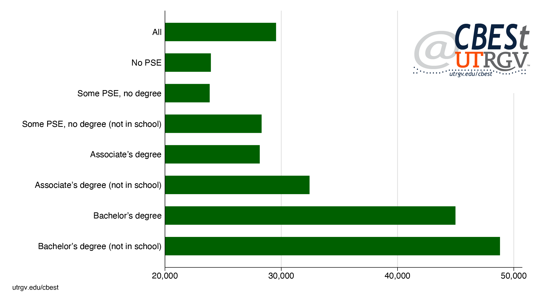
Figure 2: Texas vicenarians in the labor force average earnings, 2018
Source: American Community Survey
Regional variation
Figure 1 tells us that a bit over 1 in 5 hold a four-year degree and figure 2 that they enjoy a large premium over all other educational categories. Given the large premium in earnings, one expects a larger share with college degrees. What’s missing? Two possible answers: not enough capacity to educate more or there is a demand problem. We focus on the latter. We argue that state averages mask the influence local labor markets have over demand for a college degree.
Figure 3 shows the average 2018 earnings of vicenarians with a bachelor’s degree who are not enrolled in school by metro. Notice the large variation in earnings. The average vicenarian in Midland earns 75% more than the college graduate in McAllen-Edinburg-Mission Metro. In fact, the 3rd and 8th worst scoring metros in the child opportunity index (discussed in the introduction) have the worst earnings outcomes. More in general, the border region observes a steep discount to a college degree relative to the rest of Texas. Along with Waco Metro.
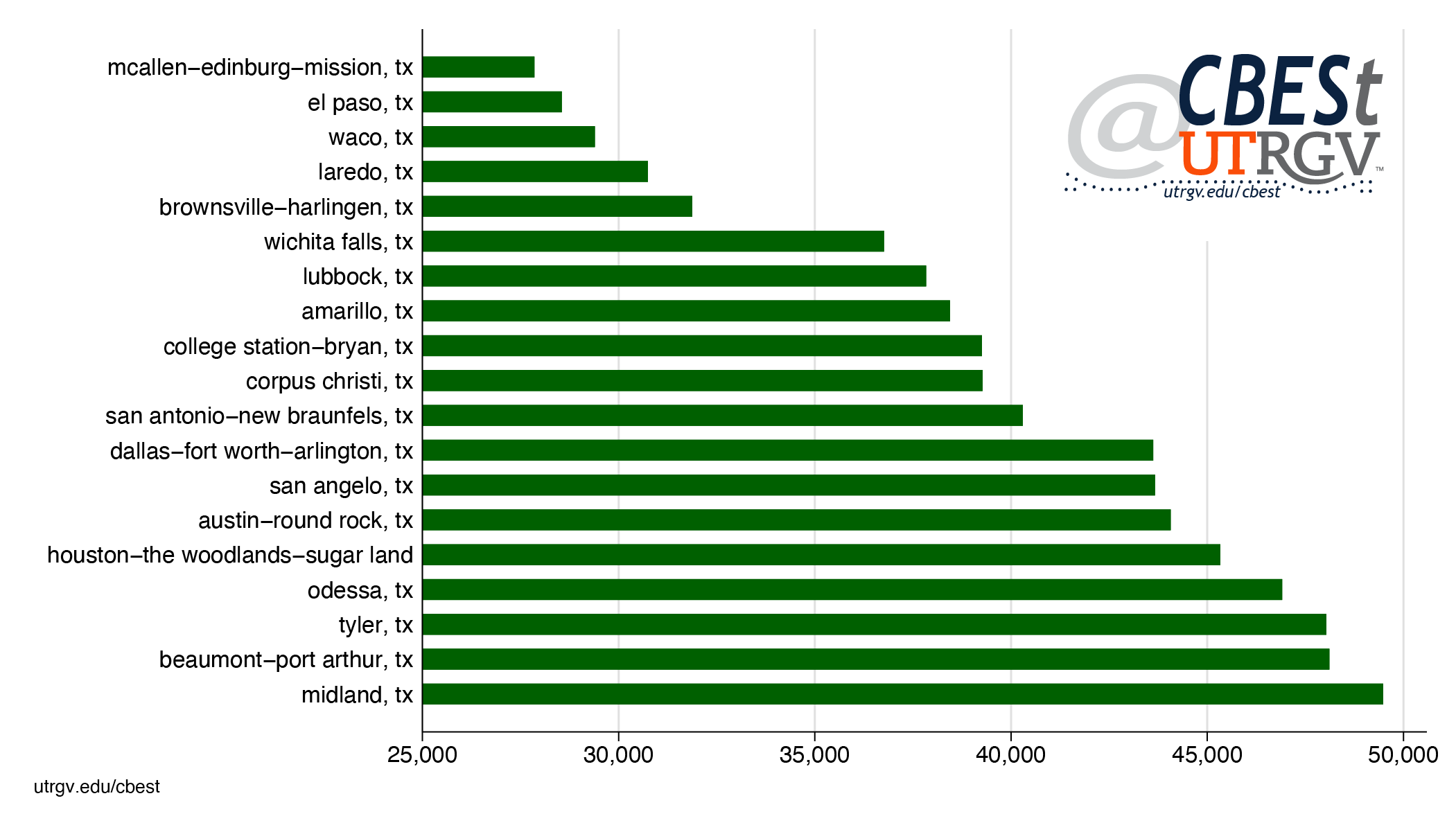
Figure 3: Texas vicenarians with bachelor’s degree (not in school) average earnings by metro, 2018
Source: American Community Survey
Figure 4 shows the relationship between college wage premium and the share enrolled in school. For example, Beaumont-Port Arthur Metro vicenarians with a college degree, in the labor force and not in school, earn 2.2 times more than those who have some postsecondary education, no degree, not in school (y-axis). In El Paso Metro, 31% of vicenarians are in school (x-axis). We exclude Lubbock and College Station-Bryan Metro. Including them makes the trendline positive. The trendline is statistically insignificant in either case. This suggests a weak relationship between college wage premiums and the incentive to be enrolled in school. Other factors are driving the demand for postsecondary education.
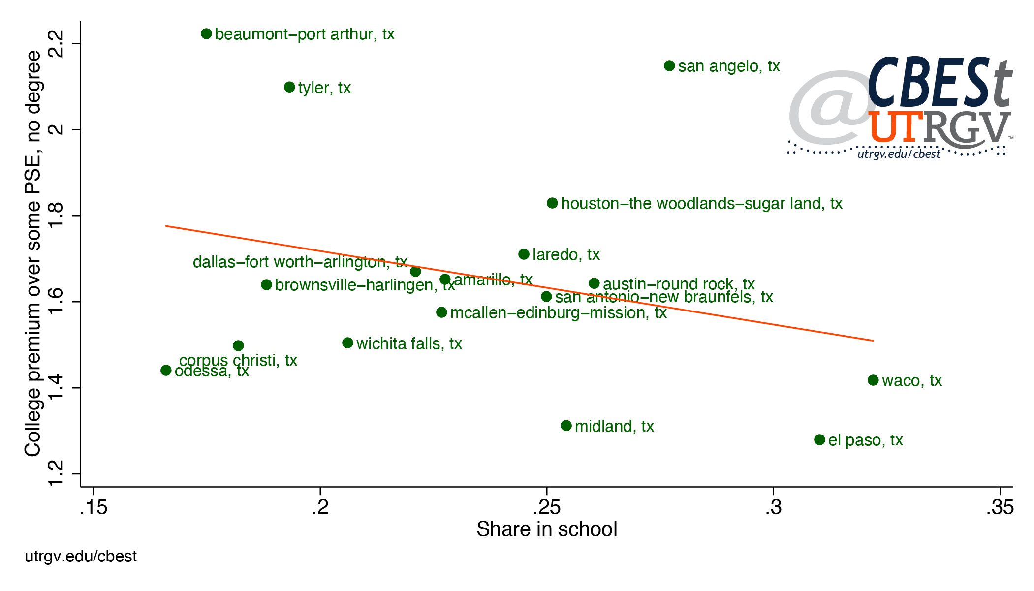
Figure 4: Texas vicenarians college premium and share in school, 2018
Source: American Community Survey
An important factor influencing demand for postsecondary education is economic opportunities in the metro. To illustrate this point, figure 5 presents the relationship between median first-year earnings after college graduation and median earnings in the metro where the college is headquartered. College data is for public institutions with at least 400 earners. Earnings exclude graduate degrees. For example, median earnings in the first full year after completing a degree at The University of Texas at Arlington is $51,000 (y-axis). The University of Texas Rio Grande Valley and South Texas College are in a metro where the median 25 to 65-year-old in the labor force earns $25,000 (x-axis). The figure shows a positive relationship between earnings one year after graduation and the general earnings power in the metro. The slope suggests that every $1,000 in metro earnings is associated with $500 in first-year earnings. The association is the same if we exclude community colleges. This suggests a strong correlation between local economic conditions and the labor market new graduates face.
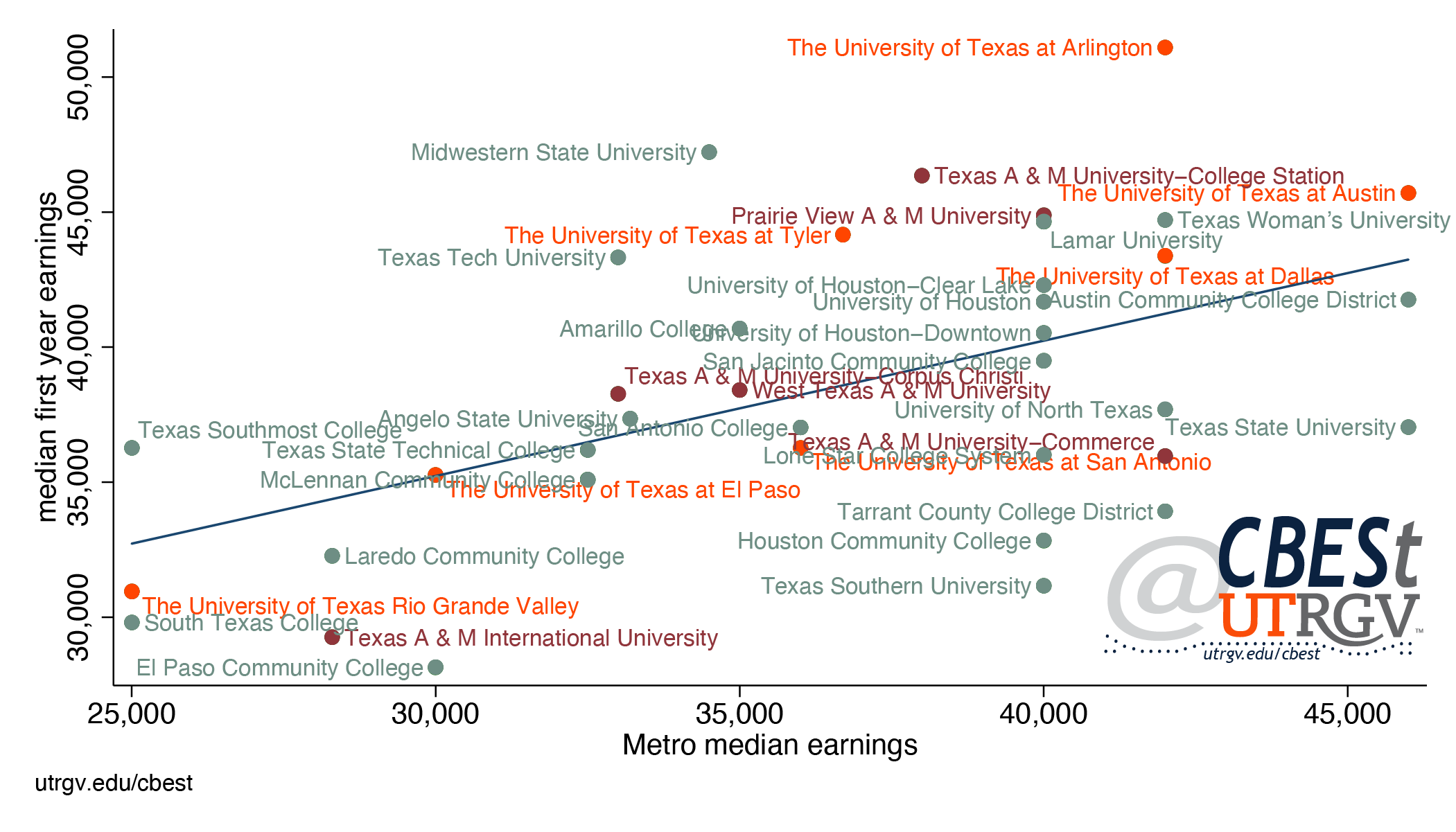
Figure 5: Relationship between first-year median income and metro median income, 2016-2017
Source: American Community Survey & US Department of Education
Figure 5 is consistent with work by Raj Chetty and coauthors (see endnotes) who show that income segregation among US colleges reflect the neighborhoods in which the children grow up. It suggests that earnings in the border region (as seen in figure 4 and 5) reflect a lack of opportunities for young adults.
The jobs vicenarians with college degrees face are highly dependent on local economic conditions. To help make this point, figure 6 shows the share of vicenarians with a college degree, not in school, who usually work 30 hours or less a week. Along border metros, 1 in 5 works 30 or less per week. This includes Midland Metro. Brownsville-Harlingen Metro is the exception where 1 in 10 do so. Part-time workers are more likely to experience larger variation in incomes, schedules, and access to benefits such as health care or paid leave.
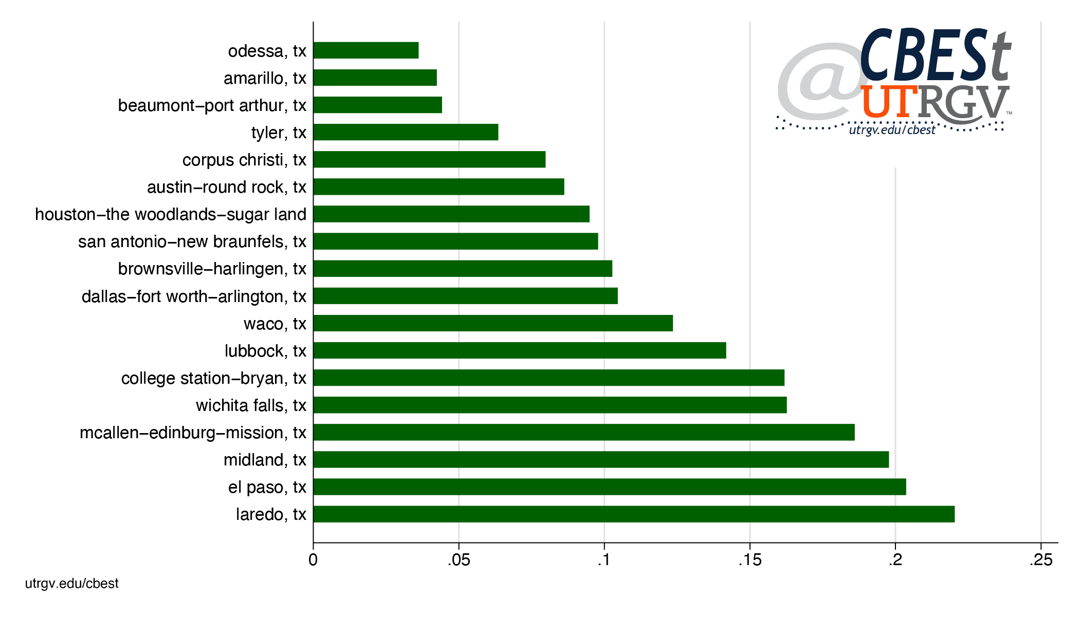
Figure 6: Share of vicenarians with a bachelor’s degree, not in school, working 30 hours or less, 2018
Source: American Community Survey
Bottom line
Texas has an under-development problem that is evident in its ability to produce the workforce needed to compete for and attract the best paying industries. The wide variation in outcomes across the state speak to regional differences in the level of economic development and a lack of effort to equalize these deficiencies. The state must make a better job in funneling resources to its poorest regions. For example, the Texas Enterprise Fund, a tool to attract projects that offer significant job creation and capital investment to the state, reports awarding $59 million in 2018 and 2019. First, the funds seem inadequate to compete and attract key industries to the state. Second, not one of the 18 recipients were located along the border.
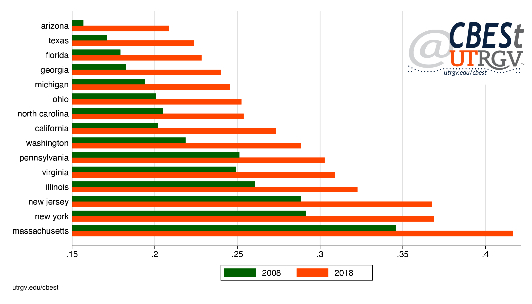
Figure 7: Share of vicenarians with a college degree in the 15 largest states, 2008 and 2018
Source: American Community Survey
Finally, one is left to wonder, “what is the state’s endgame? are policymakers’ content with the current level of competitiveness?” Figure 7 provides us with a clue. The figure shows the 15 states with the largest populations of young adults. It displays the share of vicenarians in 2008 and 2018 with a bachelor’s degree. The figure makes it clear that today’s cohort of vicenarians are more educated than the cohort of 10 years ago across the selected states. The only thing that has not changed is Texas 14th place in both cohort years.
The state can do much to improve these numbers. Such as, greater investments in public education in less developed neighborhoods, better coordination and use of regional economic development corporations, strengthening public colleges and universities roles in economic development initiatives. A different outcome requires a different approach. One that focuses on developing all corner of the state.
____
Dr. Salvador Contreras is Associate Professor of Economics at the University of Texas Rio Grande Valley
Endnotes
Acevedo-Garcia, D. and Noelke, C. and McArdle, N. and Sofer, N. and Huntington, N. and Hardy, E. and Huber, R. and Baek, M. and Reece, J. (January 21, 2020). The Geography of Child Opportunity: Why Neighborhoods Matter for Equity. Diversity Data Kids. Retrieved from http://diversitydatakids.org/sites/default/files/file/ddk_the-geography-of-child-opportunity_2020v2.pdf
All TEF Awarded Projects to Date (as of February 29, 2020). Texas Economic Development. Retrieved from
https://gov.texas.gov/uploads/files/business/TEF_Listing_as_of_2.29.2020.pdf
Chetty, R. and Friedman, J. N., and Saez, E. and Turner, N. and Yagan, D. (forthcoming). Income Segregation and Intergenerational Mobility Across Colleges in the United States. The Quarterly Journal of Economics.
Retrieved from https://doi.org/10.1093/qje/qjaa005
https://opportunityinsights.org/paper/undermatching/
Ratcliffe, R. G. (March 17, 2020) How Will the Oil Bust and the Coronavirus Affect the Texas Budget? Texas Monthly. Retrieved from
https://www.texasmonthly.com/politics/oil-bust-coronavirus-texas-budget/
Ruggles, S. and Flood, S., and Goeken, R. and Grover, J. and Meyer, E. and Pacas, J. and Sobek, M. (2019). IPUMS USA: Version 9.0 [dataset]. Minneapolis, MN: IPUMS, 2019.
Retrieved from https://doi.org/10.18128/D010.V9.0
Winter 2019 v15, n4
Texas manufacturing and innovation jobs could use more education
by Salvador Contreras
On December 9th Brookings Institution, a think-tank based in Washington, D.C., put out a report by Robert Atkinson and, Mark Muro, and Jacob Whiton showing that growth of America’s best paying high-tech and innovation jobs are concentrated in a handful of “superstar” metros. They claim that 90% of job growth in this sector occurred in Boston, San Francisco, San Jose, Seattle, and San Diego. Among Texas metros on their list of 100 metros, San Antonio and Austin had the highest gains at 27th and 31st place respectively. Between 2005-2017 these metros saw zero and a decline of 0.1% in their share of innovation industry employment.
In this brief we take a closer look at jobs in the innovation sectors in Texas. It is believed that the agglomeration of talent is an important driver of job growth and wages. We also focus on the border region’s manufacturing and innovation industry. We show that stagnant wages in part reflect a declining share of employment in good paying occupations. Further, stagnant educational attainment has not helped in attracting the type of jobs needed to see real wage growth.
Wages
We start by showing the evolution of real incomes in Texas and the border region. Figure 1 presents incomes of individuals 25 years and older who are in the labor force (employed plus unemployed). Incomes are in 2010 dollars deflated using the Consumer Price Index. Border metros are El Paso, Laredo, McAllen-Edinburg-Mission, and Brownsville-Harlingen.
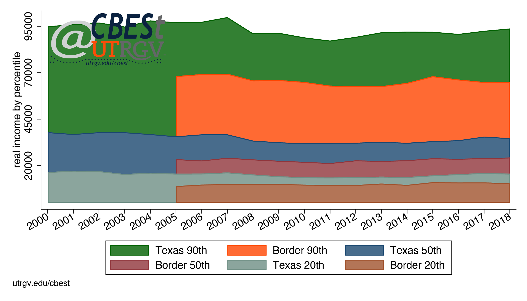
The figure presents real incomes at the 90th, 50th, and 20th percentile from 2000 to 2018 for Texas and 2005 to 2018 for the border region. Figure 1 makes it clear that incomes in the state and border region have been flat. In addition, the figure shows that individuals in border region earn substantially less than the overall state. For example, the best paid worker (90th percentile) in the border region earn on average $27,000 less than the comparable state group. Same is true for the middle (50th percentile), $11,000 less, and lowest paid (20th percentile) individuals, $5,000 less.
Why are wages in Texas flat and why are border region earnings substantially less than the overall state? The surest way to get real wage growth is through higher labor productivity. US manufacturing from 2000 to the second quarter of 2019 saw an annualized 2% growth in real output per hour. However, not all manufacturing jobs are equal. The Brookings piece called the following industries the high-tech innovation sector.
• Basic chemical manufacturing
• Pesticide, fertilizer, and agricultural chemical manufacturing
• Pharmaceutical and medicine manufacturing
• Computer and peripheral equipment manufacturing
• Communications equipment manufacturing
• Semiconductor and other electronic components manufacturing
• Navigational, measuring, electromedical, and control instruments manufacturing
• Aerospace product and parts manufacturing
• Software publishers
• Satellite telecommunications
• Data processing, hosting, and related services
• Other information services
• Scientific research and development services
Notice that eight of the 13 have manufacturing in the name. Manufacturing jobs are highly sought after because they represent a clear path to the middle class. The Trump administration’s trade wars are in part a response to America’s continued bleeding of manufacturing jobs. In addition, the world has continued to see an ever-increasing move to automate production. Both these factors have led to substantial loses in manufacturing jobs. Figure 2 shows Texas and the border region’s manufacturing jobs as a share of total employment. From 1990 to 2019, the state has seen its share of manufacturing jobs go down from 13 to 7%. The figure also shows border metros experienced a similar fate. For instance, the Rio Grande Valley (RGV) had 1990 levels similar to the state and has seen its manufacturing share fall to 3% by 2019. El Paso saw a decline from 20%, 7% above the state in 1990, to 5%, 2% below the state in 2019. The Laredo metro historically had a relatively small manufacturing base.
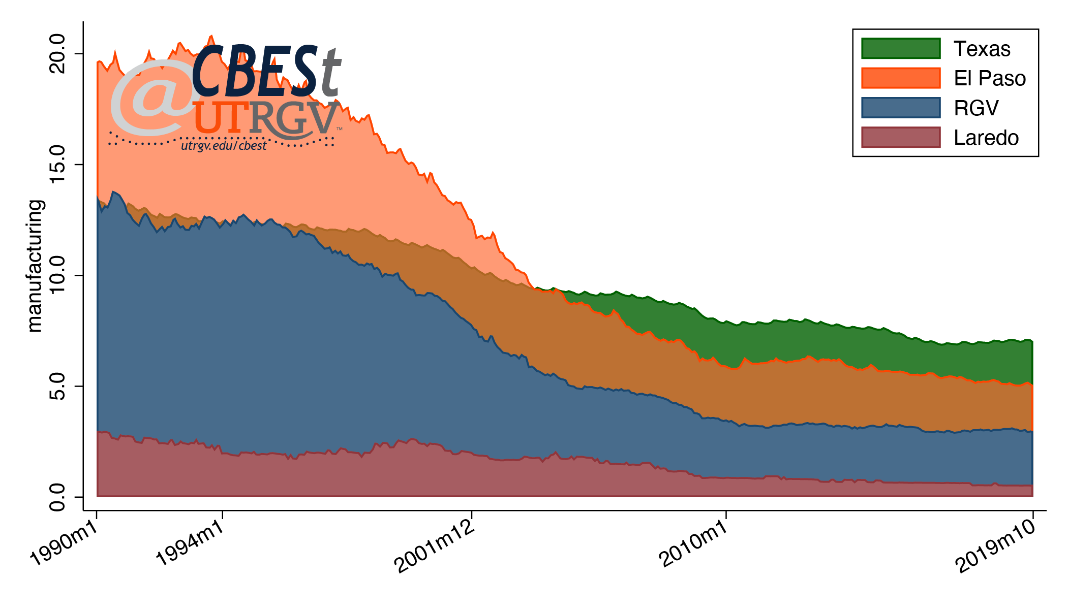
Figure 2: Manufacturing share of total employment
Source: US Bureau of Labor Statistics
A recent article by Austen Hufford at the Wall Street Journal points out that American factories are demanding highly educated workers. The sub-header reads: “within three years, U.S. manufacturing workers with college degrees will outnumber those without.” Using the classifications from the Brookings piece, figure 3 shows median incomes of Texans in the high-tech innovation and manufacturing sector. Workers in high-tech innovation sector earn on average $22,000 more than workers in the broad manufacturing category. Notice also that the real median income in the two categories are relatively flat. High-tech innovation sector 2018 real median income is $2,000 higher than 2005 levels. On the other hand, manufacturing is down $1,000 over the same time period.
Figure 3: Real median income in high-tech innovation and manufacturing sector in Texas
Source: American Community Survey
This suggests that all manufacturing jobs are not created equal. High-tech innovation sector pays more and demands workers with more education. The median worker in the high-tech innovation sector in Texas has 16 year of education (bachelor's degree) compared to 13 years (some college, no degree) for manufacturing. For reference, the median Texan in the labor force has 13 years of education. This partially explains why high-tech innovation sector jobs are hard to come by in Texas. The median education of the Texas labor force has not changed over this time period.
Education
Education is often seen as a proxy measure of labor productivity. If true, it would imply that job growth in high-tech innovation and manufacturing sectors will be attracted to regions with a highly educated work force. Figure 4 shows the relationship between annualized high-tech innovation sector employment growth (between 2005 and 2018) and average education by Texas metro.
Figure 4: Correlation between annualized high-tech innovation sector employment growth and average education, 2005-2018
Source: American Community Survey
Figure 4 shows that there is a positive correlation between high-tech innovation employment and average metro education. However, this is a bit misleading as College Station-Bryan and Austin-Round Rock pulls the relationship upwards. If we drop these metros the relationship is only slightly positive. Roughly, half the state’s metros have seen positive growth in this sector. Among border metros, only McAllen-Edinburg-Mission experienced positive growth. College Station-Bryan, Midland and Waco saw annualized growth in high-tech innovation employment above 5%.
Figure 5 shows the relationship between annualized employment growth in manufacturing and average education by metro. There is a clear positive relationship between these two. More importantly, the positive relationship persists even without the two most educated metros. College Station-Bryan and Midland are the two metros with the highest growth. While, the three border metros of Laredo, El Paso, and Brownsville-Harlingen have the largest declines.
Figure 5: Correlation between annualized manufacturing employment growth and average education, 2005-2018
Source: American Community Survey
Summary
The state has had a difficult time generating real wage growth over the past 18 years. This is in part driven by a decline in good paying manufacturing jobs and an inability to attract high-tech innovation jobs. We saw in figures 4 and 5 that for every metro with positive employment growth there is another with negative growth. This may reflect the skill composition of the labor force needed to attract and retain such jobs. This seems to be particularly true when looking at the border region. The region has the highest loses in manufacturing employment. It also has a labor force with the lowest levels of average education. This explains, to some extent, the income discount observed in figure 1.
____
Dr. Salvador Contreras is Associate Professor of Economics at the University of Texas Rio Grande Valley
Endnotes
Banner image is from GM’s announcement of new Arlington 1-million-square-foot body shop.
Retrieved from https://media.gm.com/media/us/en/gm/photos.html
Atkinson, R. D. and Muro, M. and Whiton, J. (2019). The case for growth centers: How to spread tech innovation across America. Brookings.
Retrieved from https://www.brookings.edu/research/growth-centers-how-to-spread-tech-innovation-across-america/
Hufford, A. (2019). American Factories Demand White-Collar Education for Blue-Collar Work. Wall Street Journal.
Retrived from https://www.wsj.com/articles/american-factories-demand-white-collar-education-for-blue-collar-work-11575907185
Muro, M. and Liu, S. (2017). Tech in metros: The strong are getting stronger. Brookings.
Retrieved from https://www.brookings.edu/blog/the-avenue/2017/03/08/tech-in-metros-the-strong-are-getting-stronger/
Ruggles, S. and Flood, S., and Goeken, R. and Grover, J. and Meyer, E. and Pacas, J. and Sobek, M. (2019). IPUMS USA: Version 9.0 [dataset]. Minneapolis, MN: IPUMS, 2019.
Retrieved from https://doi.org/10.18128/D010.V9.0
Fall 2019 v15, n3
Texas Inequality
by Salvador Contreras
The United States is experiencing one of the longest economic expansions in modern history. The unemployment rate in Texas has declined from just over 8% in late 2009 to 3.5% in the first half of 2019. During this period the Texas labor force has increased by some 3 million and seen wages and salaries increase by $270 billion. In light of these great numbers, it is only natural to wonder how widespread this bounty has been.
In this piece, we look at how Texas distributes incomes, income inequality, and regional differences. We show that inequality in Texas has been flat (to slightly up) over the past 17 years. However, we show that at these inequality levels, blacks and Hispanics across income and education levels face a significant income gap. Finally, we show that although the Texas Border Region is poorer than other parts of the state, it has a more equitable distribution of incomes with McAllen-Edinburg-Mission MSA being an exception.
Let us first start with why we should care about income inequality. Inequality is how evenly, some would argue fairly, incomes are spread. If society is composed of 5 individuals who earn a combined $100 then we say that incomes are equally distributed if each earns $20. However, if 1 earns $100 and the other 4 earns zero then we would have a highly unequal distribution of income. There are many reasons why society may decide to “unfairly” allocate incomes. Whatever the reason, those who receive less also face reduced economic opportunities for themselves and their families.
In the United States, initial resources strongly predict a child’s later in life outcomes like education and income. Children born to parents with few resources, on average, will go on to themselves become parents with relatively few resources. That is, intergenerational income mobility is stymied. This is in part because poor parents are able to provide fewer resources to their children like access to formative experiences or safe neighborhood, access to health care or a good school. All these factors likely influence the chances of having an early in life equal starting line. For example, a paper by Raj Chetty and co-authors (see endnote) show that children born in 1986 to parents in the bottom 20th percentile have a 9% probability of reaching the 80th percentile.
When society accepts greater income inequality it concedes that ideas, energies, and potential from some are not essential to the vibrancy, creativity, and development of the eco-system. That said, inequality is not necessarily all-bad, after all, context is important. Economies with high economic growth generally see a rise in inequality as a result of the marketplace compensating the responsible creative forces. Growth makes the economic pie bigger for everyone.
Texas Inequality
Turning to Texas, figure 1 shows the GINI index and the income share held by top decile (top 10%). These are two commonly used measures of inequality. GINI measures the extent to which the distribution of income deviates from a perfectly equal distribution. GINI has a range between 0 or perfect equality and 100 or perfect inequality. All measures of inequality and income are created using the American Community Survey 1% sample and consists of individuals in the labor force who are age 25-65.
Figure 1: Texas income inequality, 2000-2017
Source: American Community Survey
Figure 1 shows that the GINI has increased by about 1 point over the past 17 years. The 2017 Texas GINI is roughly in line with the GINI for the United States. The second measure of inequality tells us the income share held by the top 10%. Here again, we see a slight increase over the 17 years. The top 10% holds 35% of all income. This again is similar to the income share for the United States. Over the past 17 years inequality has been relatively flat in Texas. That is, it does not appear to have gotten (much) worse.
Next, we take a close look at how incomes have changed from 2000-2017. Figure 2 shows the percent change of real incomes by income group over the past 17 years. All dollar values are adjusted for inflation and are in 2010 dollars. The figure shows that those in the 50th percentile have seen a 6.3% decline in real income. The 50th percentile, is simply the median or middle. For example, in 2017, those in the middle earned $35,600. This means that half the sample population earned more, and half earned less than $35,600. The 80th percentile saw almost no change. Those at the 90th and 20th percentile saw a 2.5% decline in real incomes. Only, the 95th percentile, those making $129,000 in 2017 saw an increase of 2% over the 17-year period.
Figure 2: Real income growth by percentile group, 2000-2017
Source: American Community Survey
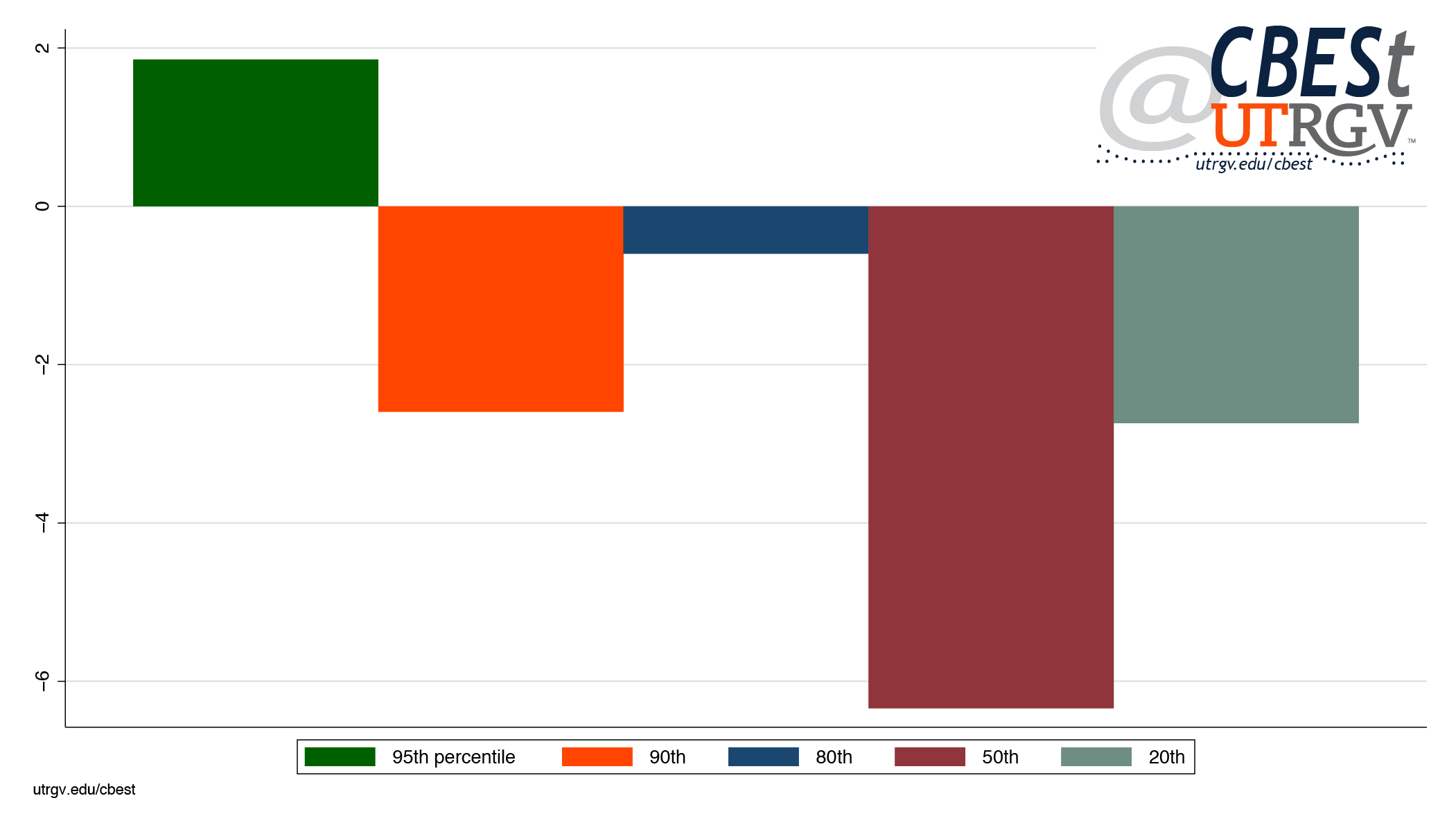
Texas Minorities
Next, we evaluate the relative incomes of blacks and Hispanics. We produce black and Hispanic incomes as a percent of white incomes by skill level and percentile. We divide individuals into low skill (high school education or less) and high skill (some college or Associates Degree or more).
Figure 3: Black and Hispanic incomes as a percent of white’s by percentile and skill level, 2017
Source: American Community Survey

Figure 3 shows black and Hispanic incomes as a percent of white’s by percentile and skill level in 2017. For example, the 95th percentile of high skill blacks took home 60 cents for every dollar a white individual earned. That is, blacks in this group took home 60% the white income of $178,000. For comparison, top earning, high skill, Hispanics took home 58 cents. It is interesting that low skill blacks and Hispanics in most cases do better than high skill blacks and Hispanics in closing the income gap with whites across income groups. The exception is at the 50th percentile where blacks and Hispanics earn 71 cents across skill levels. The lowest earning, low skill, Hispanics have the smallest income gap. They earn 89% of comparable white’s $13,300 income.
As a final note to figure 3, it is interesting that the black and Hispanic income gap is increasing in income percentiles. In particular, the top black and Hispanic earners are clearly excluded from jobs and entrepreneurial activities that pay wages reserved for whites. If the highest incomes are attained by entrepreneurial ability, education, and talent it is not possible that the top 5% of black and Hispanic Texans are 60% as able, educated, and talented as the top 5% of whites. Other factors must be at play. Whatever the reason, we will not find answers in this piece. Certainly, the gap could be lower if we adjusted for wealth, professional networks, industry, and a host of other factors. However, if we had such data, it is not clear that the gap would be zero. After all, even low earning, low skill, whites out earn comparable blacks and Hispanics. That said, not all is bad news. Top earning, high skill, blacks saw their incomes increase by 20% and Hispanics 11% over the 17-year period compared to 9% for whites.
Texas Metros
Next, we give our attention to evaluating differences within the state. Figure 4 maps GINIs for Texas MSAs. Wichita Falls and Laredo are the two Texas MSAs with the lowest levels of income inequality. Houston-The Woodlands-Sugar Land and McAllen-Edinburg-Mission are the most unequal MSAs in Texas.
Figure 4: Texas income inequality by MSA, 2017
Source: American Community Survey
Figure 5 shows the income share held by the top 10% by MSA. This second measure of income inequality has Laredo and Odessa MSAs as the most equal MSAs. The top 10% hold 29% of all income in these MSAs. This measure of inequality moves McAllen-Edinburg-Mission MSA to the middle in inequality. However, Houston-The Woodlands-Sugar Land is again the most unequal MSA. The top 10% in this MSA hold 37% of all income.
Figure 5: Income share held by the top decile by MSA, 2017
Source: American Community Survey
Finally, figure 6 presents the incomes of the 50th and 80th percentile. The graph is sorted by the income of the 50th percentile. Notice that the Border Region has the lowest 50th percentile incomes. Individuals in Brownsville-Harlingen and McAllen-Edinburg-Mission MSAs at the 50th percentile earn $22,200. El Paso and Laredo comparable groups earn $3,000 to 4,000 more. Midland MSA has the highest 50th and 80th percentile incomes at $44,500 and $80,000 respectively.
Figure 6: Incomes of the 50th and 80th percentile by MSA, 2017
Source: American Community Survey
Brownsville-Harlingen and Laredo MSA 80th percentile earn $45,000, the lowest among Texas MSAs. El Paso MSA has the highest incomes among the four Border Region MSAs. Among the largest metros, Austin-Round Rock, Dallas-Fort Worth-Arlington and Houston-The Woodlands-Sugar Land MSA have the highest incomes at the 50th and 80th percentile respectively.
Summary
From 2000-2017 Texas economy expanded 162% or about 2.9% annually. This growth has had a minor effect on inequality. However, the current level of inequality has constrained the economic opportunities of black and Hispanic Texans. Across skill and income groups blacks and Hispanics earn significantly less than whites. In addition, economic growth appears to have been exclusively for the benefit of the highest earners. The purchasing power of the average Texan is today lower than in 2000. Finally, economic growth in Texas has been uneven and is evident in the earnings profile across metros. The Border Region in particular is unable to attract the income levels enjoyed by the rest of the state.
___
Dr. Salvador Contreras is Associate Professor of Economics at the University of Texas Rio Grande Valley
Endnotes:
Raj Chetty, Nathaniel Hendren, Patrick Kline, Emmanuel Saez, and Nicholas Turner. (2014) Is the United States Still a Land of Opportunity? Recent Trends in Intergenerational Mobility. NBER Working papers series. https://www.nber.org/papers/w19844.pdf
Summer 2019 v15, n2
Where have the criminals gone? Negative crime growth in South Texas
by Salvador Contreras
The border region has been portrayed by the national media as unsafe. This has been in part attributed to immigrants who are depicted as criminals who bring their criminal ways to the border. By extension, the border region must be suffering from abnormal levels of violence and crime. It brings to mind Fox News contributor Lawrence Jones who while reporting from Laredo is seen wearing a green armored vest. It is no surprise that people are asking, “just how unsafe is the Border Region?”
In this piece we bring some perspective to crime trends at the Border/South Texas Region. We use agency level data from the FBI Uniform Crime Reporting Program. We report crime (arrests) rates per 1,000 people. We show that crime in the Border Region has seen a steep decline over the past 18 years. This is of no surprise since crime in Texas and the Nation have also witnessed sharp declines. The Border/South Texas crime trends are similar to other parts of the state. It is quite possible that immigrants have had no effect on crime trends in our region.
Total Crime
Let’s start with a map. Figure 1 presents the average annual growth in the crime rate from 1999 to 2016 by county. Darker red represents largest declines while darker blue are largest gains. The map shows that most Texas counties, 187 of 249, experienced declines in crime. South Texas had few cases with positive growth, Aransas, La Salle, McMullen, and Refugio. However, for the exception of Aransas, these are small counties (in terms of population).
Figure 1: Average annual crime growth, 1999-2016
Source: FBI Uniform Crime Reporting Program
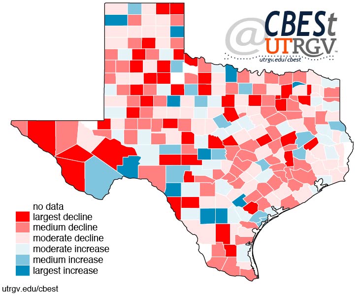
Table 1 presents the growth rates of Texas 30 most populous counties. The table is sorted by growth rate. Tarrant County saw average annual declines of 4.4%, followed by Hays and Fort Bend County. At the bottom of the table we see that Lubbock and Bexar County saw almost no change. While Galveston saw an increase of 1.6%. Notice that all border counties on the list (El Paso, Hidalgo, Cameron, and Webb) saw declines ranging from 2.5% (El Paso) to 1.5% (Webb).
Table 1: Texas 30 large counties average annual crime growth, 1999-2016
Source: FBI Uniform Crime Reporting Program
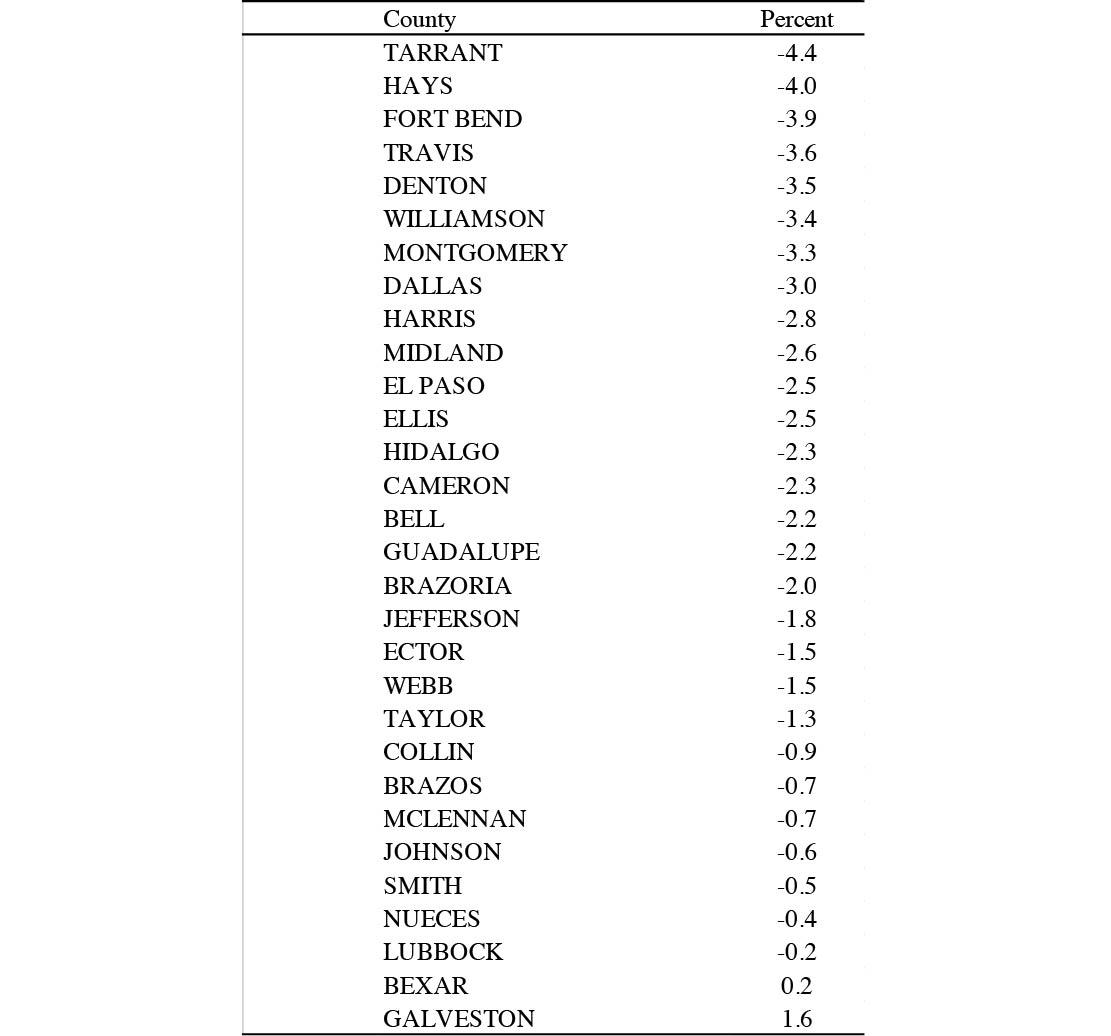
Figure 2 shows youth and adult annual crime growth for the 30 most populous counties. Youth are defined as 15-19 years of age and adults are 20 years of age or older. Data is sorted by adult rates. For example, Hays County had the largest decline, 3.6%, in adult crime. Tarrant and Montgomery County had the biggest decline in youth crime at 6.7%. Notice that all sampled counties saw a decline in youth crime. However, 9 of 30 counties had positive growth in adult crime.
Figure 2: Average annual growth in crime by age group, 1999-2016
Source: FBI Uniform Crime Reporting Program
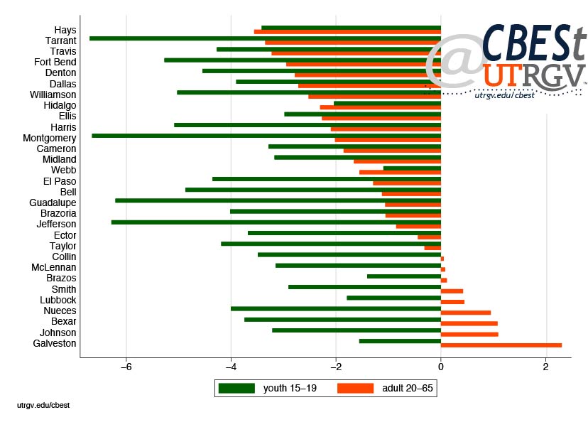
The border counties of Hidalgo, Cameron, El Paso, and Webb saw declines in youth and adult crime. Among these, El Paso had the largest decline in youth crime at 4.4% and Hidalgo in adult crime at 2.3%.
Crime by Category
Next, we present four broad categories of crime. These are violent crime, property crime, petty delinquency, and drug crimes. Violent crime encompasses murder, manslaughter, robbery, and aggravated assault. Property crime is defined as burglary-breaking or entering, larceny-theft (includes motor vehicles), and arson. Petty delinquency captures vandalism, disorderly conduct, and curfew and loitering violations. Drug crimes encompassing sale, manufacturing, and possession.
Figure 3: Average annual growth by crime category, 1999-2016
Source: FBI Uniform Crime Reporting Program
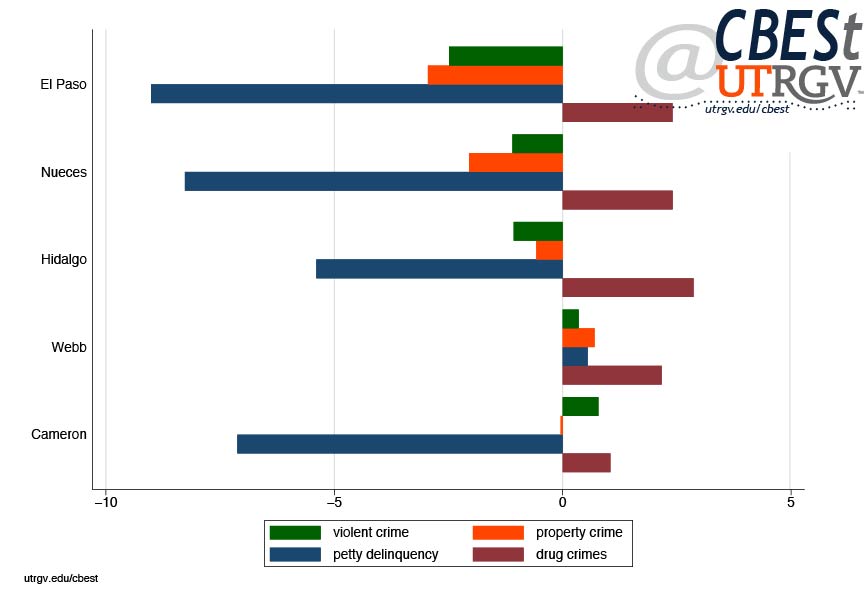
Figure 3 presents average growth in crime of selected Border/South Texas Counties by crime category. The figure is sorted by violent crime. Among these counties, El Paso saw the largest decline in violent crime and petty delinquency. Webb County saw small increase in all four categories. Drug arrests were up in all five counties. The largest gains being in Hidalgo County at 2.9%.
Figure 4: Average annual growth in drug crimes, 1999-2016
Source: FBI Uniform Crime Reporting Program
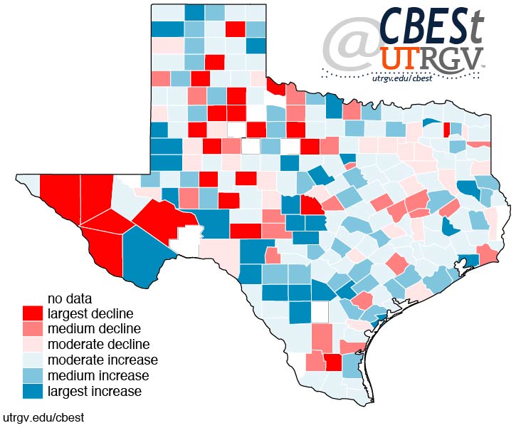
Figure 4 shows the average annual growth in drug arrests. Again, red represents a decline and blue an increase. Notice that drug arrest rates are up in most Texas counties. Border counties experience moderate increases. Among Texas largest counties: Collin, Galveston, and Lubbock saw the highest increase in drug crimes ranging from 4.9% to 6.6%.
The Border Region
So, is there more crime in the Border Region? Figure 5 shows the 2016 crime rate of Texas 30 most populous counties. The figure shows that Fort Bend, Denton, and Collin County have the lowest crime rates. At the other extreme, Galveston, Nueces, and Ector County have the highest. In 2016, Nueces County had 96 crimes per 1,000 people.
Figure 5 shows that the Border Region is quite average. Among border counties, El Paso has the lowest rate at 37 and Cameron the largest at 46 crimes per 1,000 people. By this measure, the Border Region is no more “dangerous” than the average large county in Texas.
Figure 5: Total crime per 1,000 people, 2016
Source: FBI Uniform Crime Reporting Program
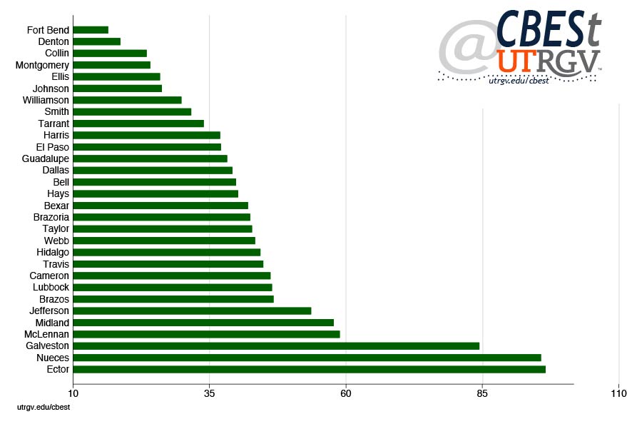
Crime is driven by many factors. None of which are explored here. However, it is safe to say that the Border itself does not appear to attract more or less crime than other parts of Texas.
___
Dr. Salvador Contreras is Associate Professor of Economics at the University of Texas Rio Grande Valley
Endnotes:
Horton, A. (2019, April 5) Fox News contributor mocked for wearing ‘totally ridiculous’ body armor at the border. Washington Post. Retrieved from https://www.washingtonpost.com/arts-entertainment/2019/04/04/fox-news-contributor-wore-protective-vest-border-among-safest-spots-us/?noredirect=on&utm_term=.ad5979b11e6e
Fall 2018 v14, n3
The health of the region’s banking sector and implications for financial inclusion
by Salvador Contreras
Banks play an important role in the economy. They facilitate a secure way to protect individuals hard earned income and provide credit to households and businesses. The banking sector is critical to the stability of the overall economy. In this piece, we take a close look at the health of the local banking sector. Understanding the regions banking sector provides us with a way to gauge the region’s economy and trends. We limit our analysis to banks supervised by the Federal Deposit Insurance Corporation (FDIC).
We begin by looking at the size and health of the region’s banking sector. We find evidence that suggests that the region’s banking sector is in excellent health. Bank capitalization and leverage levels are sound. However, one area of concern is the contraction in credit in Cameron and Hidalgo County. This may be a precursor to lower economic activity in the region. This stands in contrast with the rest of Texas that has seen continued expansion of credit. Finally, we take a look at patterns in household use of financial services.
Bank visibility
We begin by presenting the number of local bank branches. Figure 1 shows the average number of branches per 100,000 people. For the exception of Web County, the region has seen a decline in the number of branches since the Great Recession. For example, the number of branches in Hidalgo County fell to 17 branches in 2018 from 20 in 2008. This however, is consistent with branches counts in Texas and the nation and overall industry patterns of mergers and acquisitions. For example, Texas branches fell from 28 to 23 branches per 100,000 people in the same time period. While the decline in branches is small, the trend indicates that consumers are seeing fewer options of where to bank.
Figure 1: Branches per 100,000 people, 2000-2018
Source: Federal Deposit Insurance Corporation
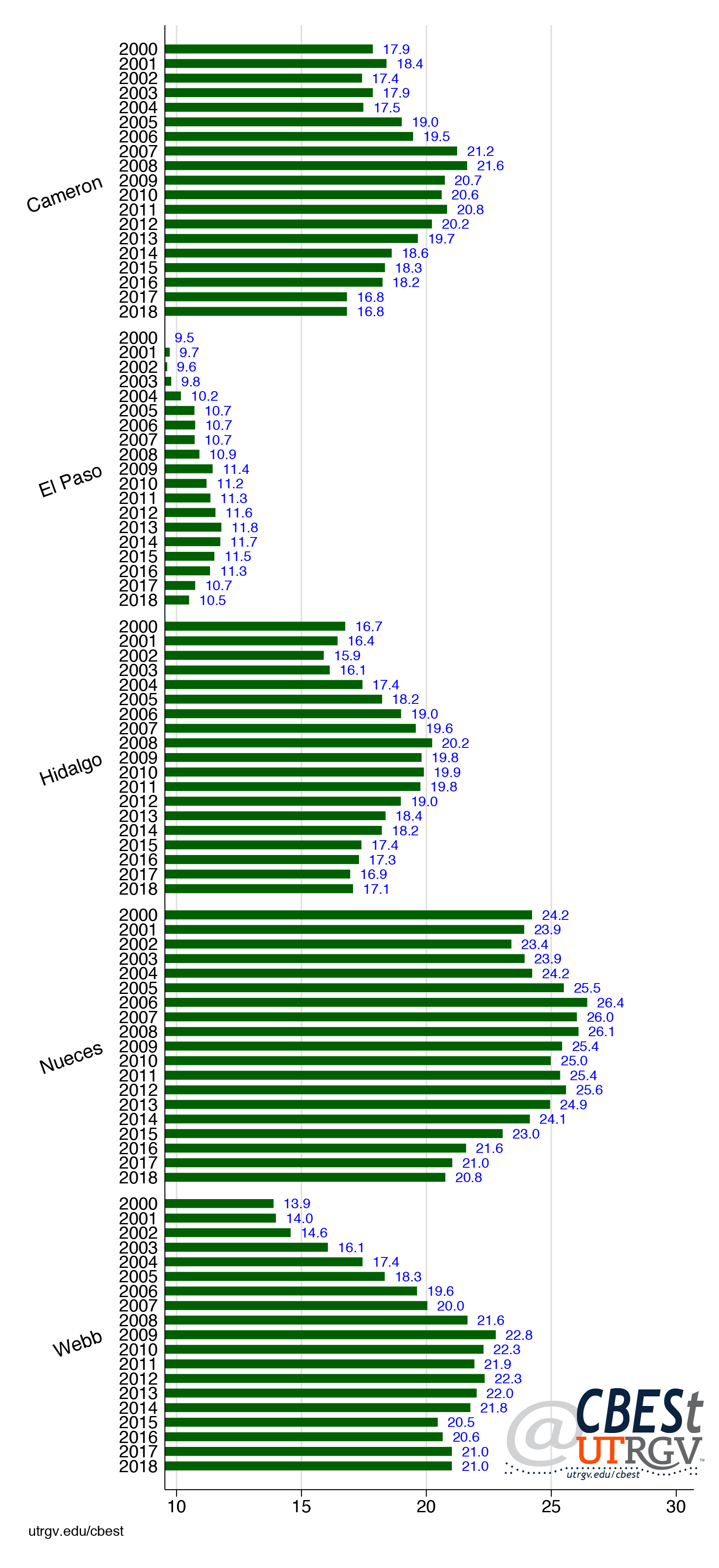
Also, notice that Cameron, Hidalgo, and El Paso have less branches compared to peers. El Paso, in particular stands out for the fewest number of branches. More in general, compared to the State the border region has fewer branches per capita. We should point that our data does not include ATM machines, credit unions, or other non-FDIC financial intermediaries. However, it is not clear these would account for the differences. Next, we present one culprit affecting branch availability.
Figure 2 presents Herfindahl-Hirschman Index for Texas in 2018. This index measures banking concentration by county. We construct this measure using branch level deposits. The index has a value between 0 (perfect competition) to 10,000 (monopoly). Notice that El Paso and Webb County have the highest Herfindahl Index compared with regional peers. For instance, the Herfindahl Index for El Paso is 1,800 and 2,000 for Webb County. Under Federal Trade Commission (FTC) guidelines, this would indicate a sector that is moderately concentrated. For comparison, Hidalgo County has an index of 1,000.
Figure 2: Bank concentration (Herfindahl Index), 2018
Source: Federal Deposit Insurance Corporation
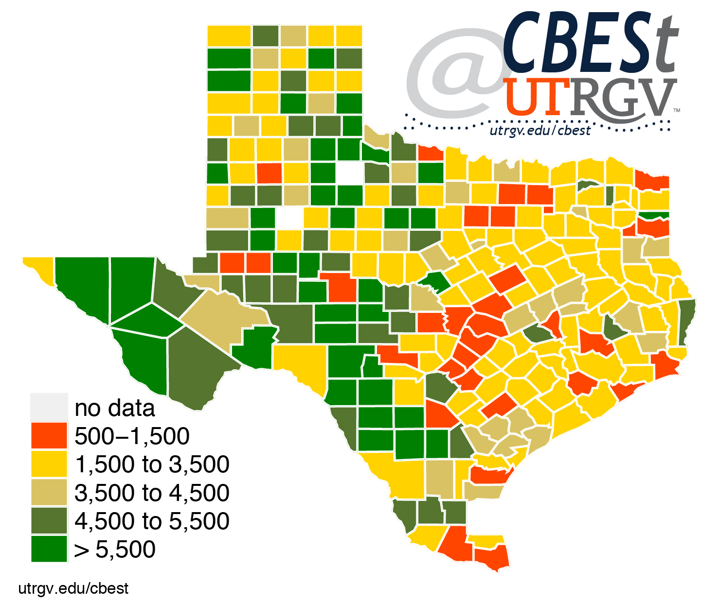
Health of banking sector
Ever since the financial crisis the banking industry has received added attention from regulators. Bank stress tests have further encouraged banks to improve their financial health. These tests are used to evaluate how a bank is likely to fare when faced with an adverse economic situation (such as stock market crash, GDP contraction, high interest rates, etc.). Bank regulators look at balance sheet components to evaluate a bank’s financial health. Tier 1 capital ratio is one of these instruments. Figure 3 presents historical tier 1 capital ratio (tier 1 capital divided by risk weighted assets). This is a measure of banks capital core or financial health. Because we focus on the region (and not a specific bank) we present the weighted average of all banks (weighted by deposits) to create the county measure. A higher number indicates better health.
Figure 3: Weighted tier 1 capital ratio, 2000-2017
Source: Federal Deposit Insurance Corporation
Figure 3 shows that across the region the health of the banking system has improved since the financial crisis. Also, notice that the averages after the crisis are far higher than before the crisis. This pattern is consistent with national trends. With stricter banking regulation banks are healthier and leaner than before the financial crisis.
Figure 4: Weighted tier 1 capital ratio, 2017
Source: Federal Deposit Insurance Corporation
Figure 4 presents tier 1 capital ratio for Texas counties in 2017. The bottom 10 percentile of Texas counties are in red. The lowest score is 11%. It is difficult to draw comparisons with the 8% minimum stipulated under Basel III given that we aggregate our data at the county level. Basel III is an international regulatory framework for banks that arose as a response to the financial crisis. Never-the-less, if we use this as a benchmark, we can say that on average banks servicing Texas are quite healthy.
Credit
Figure 5 presents seven different categories of loans as a share of total assets. A higher number indicates that banks are deploying a larger share of assets in the form of loans. It also indicates that banks are taking on additional liquidity risk as loans are a less liquid asset. The first bar shows total loans. Notice that El Paso County has the lowest share of total loans compared to peers at 57%. The state average is 56%. The county with the highest share is Nueces followed by Cameron County with 66% and 64% respectively. The second bar shows total real estate loans followed by commercial real estate, construction and land development, commercial and industrial, single-family and multi-family residential real estate loans to gross total assets. Notice that El Paso has the lowest share in every category for the exception of single-family residential real estate loans. El Paso leads in this category.
Figure 5: Weighted loans to gross total assets, 2017
Source: Federal Deposit Insurance Corporation
Loan performance
Figure 6 presents weighted non-performing loans to total loans. Non-performing loans are defined as total assets 90 days past due still accruing interest plus total assets no longer accruing interest. A rising share indicates deteriorating credit quality of banks. Across the region the quality of loans has improved since the financial crisis. Interestingly, quality of 2017 loans are a bit worse than early 2000s levels. Figure 6 shows that on average, non-performing loans in 2017 were just over 1% of total loans.
Figure 6: Weighted non-performing loans to total loans, 2017
Source: Federal Deposit Insurance Corporation
Figure 7 presents selected categories of non-performing loans. Non-performing residential real estate loans as a share of total residential real estate loans is the most troubling category in all counties for the exception of Webb County. El Paso County has the highest share of non-performing residential real estate loans. However, 3.7% is hardly large. It’s clear from the data that the region’s banking sector is in great shape.
Figure 7: Weighted non-performing loans, 2017
Source: Federal Deposit Insurance Corporation
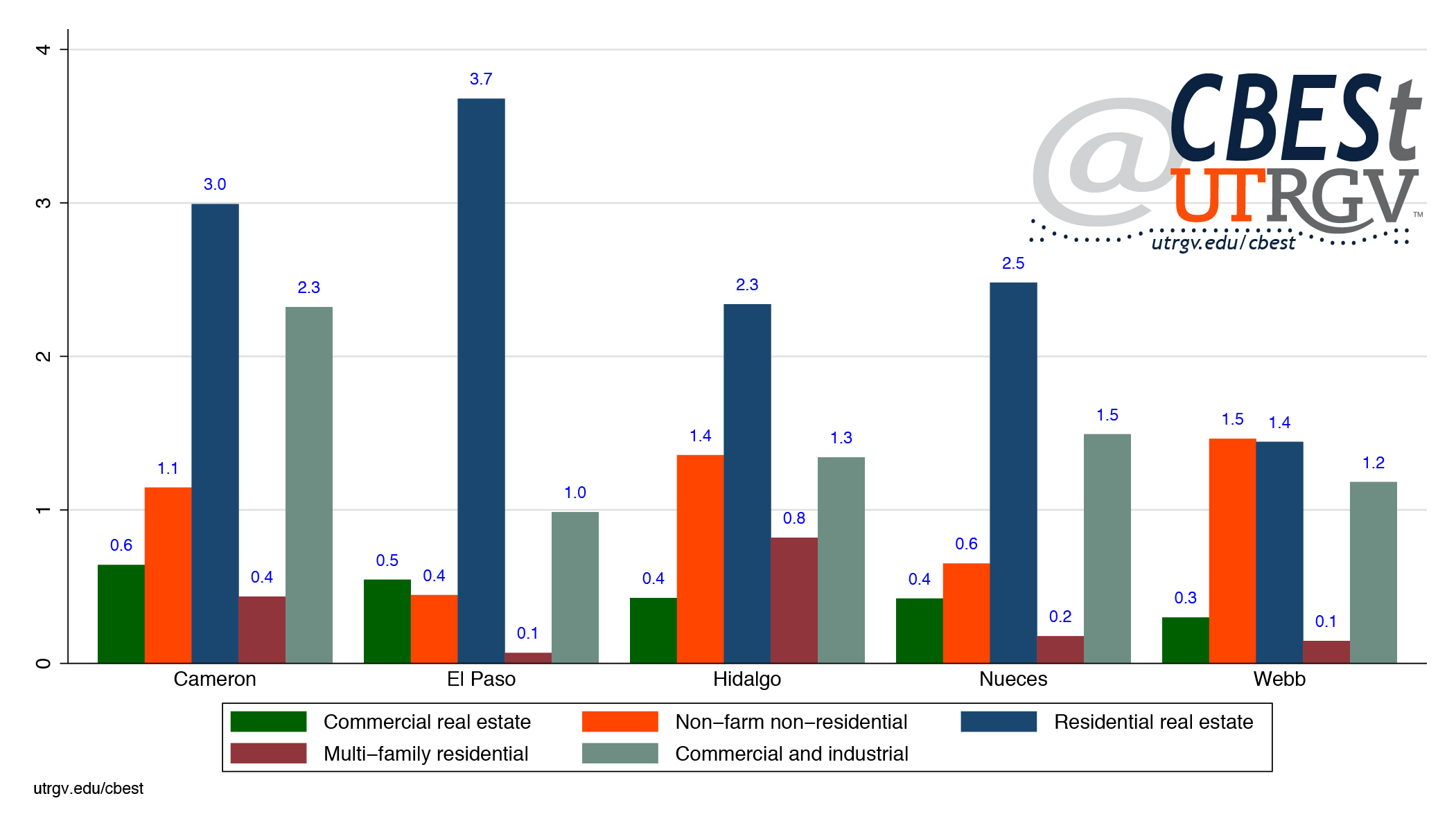
If area banks are in great shape does that mean that they are increasing the availability of credit? Figure 8 tries to get at this question. Figure 8 presents the average annual growth in credit (loans outstanding) from 2010 to 2017 by selected categories. El Paso and Nueces County have the strongest average increases in credit among peers. Total loans have grown at average annual pace of 2.4% and 3.3% in El Paso and Nueces County respectively. For comparison, Cameron and Hidalgo County have seen a contraction of 2.2% and 1.2% respectively. Interestingly, multi-family residential real estate loan growth has been a key standout in all counties except Nueces. However, as figure 5 shows, this is also the smallest category of loans.
Figure 8: Average annual growth in credit, 2010-2017
Source: Federal Deposit Insurance Corporation

Financial inclusion
Figure 1 showed that the number of branches has fallen across the area and Figure 8 that credit has been contracting in Cameron and Hidalgo County. More in general, we show above that banks across the region are in excellent health. Next, we explore how these banking conditions may affect consumption of banking services. Figure 9 shows bank account ownership (checking, saving, or money market) in the region. Data is from the FDIC and is collected as part the Current Population Survey (CPS) Supplement Survey. The figure shows the share of the population that owns a bank account. Figure 9 shows bank account ownership has been increasing across the region except in Hidalgo County. The McAllen-Edinburg-Mission MSA has the lowest share of population owning a bank account.
Figure 9: Bank account ownership, 2009-2015
Source: Federal Deposit Insurance Corporation

Figure 10 presents bank account ownership and use of alternative financial services for selected Texas metros. It is believed that some individuals, particularly the poor, may choose not to own a bank account because of the expense associated with owning one, such as, minimum balances and overdraft fees. Some may be encouraged to seek out alternative financial services such as check cashing, title loans, money orders, and bill paying providers. Figure 10 shows the estimated share of the population that used an alternative financial service in the past 12 months. It is not evident from the figure that lower bank ownership is associated with greater alternative financial services use. In fact, there is great variation in alternative financial services use across Texas metros.
Figure 10: Bank ownership and alternative financial services use, 2015
Source: Federal Deposit Insurance Corporation

Figure 11 presents the number of alternative financial services establishments per 100,000. This data is collected from US Census County Business Patterns for establishments in sector that include check cashing, money order, loan servicing, money transmission, payday lending, and traveler’s check issuance. The figure shows that Brownsville-Harlingen and McAllen-Edinburg-Mission MSAs have seen an increase in alternative financial services establishments. However, these appear to simply reflect natural increases that are making up for low presence levels when compared to Corpus Christi and El Paso MSAs.
Figure 11: Alternative financial services establishments per 100,000, 2009-2015
Source: US Census

Summary
This report showed that the region’s banking sector is in great health. Banks have economized on their branches by cutting their numbers and hold a portfolio of high-quality loans. Credit has expanded across different categories. The only concern is that credit in Cameron and Hidalgo Counties have contracted over the past 7 years. It is difficult to say what ramifications this may have on economic development going forward. This is an area that we will address in our upcoming economic forecast for the region (early 2019). Multi-family residential real estate loan expansion is a bright area across the region. El Paso and Nueces County show widespread increase in credit particularly in areas that may be conducive to broader economic development such as commercial, industrial, construction, and land development loans.
We presented data on financial services use across the region. We show that the border region has one of the lowest levels of bank account ownership. In addition, we find that the McAllen-Edinburg-Mission MSA has not seen an improvement on this front. On the-other-hand, it has seen an increase in the number of establishments that provide alternative financial services. Unfortunately, we don’t have data on financial literacy programs that could help explain disparities in financial service use across the region.
In conclusion, the banking sector’s great health should be seen in positive light. The sector has the wherewithal to be a key partner to help fuel economic activity in the region.
___
Dr. Salvador Contreras is Associate Professor of Economics at the University of Texas Rio Grande Valley
Summer 2018 v14, n2
Trade, Trade War, Texas, and the Border Region
by Salvador Contreras
Donald Trump made trade an important issue during the election where he referred to the North American Free Trade Agreement (NAFTA) as the “worst trade deal ever.” The Administration has for some time now been in negotiations with Canada and Mexico to update NAFTA. Texas has followed this process a bit closer than other states. Mexico is Texas’s biggest trading partner. In 2017 Texas total trade with Mexico was $187 billion or 35% of Texas total trade with the world. If the United States (US) were to withdraw from NAFTA, Texas would surely feel its effects more so than any other state. For instance, California’s total trade with Mexico was $73 billion or about 12% of its total trade with the world.
A number of Texas elected officials and trade groups have come out to argue that the US needs to modernize and keep NAFTA. As of the writing of this piece, NAFTA negotiations were ongoing. But the imposition of steel and aluminum tariffs on America’s closest allies (Canada, European Union, and Mexico) are to be understood as an unfavorable sign of how the negotiations are going. In this piece we give a brief description of the issues, what is at stake for Texas, and potential impact on the Texas border region.
Trade
To most economists the gains from trade are so obvious that imagining an alternative seem nonsensical. All societies face limited resources such as people, land, water, and raw materials. The explosion in development across the world has been accompanied with increasing dependence in technological knowhow that allows for the production of more goods and services with the same amount of available resources. Societies have become wealthier by their ability to make workers more productive (producing more with fewer resources). This has made some countries quite wealthy. This wealth is due in part by specialization and from gains from trade. Subsequently, such societies have had to contend with ever increasing need to investment in skill acquisition to further improve output per worker. The side effect is that these workers have become more expensive to employ. So long as the value added by these workers is at least as large as their added cost there is no problem. The problem of course is that not all goods produced require skilled workers. It is said that countries like the US should focus on producing (capital intensive) goods that require skilled workers and let other (low skill labor abundant) countries focus on producing labor intensive goods.
This of course is all good and well. The problem is that when a job moves to another country someone loses theirs. The argument goes that a county is on net better off by specializing and producing the things for which it holds a comparative advantage and letting others produce the goods where it does not. To redress any harm caused by trade, the US should spend resources retraining those negatively impacted by trade. A good example of this is the Trade Adjustment Assistance Program. However, most people dislike being laid off and dealing with the ensuing uncertainties of economic insecurity.
Much of the trade rhetoric on jobs lost to trade center on manufacturing jobs. In the case of NAFTA, motor vehicle and parts manufacturing. Figure 1 presents the number of jobs in manufacturing measured in millions of jobs on the right axis and vehicles and parts on the left axis. For example, from 1990 to present US jobs in vehicles and parts reached a high of 1.3 million on July 2000 and manufacturing on February 1990 at 17.8 million. The figure shows that after NAFTA went into effect on January 1994, US manufacturing jobs went either sideways or up. Figure 1 also shows that after China joined the World Trade Organization (WTO) in December 2001, manufacturing employment took a hit. It hit bottom as the US was pulling itself up from the Great Recession. Manufacturing jobs in the US have since increased. From the summer of 2008 to February 2018 manufacturing jobs have grown by 8% and motor vehicle and parts jobs by 47%. However, manufacturing jobs are down 27% from 2000 levels.
Figure 1: Motor Vehicles & Parts and Manufacturing Employment (millions)
Source: U.S. Bureau of Labor Statistics
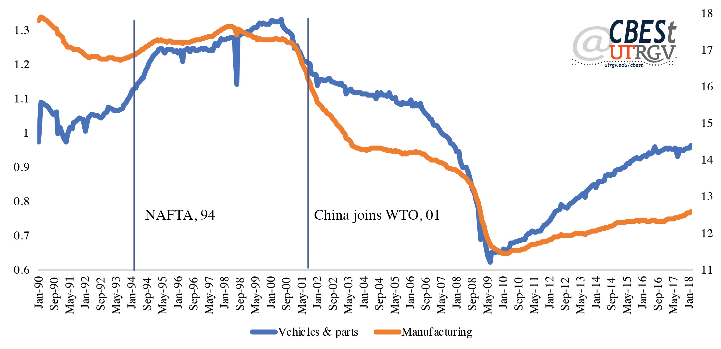
Many of these manufacturing jobs have either been eliminated due to technological advances and productivity gains at US plants and the rest due to offshoring. However, it is not evident from these patterns that NAFTA is responsible for job losses in US manufacturing and motor vehicle and parts. What is clear is that Americans consumers have taken these structural changes in stride and have increase their consumption of good and services. Since 2000, Americans real expenditures has grown at an average annual rate of 5.5%.
There is no question that the American consumer has benefited immensely from low prices made possible by imported goods. This however has meant a widening trade deficit. Figure 2 shows the US trade balance from 1990 to present. Balance of trade measures the value of what the US sells to foreigners minus what we import from them. In the early 90s, and on the year of NAFTA implementation the US was running around a $10 billion monthly deficit. The trade balance deteriorated in the late 90s and leveled off for a period around the time China joined the WTO in 2001. However, this did not last long, and the trade balance further deteriorated, bottoming out at the start of the Great Recession in 2008. The improvement in the trade balance during the financial crisis was due to a decline in US national income which resulted in a decline in demand for imports. Since the recovery, trade balance has been on a worsening path. The trade deficit as of the first quarter of 2018 stands at $163 billion, about $30 billion more than the same time the previous year.
Figure 2: US Trade Balance (billions)
Source: US Census
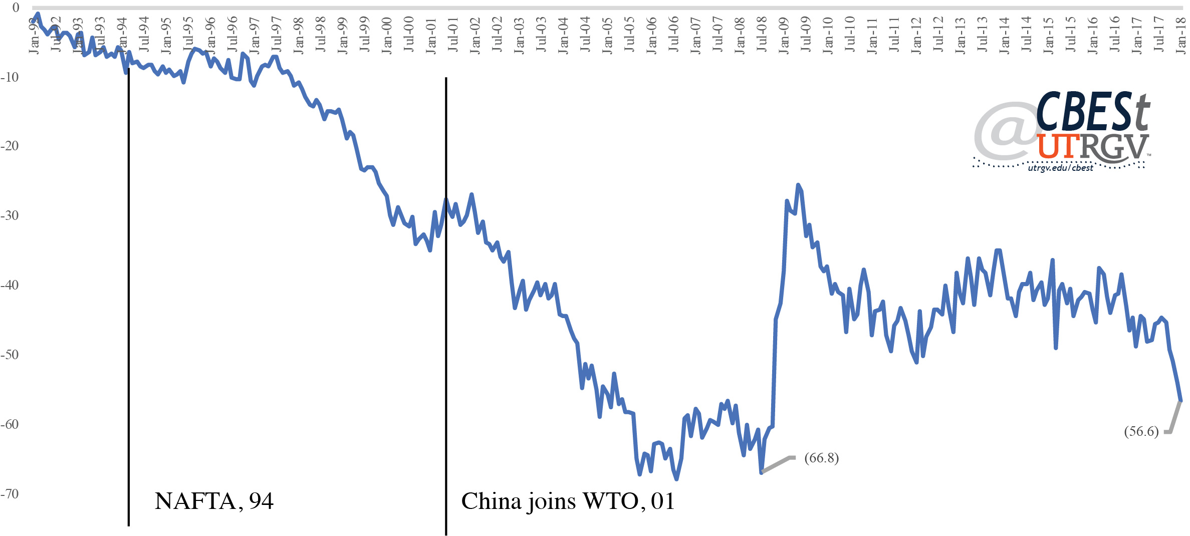
According to the US Census, for the first quarter of 2018, the US ran a trade deficit of $106 billion with China, followed by Mexico $19 billion and Germany $18 billion. The US ran a deficit with the European Union over the same time period of $43 billion (trade in goods, seasonally adjusted). All in all, the US is running a trade deficit that amounts to about 3% of GDP (in 2017). In this light, it is high but not excessively so.
At issue with NAFTA is manufacturing in motor vehicle and parts. In the first quarter of 2018, the US exported passenger cars, trucks, buses, special purpose vehicles, and parts to Canada worth $16 billion and Mexico $9 billion (top two). Imports of the same category are $30 billion from Mexico and $15 billion for Canada (top two). In other words, in the first quarter of 2018 the US ran a trade deficit in vehicles and parts of $1 billion with Canada and $21 billion with Mexico (not seasonally adjusted).
Trade
Most of Texas trade with Mexico is through the ports along the Texas/Mexico border. Figure 3 presents total trade by port. To smooth out month changes we present 12-month moving averages in 2015 dollars. The Laredo port is by far the biggest port, moving on average $17 billion per month. El Paso is a distant second at $6 billion followed by Hidalgo at $3 billion. The selected 6 ports account for 78% of Texas total trade with Mexico. About 60% of all trade in the selected ports moves through the port of Laredo. The flip side of this distinction is that Webb County is most expose to potential disruption to NAFTA.
Figure 3: Total Trade with Mexico by Selected Ports (2015 dollars, billions)
Source: US Census
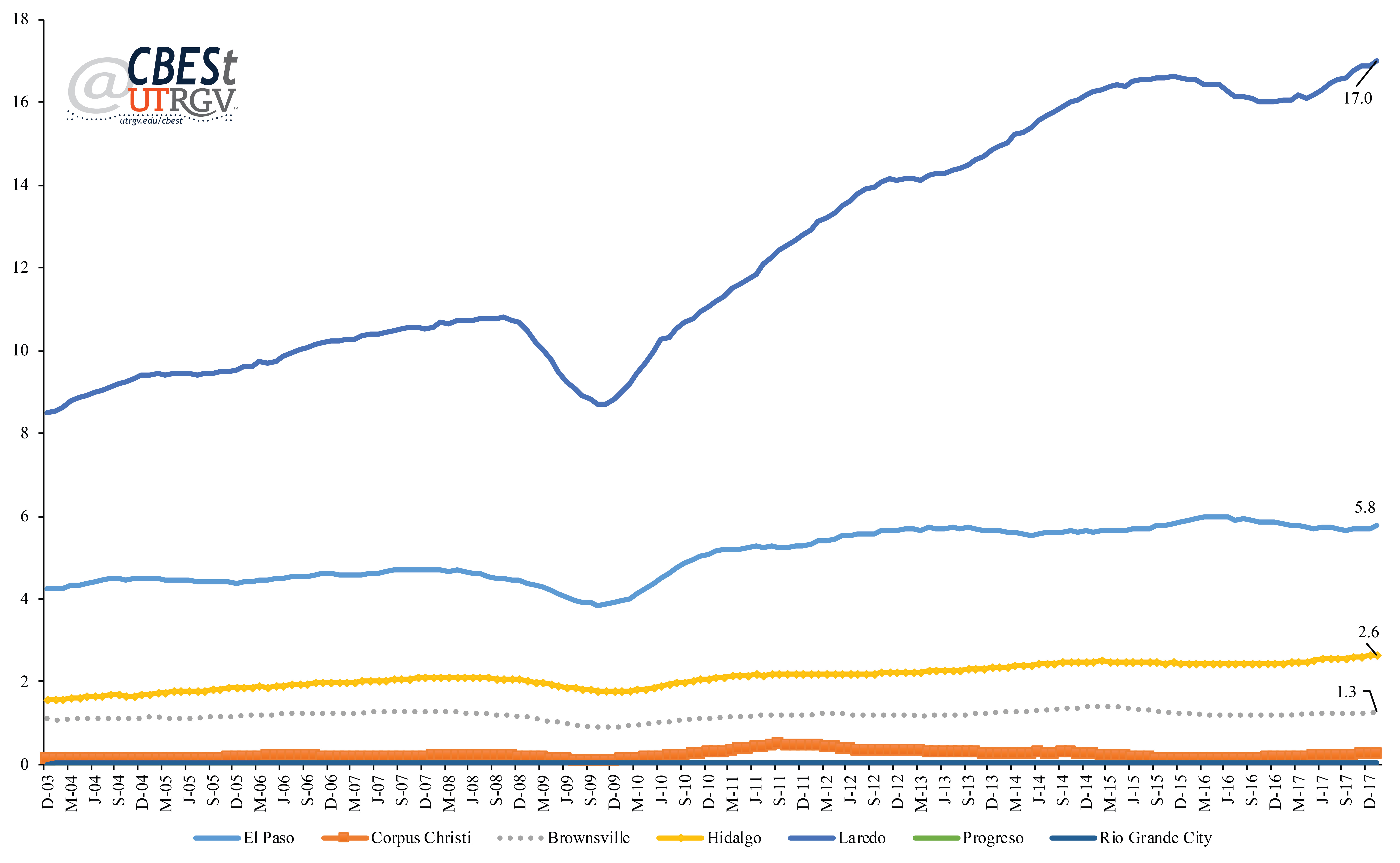
Figure 4 present 12-month moving average index of total trade. The index is set to 100 in 2003. Figure 4 shows that Progreso has had the highest growth in total trade. Since 2003, trade through Progreso has doubled as has Laredo. Corpus Christi, Hidalgo, and Rio Grande City trade flows have grown over the past 15 years by about 70%. Brownsville is the port with the least trade flow growth over the same period of time at 15%.
Figure 4: Total Trade Index by Selected Ports
Source: US Census
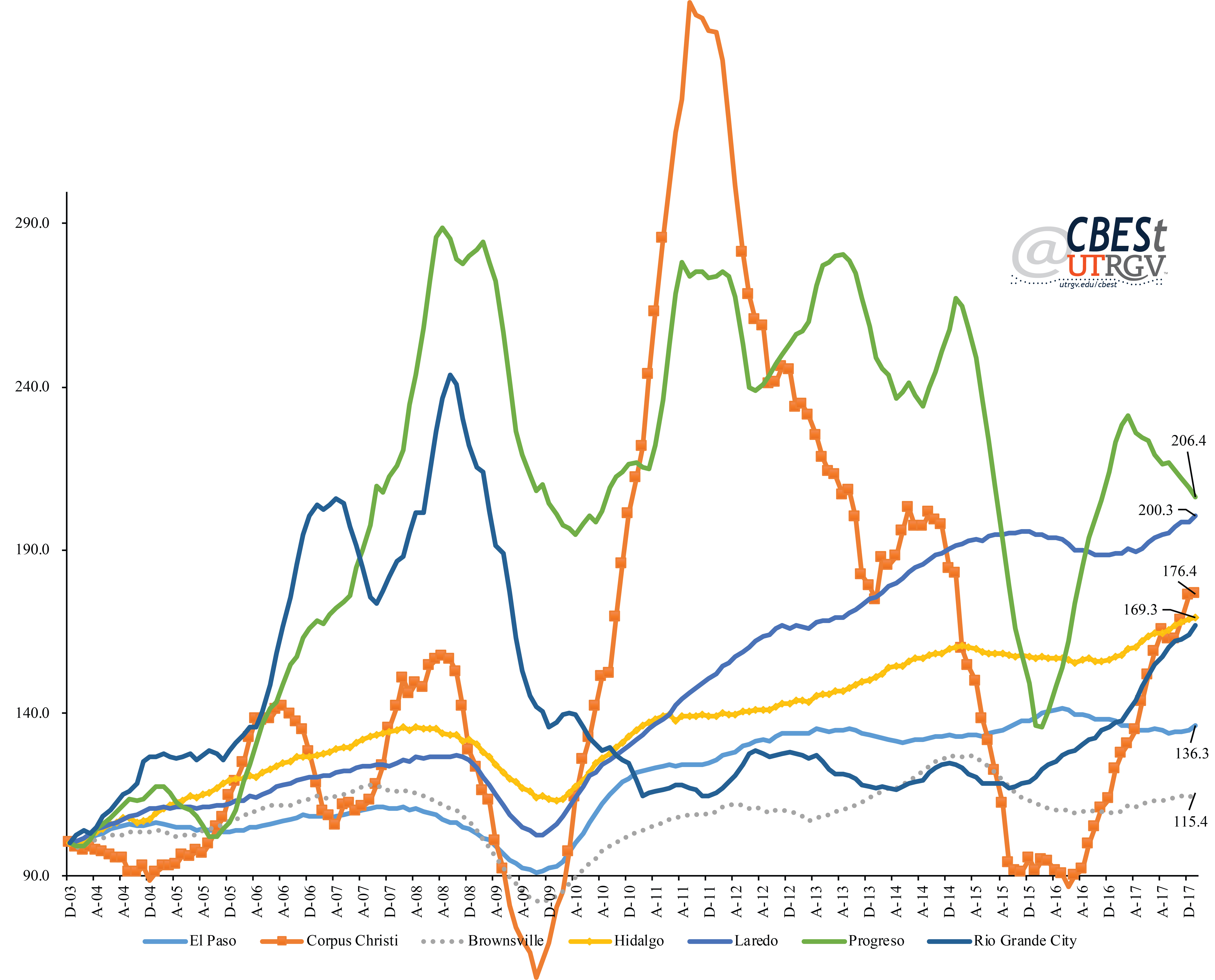
Figure 5 present the balance of trade through the selected Texas ports. Figure 5 shows that, for the exceptions of Brownsville and Corpus Christi, most Texas ports run a trade deficit with Mexico. That is, the value of goods going south through these ports is less than what comes north. The largest deficit runs through Laredo at about $1.5 billion per month. Hidalgo and El Paso have the second largest deficits at around $700 million dollars a month.
Figure 5: Balance of Trade with Mexico by Selected Ports (millions)
Source: US Census
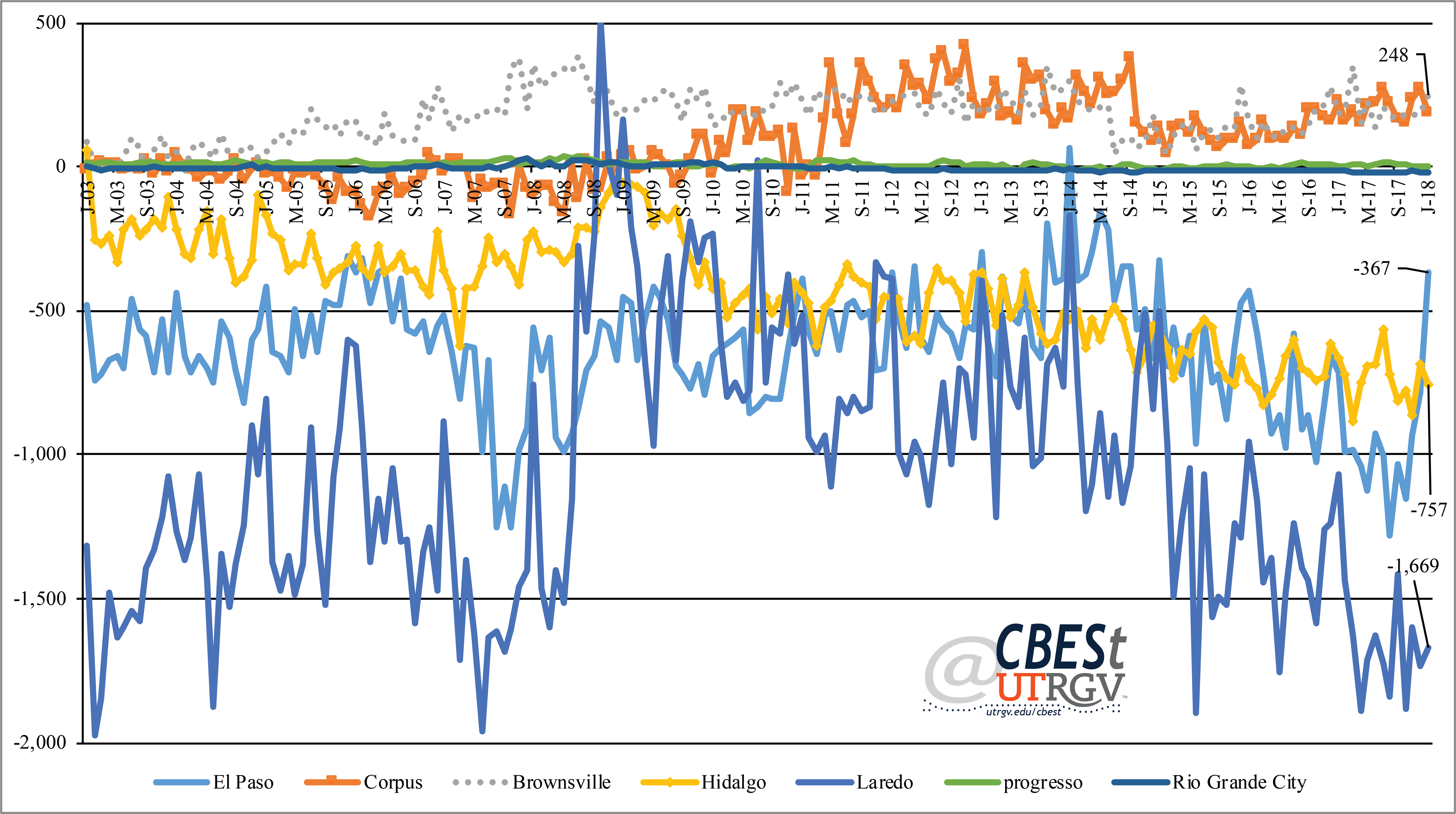
Mexico
The rise in trade with Mexico has benefited Mexico unevenly. Figure 6 shows the average foreign direct investment (FDI) annualized growth from 1999 to 2017 to Mexico by states. FDI into Mexico has grown 4.3% annually. In 2017, FDI to Mexico was $29.7 billion. Over the past 18 years states like Hidalgo and Veracruz have had the highest growth in FDI. Given the amount of trade that moves through the border one would expect a higher growth in FDI in Mexican border states. Baja California (Norte) and Nuevo Leon have seen little average growth. Sonora experienced an average annual contraction in FDI of 1.3%. Tamaulipas growth is just above the national average at 4.7%. Tamaulipas FDI in 2017 was $1.3 billion, $100 million less than Baja California, and $500 million less than Nuevo Leon. Among border states, Coahuila has had the highest average annual growth. Coahuila and Chihuahua have seen the highest growth among states bordering Texas at 9% and 5.7% respectively. In 2017, Coahuila received $2.3 billion and Chihuahua $1.7 billion in FDI.
Figure 6: Mexico’s Foreign Direct Investment (annualized average growth), 1999-2017
Source: Secretaría de Economía
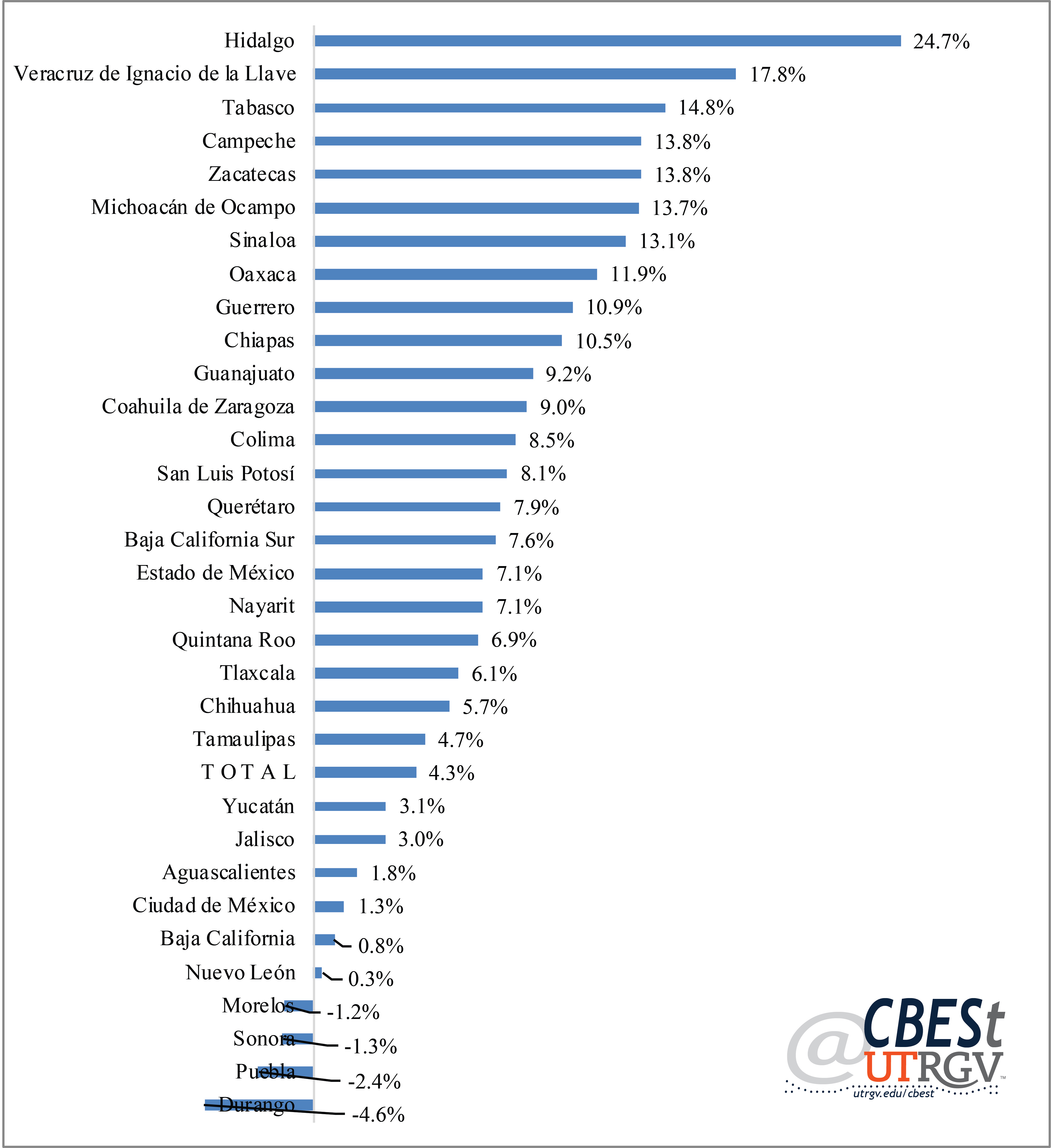
FDI is an important source of investment dollars that primarily go into the manufacturing sector. Figure 7 presents a breakdown of FDI originating from the US by sector. Manufacturing sector takes 55%, followed by commerce (13%) and financial services (11%). The data suggests that the border states of Nuevo Leon and Baja California may not have benefited as much as other Mexican states from the expansion of the motor vehicle and parts manufacturing trade.
Figure 7: US Foreign Direct Investment to Mexico by Sector (2017)
Source: Secretaría de Economía
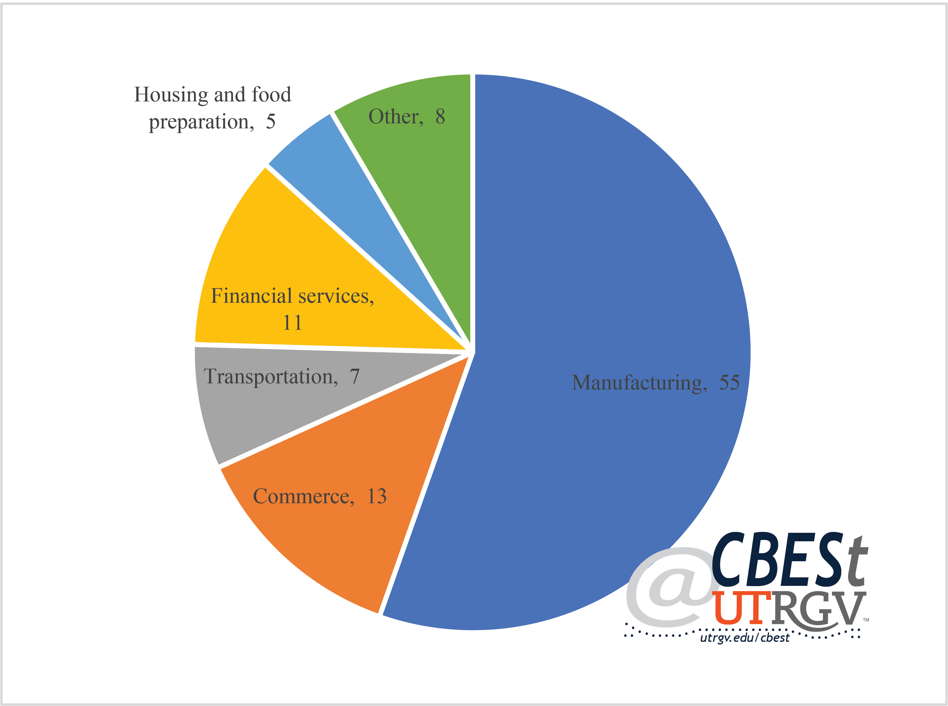
The rise in FDI in manufacturing has had a positive effect on Mexican manufacturing employment. Figure 8 presents the average annual growth in manufacturing employment through January 2018. Mexico’s manufacturing employment has increase at an average annual pace of 8%. Matamoros, Reynosa, and Nuevo Laredo have had employment growth consistent with the national rate. However, Juarez has seen a more muted growth at 2.3%. Figure 8 also shows the growth in hours worked. Here we can see that even as total employment has increased, hours worked have increase at a far slower paced. Suggesting a decrease use of overtime and increase use of part-time or contract employees. On average, hours worked have increased 3.3% annually. Tamaulipas had a similar growth profile as the nation. However, Matamoros and Reynosa growth in hours worked are lower than the state. Nuevo Laredo has the highest increase at 5.4%.
Figure 8: Mexico Manufacturing Employment (annualized average growth), 2008-2018
Source: Instituto Nacional de Estadística y Geografía
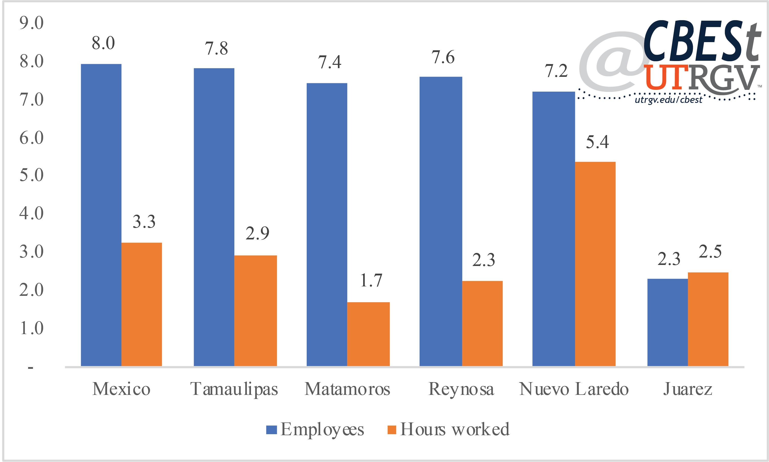
One of the many factors that make Mexico appealing for manufacturing is its low labor costs. Figure 9 presents average monthly wages and earnings per hour for 2017 in US dollars. The average manufacturing Mexican worker makes $488 per month or $2.50 per hour. Among the selected municipalidades, Juarez workers earn the lowest monthly average earnings at $459 while Reynosa the lowest hourly wages at $2.40. Nuevo Laredo has the highest monthly and hourly earnings at $556 and $2.90 respectively.
Figure 9: Mexican Manufacturing Earnings (average), 2017
Source: Instituto Nacional de Estadística y Geografía
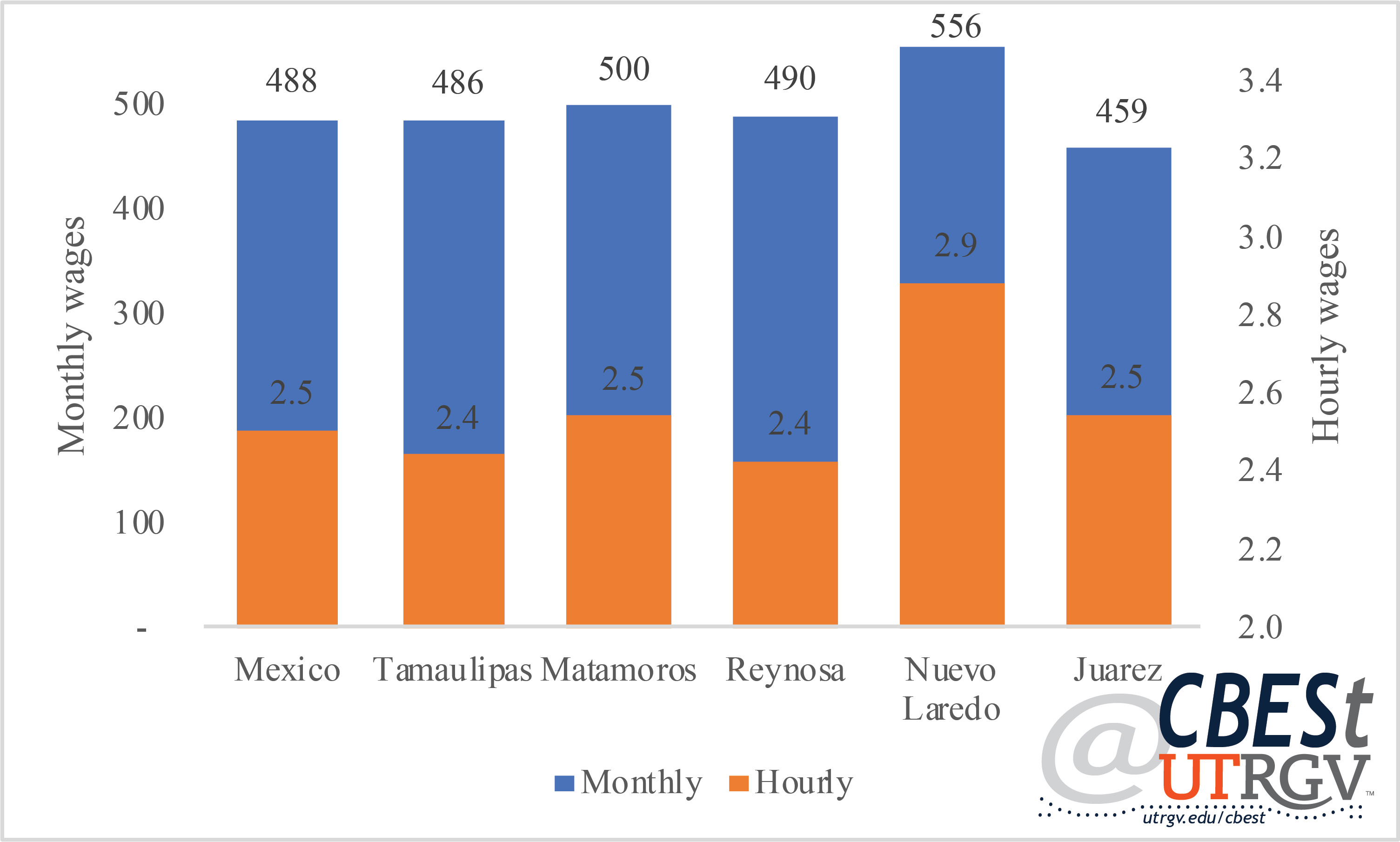
NAFTA
The North American Free Trade Agreement (NAFTA) is an agreement between Canada, Mexico, and the United States that eliminated (or substantially reduced) tariffs. NAFTA set out rules of origin, customs, procurement, investment, trade in services, intellectual property rights, and dispute procedures. The accord went into effect on January 1, 1994.
NAFTA has been integral to the auto sector. In 2016, the top two US exports to Canada were motor vehicles and parts. The top two imports from Canada were motor vehicles and oil & gas. The top two US exports to Mexico were vehicle parts and petroleum & coal products. Mexico’s top exports to the US were motor vehicles and parts. Much of the current NAFTA negotiations have centered on motor vehicles and parts. This is partly due to the large share these two categories play in US imports from Mexico. To illustrate this point, the top 4th category of Mexican exports to the US was audio & video equipment valued at 12.5 billion or 4% of total US imports from Mexico. On the other hand, about a third of Mexican exports to the US are motor vehicles and parts.
The US has two main options in addressing NAFTA. It can leave it or renegotiate it. But recently, it’s come to light that there may be a third way, section 232. It seems that leaving the Treaty may be the easiest to initiate. Under Article 2205 of NAFTA, "a Party may withdraw from this Agreement six month after it provides written notice of withdrawal to the other Parties. If a Party withdraws, the Agreement shall remain in force for the remaining Parties." So long as new laws are not needed to implement or facilitate a US withdrawal, it is not clear that Congress has the power to prevent this from happening. Of course, the messiness may come when affected parties decide to challenge the legality of such a move. Renegotiating NAFTA seems by far the hardest option. The negotiations started back in August 2017. Nine months later a resolution is not evident. On May 31, Bloomberg reported that there was a planned meeting between Justin Trudeau and Donald Trump to salvage a deal over NAFTA. This after Mike Pence called to inform them that such a meeting was conditional on Canada agreeing to a sunset clause.
The US is pressing Canada and Mexico to accept a regular review of NAFTA. Under one of the proposals, NAFTA would expire every five years and force all parties to agree to continue in current form or make changes. Many have argued that the uncertainty of its renewal would be enough to deter would be investors. Other controversial aspects of the renegotiation deal with the auto sector over wages, US content, and the dispute process.
The third way is for the US to claim that the US auto sector is vital to US national security. This is in effect how tariffs on steel and aluminum have come about. In that case, the US claimed that the loss of production capacity at a time when world capacity had grown by 2.4 billion metric tons was a threat to American national security. The justification being that in a time of national crisis the US would not be able to meet its own demand for defense and critical infrastructure steel and aluminum needs. Under section 232 of the trade expansion act of 1962, the US Department of Commerce has the authority to investigate and make recommendations to the President on matters of trade that may pose a national security threat.
Following the success of section 232 in setting steel and aluminum tariffs (of 25% and 10% respectively) have encouraged the Department of Commerce to do the same for the auto sector. On its May 23, 2018 press release it stated that the US imports of vehicles sold in the US now constitute 48%. It will take some time to get the results of this investigation. However, it is not inconceivable that they will conclude that tariffs on motor vehicles and parts are needed to safeguard American national security interests on the grounds that innovation, capacity, and knowhow is being eroded by imports. This would certainly add to trade tensions and trade war talk.
I’ll finish by stating that trade is in large part responsible for world economic growth. The Wilson Center estimates that some 5 million US jobs are dependent on trade with Mexico. The International Trade Administration estimates that Texas exports to Mexico support 910 thousand Texas jobs. It is important to remember that tariffs, like any other market distorting tax, create winners and losers. Given Texas and the border region dependency to trade with Mexico it is likely that we may be in the latter group if we continue on a path toward a full out trade war. Of course, Americans of all strides will be asked to pay in the form of higher consumer prices. So, enjoy some guacamole while you still can.
___
Dr. Salvador Contreras is Associate Professor of Economics at the University of Texas Rio Grande Valley
Endnotes:
Hall., J. (2017). Jobs Supported by State Exports, 2016. The International Trade Administration, U.S. Department of Commerce. Office of Trade and Economic Analysis.
U.S. Census Bureau and the U.S. Bureau of Economic Analysis. (May 2018). MONTHLY U.S. INTERNATIONAL TRADE IN GOODS AND SERVICES, MARCH 2018.
U.S. Department of Commerce Bureau of Industry and Security Office of Technology Evaluation (January 2018). THE EFFECT OF IMPORTS OF STEEL ON THE NATIONAL SECURITY AN INVESTIGATION CONDUCTED UNDER SECTION 232 OF THE TRADE EXPANSION ACT OF 1962, AS AMENDED.
Villarreal, M. A., and Fergusson, I. F. (May 2017). The North American Free Trade Agreement (NAFTA). Congressional Research Service. U.S. Census Bureau and the U.S. Bureau of Economic Analysis. (May 2018). MONTHLY U.S. INTERNATIONAL TRADE IN GOODS AND SERVICES, MARCH 2018.
Wilson, C. (2016). Growing Together: Economic Ties between the United States and Mexico. Wilson Center Mexico Institute, Working paper.
Wingrobe, J. and Quinn, G. (May 2018). Trudeau Says Pence Insisted on Nafta Sunset for a Trump Meeting. Bloomberg (https://www.bloomberg.com/news/articles/2018-05-31/trudeau-says-pence-insisted-on-nafta-sunset-for-a-trump-meeting)


| ISSUES | FALL | WINTER | SPRING | SUMMER | SPECIAL ISSUE |
|---|---|---|---|---|---|
| Volume 9 | 2012 | 2013 | 2013 | ||
| Volume 8 | 2011 | 2012 | 2012 | 2012 | |
| Volume 7 | 2010 | 2011 | 2011 | 2011 | |
| Volume 6 | 2009 | 2010 | 2010 | 2010 | |
| Volume 5 | 2008 | 2009 | 2009 | 2009 | |
| Volume 4 | 2007 | 2008 | 2008 | 2008 | |
| Volume 3 | 2006 | 2007 | 2007 | ||
| Volume 2 | 2005 | 2006 | 2006 | 2006 | 2006 Annual |
| Volume 1 | 2004 | 2005 | 2005 | 2005 | 2005 Annual |