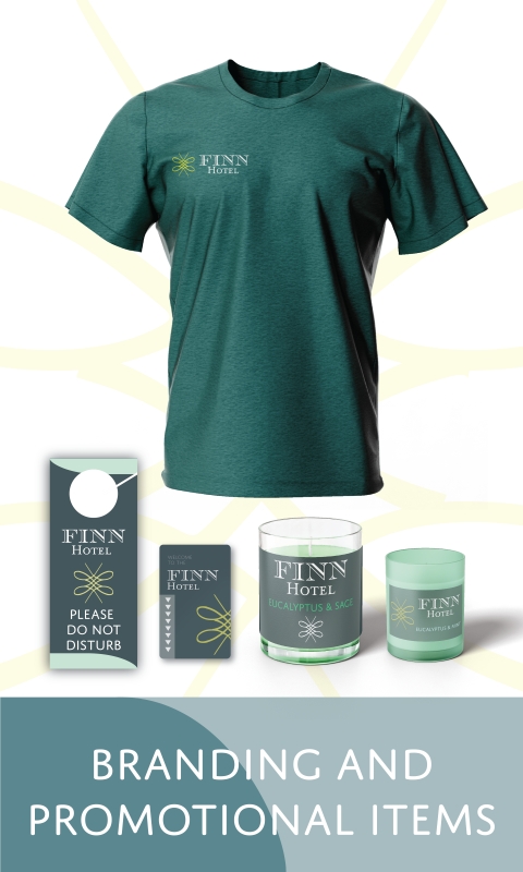
For my Senior Exhibit I created a hotel chain called Finn Hotel. People tend to feel the most relaxed and at peace when they are at home. While designing the hotel brand I kept this in mind and decided to use a color palette that will reflect that feeling of relaxation. I also wanted to display that this hotel will provide luxury and comfort to all its guests at an affordable rate. For the logo I tried to blend modern designs with a classic font style. By blending the two design types for the logo I hoped to achieve a sense of an established hotel. For the body copy in the posters, I used modern sans serif fonts to have a clean and legible look. To help the viewer feel a sense of tranquility and relaxation, I decided to use grays, blues, and greens for my color palette.
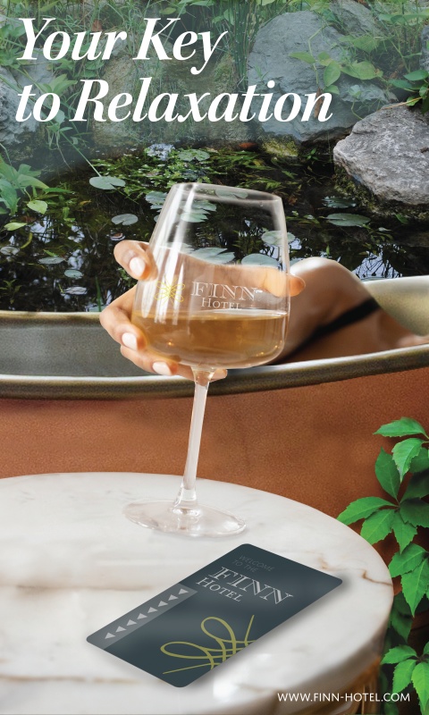
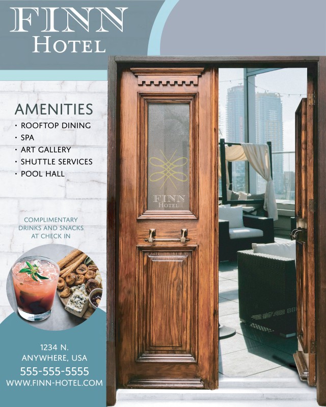
The first and second design poster are advertisements to display all the services that the hotel would offer. The color palette that was used for these posters are cool blues, greens, and gray tones. These colors also give the viewer a sense of relaxation which is the main goal of the hotel. The third poster design displays several different mockups of hotel items such as a key card and a sample uniform shirt. This gives the client a view of how the hotel brand would be displayed and used on a daily basis. The background of the poster was kept minimal to keep the hotel brand items at the center of focus.