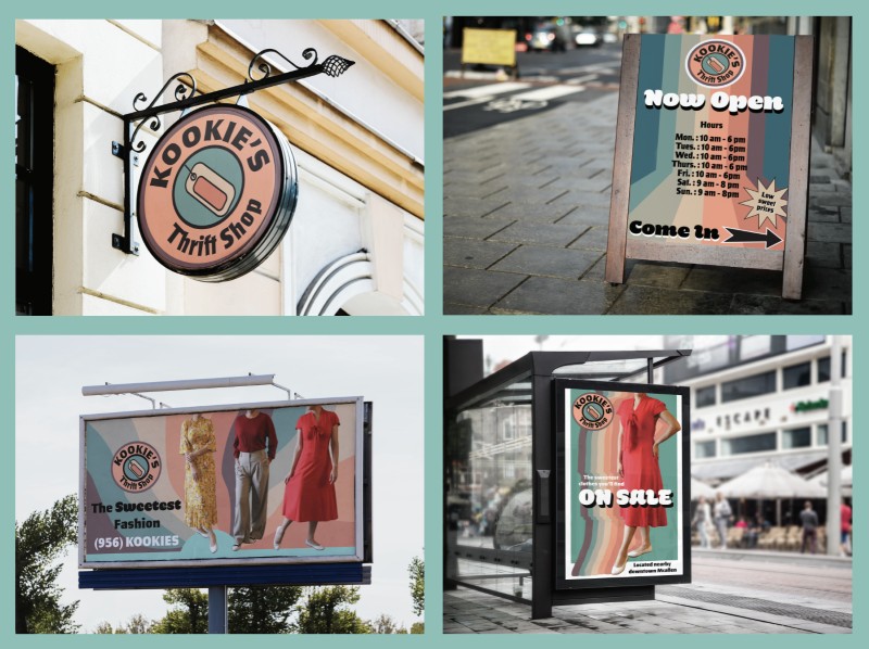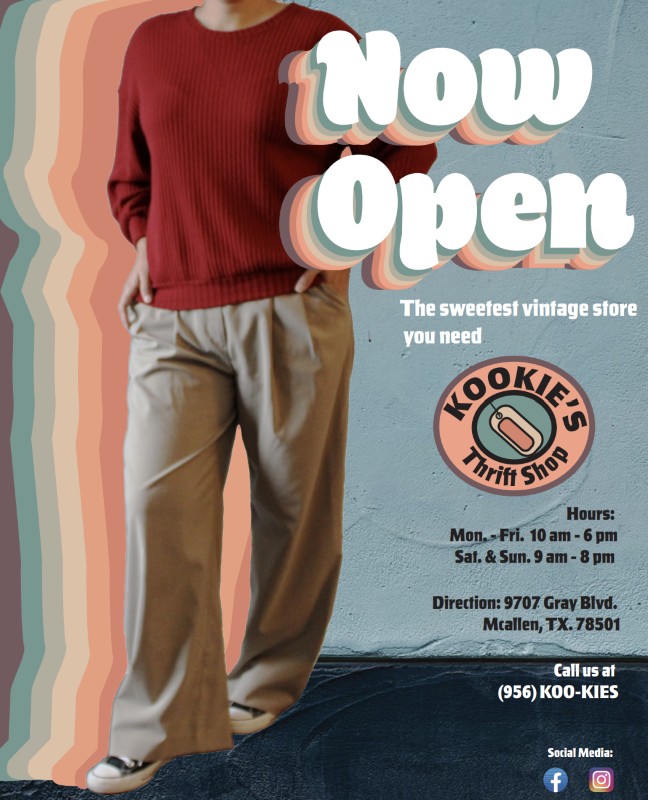
For my project, I decided to create a thrift store. Although thrift stores are known to sell discounted clothes and shoes, some of the thrift stores I’ve visited contain some items that used to be someone’s from years ago such as vinyl, DVDs, VHS tapes, and old books. Since thrift stores can have vintage items, I decided to go with a vintage aesthetic, specifically something between the 60s and 70s. I have been drawn to this aesthetic of both of these decades since high school, which is one of the reasons I also decided to pursue a career in graphic design. The idea of my store Kookie’s thrift shop is of it to be a small, independent store that sells vintage and eccentric items. Although I don’t think I will own a store, I would like to offer my graphic design service to small, independent businesses. One of the reasons I named it Kookies is a misspelling of the word kooky but also wanted to combine something cute sounding such as cookies.
As mentioned above, for my logo the color palette is based on groovy vintage colors that were popular during the 60s and 70s. I also implemented some of the geometric patterns found in the decades’ design. As for the font, I found a font that was legible but also funky in a way; I used Salden Black. The signages also contains the same color palette as the logo with either a blue or an aqua green color as the background. With the patterns on the signages, I still wanted to keep the groovy movement of patterns. The key words in the signages are in a different font. I used Hegante font to make these words pop up to the viewer.