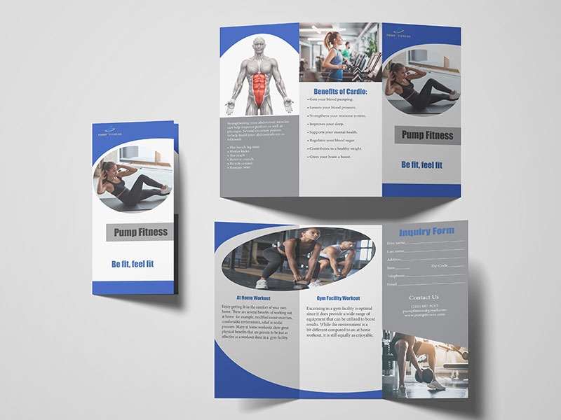
Pump Fitness
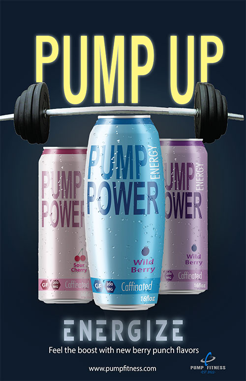
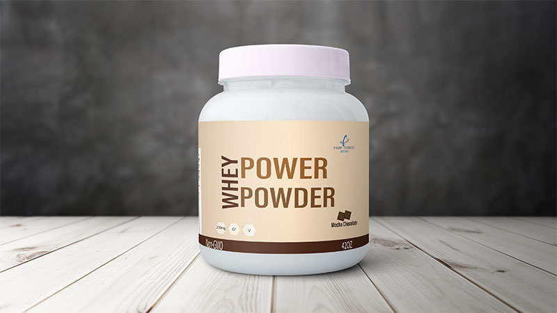
For my senior exhibit, I wanted to create a package design for a fitness brand that could promote wellness and positivity. As a frequent user of athletic performance supplements, myself, I was inspired to create my own brand of supplements such as protein powder, creatine powder and energy drinks. In the marketing industry, I have noticed that several existing products tend to target different gender audiences by the packaging design which can have a great effect on consumers. Some tend to look masculine with darker and more intimidating colors, while others lean to a feminine look with brighter colors. While there are specific products intended for each gender due to biological differences, protein powder, energy drinks, and creatine powder have the same effect on both genders and are not related to any biological differences. My intention was to create a design that can be seen as unisex on those common supplements, therefore making the target audience open to anyone by incorporating a dark and bright color scheme to all the products.