Flower Butter
For my exhibit, I wanted to create a product that every artist uses when they’re creating art for the first time. Crayons can inspire generations of artists, and with that in mind, I wanted to create an organic crayon brand that honors the medium that introduces creativity to young artists. Learning that crayons are harmful to the environment, I decided to make my brand environmentally friendly by extracting the wax from a plant and creating biodegradable packaging.
The “Flower” aspect of “Flower Butter” is about nature, and the “Butter” signifies the crayons melting like butter. Additionally, I wanted to create fun and exciting packaging that also displays the organic aspect of the brand. I believe that packaging is very important and challenging when marketing towards a younger audience. Due to my design style being minimalist, I wanted to incorporate my style to create a brand campaign that appeals to the audience by using earthy, but vibrant colors that are easy on the eyes.
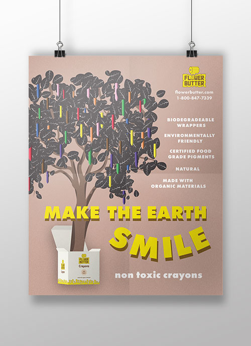
My first poster is about marketing my crayon brand by showing a tree growing out of the box, making the association with nature. “Make the Earth Smile” is the slogan I used a call to action to join the fight against the billions of crayons that make up the landfills with no biodegrading in sight.
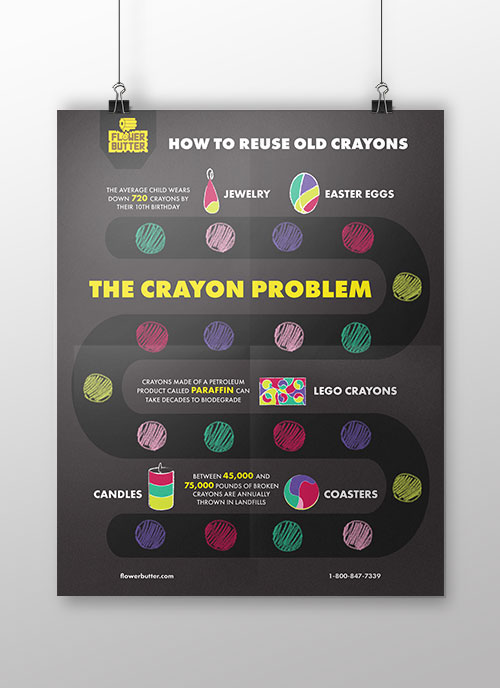
I then followed up the first poster with an infographic that teaches the audience how to repurpose their crayons once they don’t want them anymore, along with some facts about the crayon industry. The visuals I included in the infographic is a conveyor belt that wraps around the poster with some illustrations of the fun things you could make with crayons.
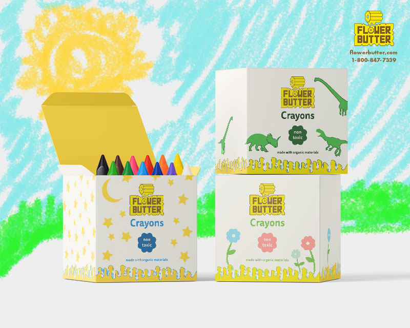
Finally, for my last project, I created some fun packaging themes for the crayons to catch the attention of the target audience. The 3 themes that I chose are dinosaurs, flowers, and astronomy. I wanted to capture the imagination that young artists have, as well as include things that we as kids used to like.