Mango National Reserve
Hi, I’m Bernadette! In the spring semester of my senior capstone exhibition class, I created a hypothetical safari consisting of four projects. I decided to create a safari because in my world, animals should feel free to follow their instincts and they deserve to pursue a life for themselves. My safari is different from existing safaris because it is a game free range, therefore no animal is victim to selfish human behaviors. I have always been an ardent fan of animals. I can see the same animal every day, and it’ll be like my first sighting of them! I guess you could say that I never decided to fully grow up and become bored of them. I decided to name my Safari Park, Mango National Reserve because aside from being delicious, Mangos are grown in many parts of Africa, and it is a word many people understand and a fruit many happily consume.
Naturally, my logo’s color is the ever-vibrant color, orange. A mango resides in my logo and serves as negative space. My logo contains Africa’s luxurious bird, the grey crowned crane because I believe this helps my Safari achieve a minimalistic contemporary approach that would align with my enjoyable safari. Alfarn is the font I chose for my logo because it is a spacious font that seemed to go well with the vast lands of Africa.
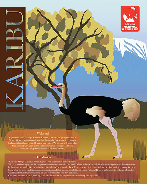
My second project was a poster, and I chose the tall icon, the Ostrich. I was inspired by photography and illustrations of African scenery, this allowed me to decide on an earthy color palette. Not only did I take my exhibit’s photographs at Gladys Porter Zoo in Brownsville, but I also purchased several books that inspired me to decide on serif sweetheart, Baskerville. This timeless font along with Alfarn are the two fonts I utilized in my poster to help bring attention to my art.
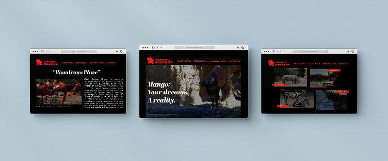
As for the third round in this safari project, I created a website. It was important for me to find a location on an African map- I ended up setting this location in South Africa because I wanted the animals in my photographs to be local to a certain land. For my website I continued the usage of Alfarn, and I included the ever-gorgeous font, Abril Fatface regular for titles, and Menlo bold for my bodycopy. Menlo bold made me think of font that would be used for any type of mail and I wanted to achieve a degree of charm. I decided on a black look for my website because this helps me set the tone of a website with a fine edge.
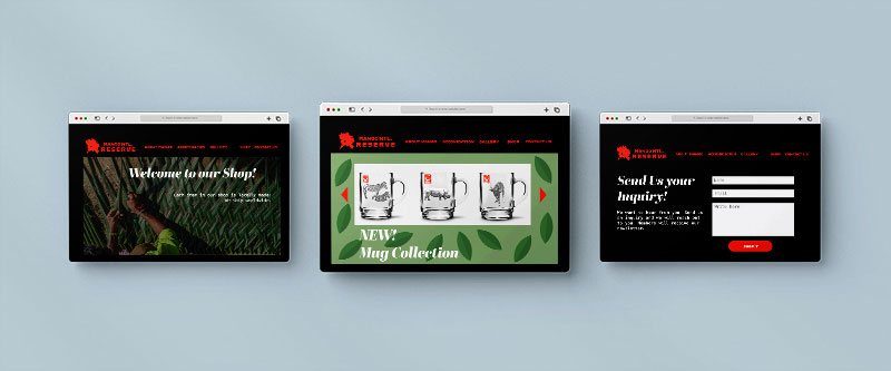
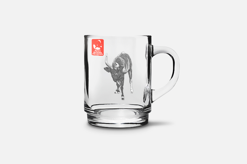
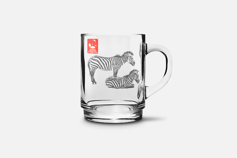
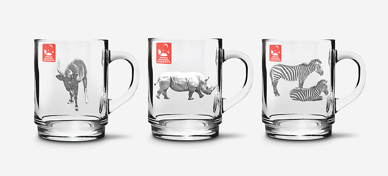
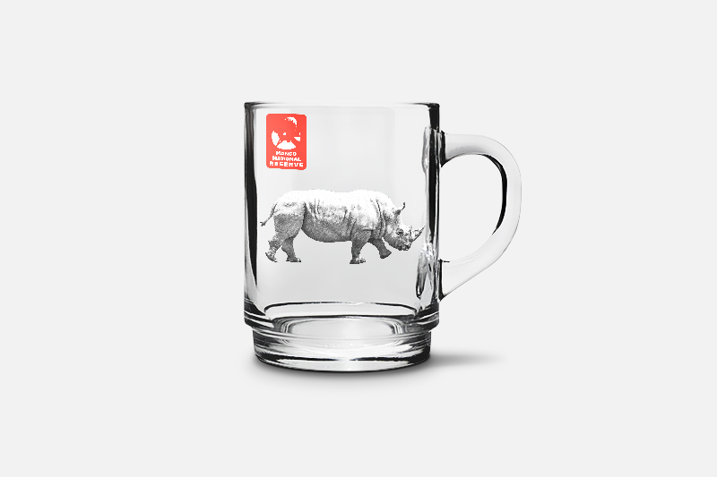
Finally for my fourth project, I created merchandise. I researched safari websites and I was inspired by some glassware on the Maasimara webstore. My glassware is different from their kitchenware because my merchandise was created by pictures taken at the zoo and edited in photoshop to appear as a sketch!
I really enjoyed the process of creating my hypothetical safari because not only do I see myself in this project. I believe that the idea of my safari desires a world in which humans and animals can enjoyably share the land and for humans to respect the intelligence and beauty of other beings. It is important to be educated about the world we live in and to inspire humanity to never dull away from fascination and happiness!