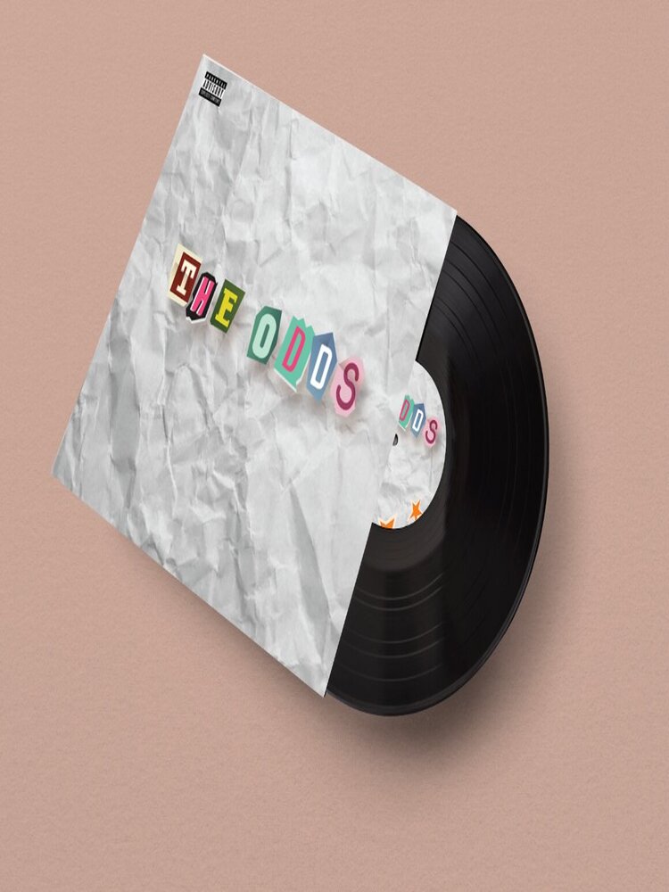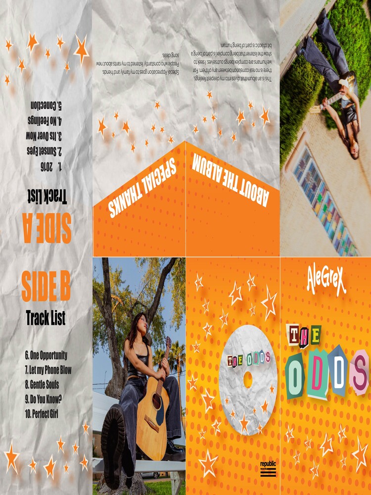

“AleGreX” is the combination of my entire graphic design journey, from the thing that first sparked it (Album covers and artist branding) down to everything I ever learned. With this piece, I wanted to combine the two forms of art that have been prominent in my life since I was a young child. Music and Design are artforms that I continuously partake in. They were both the first thing I ever fell in love with, and to be able to combine them for my final project nonetheless is a huge privilege.
I wanted this artist’s personality to be quirky and authentic, like someone you would meet in school during your lunchbreak or someone that would help you find the answer to a math problem. I wanted to create an album/artist whose entire aesthetics differed from what is expected of women in the pop scene. I wanted the audience to feel understood and connected rather than feeling like she is yet another unattainable standard. In this modern era of perfectly curated images, clean faces, heavily edited photography, and an overall feeling of disconnection. It is important to create art that is relevant and sentimentally connected to the audience.
My color choices were strategic, yellow and orange are colors rarely used in musician’s branding due to their bright and attention seeking colors. I also aimed for the entire album design to feel like a scrapbook rather than an album cover. My goal for this project was to create a branding that challenged the norms of what is expected from women in the music industry. To create a community where quirkiness, authenticity, humanity and individuality are not seen as a taboo, but rather something that makes someone valuable and deserving of admiration.