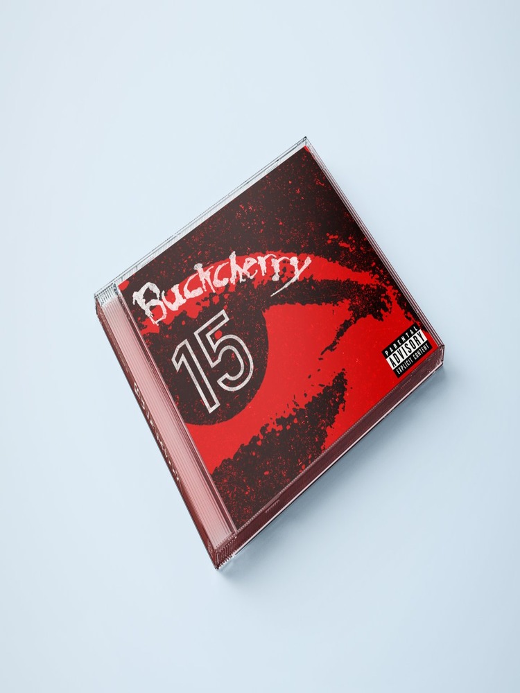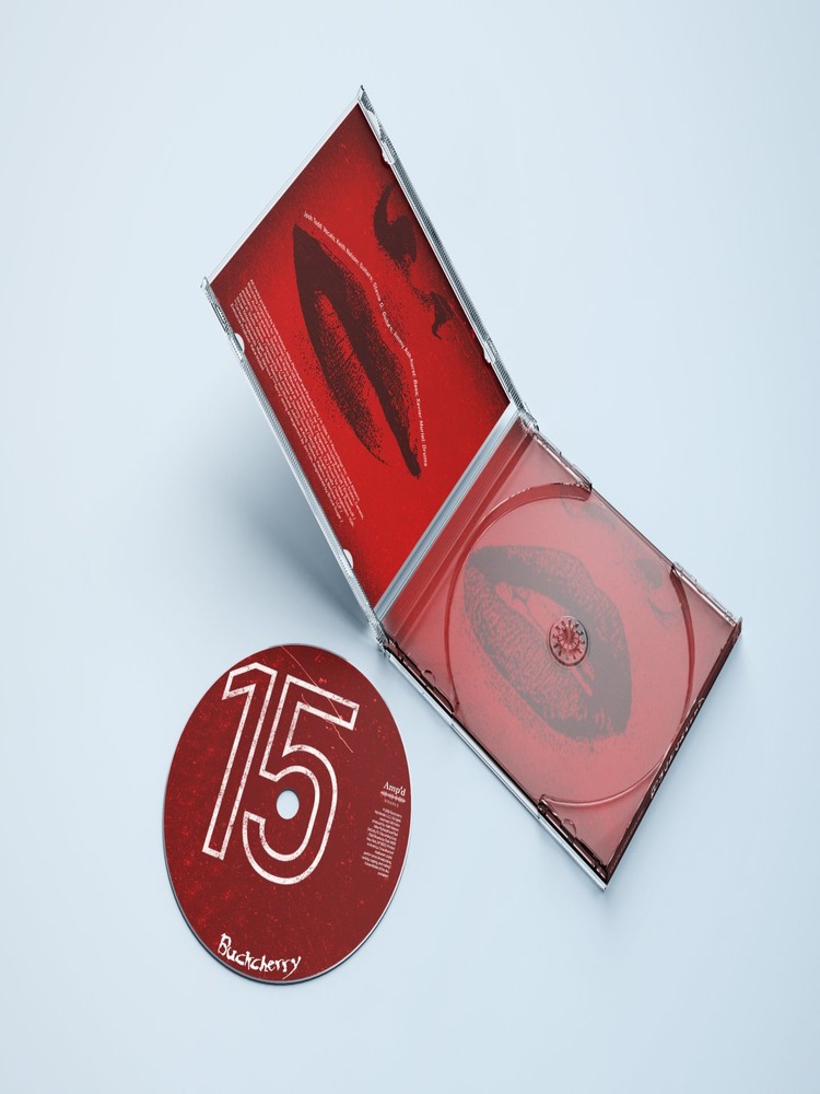

My senior exhibition 15 Days is a reimagined visual identity for Buckcherry’s album 15, expressed through a poster, album packaging, and merchandise. While the album is defined by unapologetic energy, grit, and cultural impact, its existing branding does not fully capture the intensity and attitude embedded in its sound. This project explores the opportunity to translate the album’s raw character into a cohesive, contemporary design system that feels as bold and authentic as the music itself.
Through typography, layout, color, and imagery, 15 Days demonstrates how graphic language can transform sound into emotion. The project modernizes the album’s presentation while strengthening its overall identity, showing how thoughtful branding deepens audience connection and reinforces an artist’s legacy. By aligning visuals with the record’s rebellious spirit, the work highlights the power of cohesive branding in shaping how music is experienced and remembered.
Created for longtime fans as well as rock and alternative listeners in their late twenties to early thirties, the project invites viewers to sense the music’s energy before they even press play. The goal is to provide existing fans with an experience that matches the spirit of the record while introducing new listeners to the band through compelling, energetic branding. Ultimately, 15 Days encourages audiences to reconsider the role of graphic design in music culture, demonstrating how a strong visual identity can extend the life and impact of an album beyond its sound.