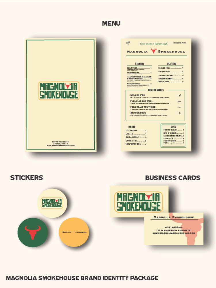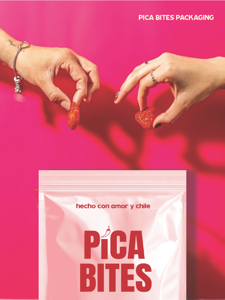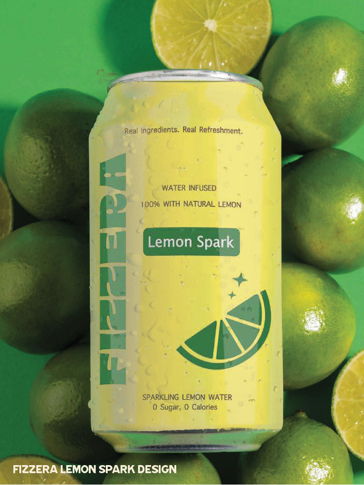

Blink & Co Studio is a conceptual branding studio focused on creating visual identities for food and beverage start-up companies. This exhibition poster introduces the studio’s mission: helping new brands stand out in crowded retail spaces through bold and strategic design.
In today’s fast-paced consumer environment, food and beverage products compete in highly saturated markets where customers make quick decisions. The word “Blink” represents that exact moment, the split second when a product either captures attention or gets overlooked. Strong design makes that moment count by turning ideas and cultural influences into identities that feel fresh, modern, and memorable.
The poster communicates this concept through bold typography and high-contrast color. A warm red gradient background creates a sense of energy and appetite, while the soft cream text adds clarity and balance. The dynamic placement of the beverage cans introduces movement, making the composition feel engaging and visually active. The bright, citrus-inspired color palette reinforces freshness, which is often associated with contemporary food and beverage products.
This project allowed me to explore branding not only as visual design but also as strategy. Creating identities for start-ups requires understanding audience behavior, industry trends, and how brands position themselves in the market. Emerging companies need more than just attractive visuals, they need a clear identity that communicates confidence and direction.
Blink & Co Studio represents a creative space where ideas develop into distinctive brands designed for today’s competitive landscape. Overall, this exhibition reflects my interest in combining creativity with real-world design applications. My goal as a designer is to create thoughtful branding that captures attention instantly and remains memorable long after.