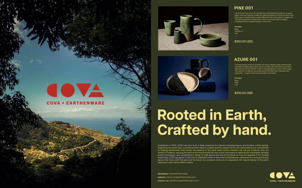
For my exhibit, I decided to develop a brand identity for an earthenware ceramics company called Cova. The brand should embody harmony between nature, craftsmanship, and modern refinement. I would like the company to create a connection between its consumers to where they could trust the brand and quality of each product. This project will explore logo design, packaging, marketing materials, and digital presence. All of which will reflect the essence of Cova’s aesthetic of being timeless, elevated, and rooted in the artistry of ceramics. I have chosen to create this particular type of branding because I have always been intrigued with ceramics and sculptures. I would always appreciate brands found in stores that create sophisticated collections that demand a passion for not only art but discipline.
Earthenware is a form of glazed or unglazed pottery that has not been fired to the point of vitrification, thus making the material slightly porous and coarser than stoneware and porcelain. To make it reliable to store liquids when unglazed, it could be covered in finely ground glass powder and fired again to fuse a glasslike layer, sealing the pores of the clay body. Such a process requires technique to create such fine pieces and were mostly used in pottery up to the seventeenth century in Egypt, Persia and near East towards the Greek, Roman, and Mediterranean, as well as the Chinese. I have always been drawn to brands that balance sophistication with authenticity, where every design element feels intentional and evocative. With Cova, I sought to elevate earthenware beyond traditional perceptions, creating a brand that feels as refined as luxury skincare yet as grounded as handcrafted pottery. The goal was to develop a visual language that speaks to the tactility of ceramics—earthy textures, soft imperfections, and quiet elegance.
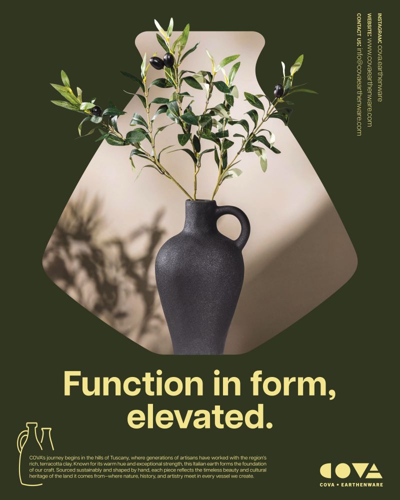
The name Cova is inspired by the words Cave or Cove which are protective grounding spaces formed by nature and the earth. Created by natural materials yet formed by man to convey elevated craftsmanship. I did not want the brand and especially the logo to rely on obvious imagery, but to be subtler in design to represent a more luxurious, refined, minimal brand identity. The color palette would not be too bright and overpowering but more muted and balanced. The typography would be clean and clear and use of shapes to connect the shapes of clay vessels. All of these elements are what I wanted to create a modern and elevated brand.