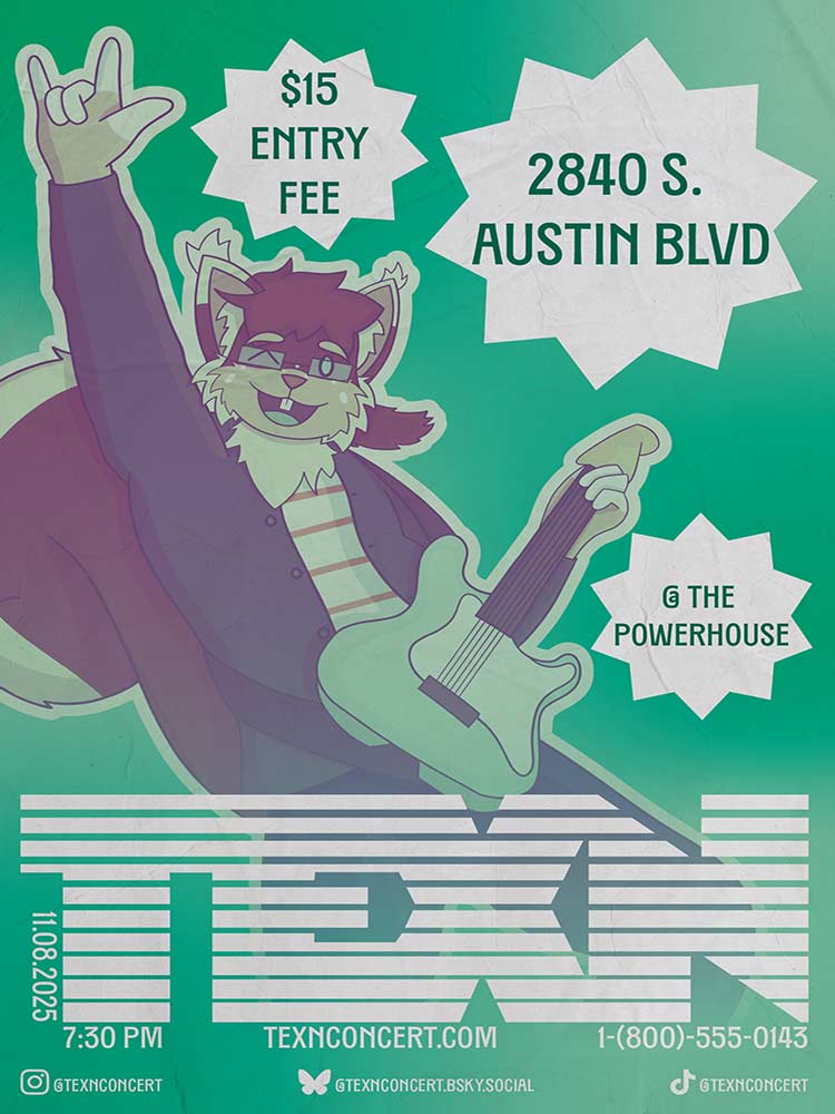
 Concerts can bring some of the most enjoyable moments to a person, whether by being raw and vulnerable with the lyrics and instrumentals, or upbeat and amusing, dancing and singing along to the singer. Design, in a similar movement, can bring others to emotions of curiosity, solely using icons, art, and the language of art, all by putting together various elements and producing an intriguing advertisement that coaxes one to want more information.
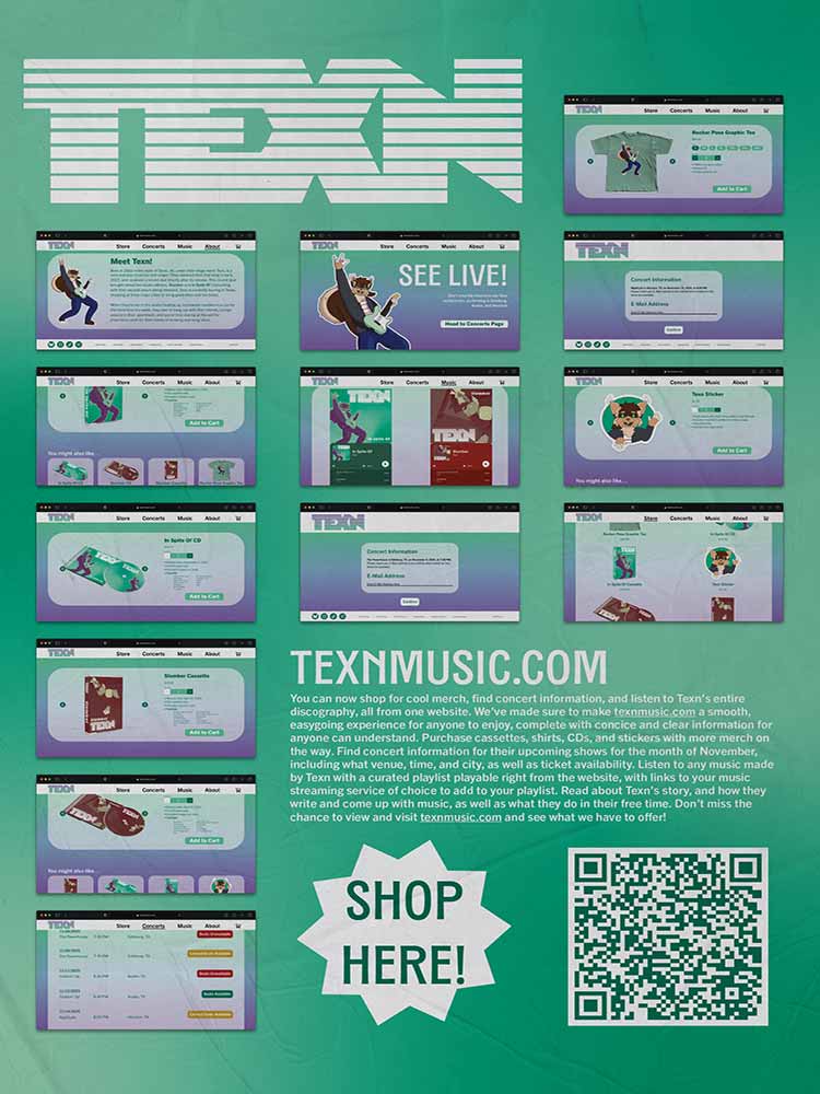
My design moves to capture this curiosity by advertising a concert using a character of mine. “Design is Human” is more than simply making all the art and designs with our own two hands; it means pouring time, effort, and energy into something that we are passionate about. I wanted to experiment with a poster that would prompt one to come close and read what is being advertised. The soft color palette and friendly demeanor of the character invite the viewer to read what’s being shown, and encourages them to think about arriving at the concert that’s being advertised. This format allows me to tap into our natural curiosity to learn more information about something that appeals to us using a pleasant style and design language.
The intended audiences for this project are young adults and music lovers who love the genre of pop-rock and indie-rock. The impact is meant to produce more fans for this hypothetical musician, generating more people to be curious about design language and why certain elements make them feel the way they do. This project reflects on my personal brand by merging my fondness for designing flyers and posters and my belief that design doesn’t have to be overly corporate to appeal to the masses.